Scoring genre clarity...

Thronefall capsule

Thronefall

A minimalist game about building and defending your little kingdom.

$8.44Overwhelmingly Positive(169)
Tower DefenseStrategyCity Builder
GrizzlyGames, MythwrightOct 11, 2024

Thronefall scores 70/100 — better than 30% of Tower Defense capsules (n=699).

Overwhelmingly Positive (169 reviews) · $8.44 · Released Oct 11, 2024 · By GrizzlyGames

Quick text summary

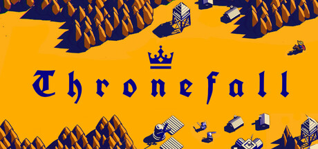
Thronefall scored 70/100 on Steam Analyzer — Good for a Tower Defense capsule. Top priority fix: [genre_clarity] Integrate a subtle but readable scene element — such as a minimalist castle silhouette or small shield/sword icon — into the background or beneath the title to signal strategy/defense genre at tiny size without breaking the minimalist aesthetic.

Capsule scores by dimension

  • Genre Clarity: 5/10 — Medieval theme, genre ambiguous. The gothic blackletter font and crown icon above the title clearly signal a medieval kingdom theme, which is consistent with the strategy/defense genre. However, at tiny size there are no gameplay cues — no units, no battlefield, no tower icons — leaving the genre ambiguous between RPG, strategy, card game, or even a pub brand. A viewer scrolling quickly at tiny size cannot distinguish this from a medieval RPG or tavern simulator.
  • Title Readability: 7/10 — Bold blackletter reads at small size. The large, high-contrast dark navy blackletter title on a flat amber/yellow background is highly legible at full size, and the letterforms remain distinguishable at small capsule size due to generous letter scale. At tiny thumbnail size the gothic letterforms compress and some interior detail is lost, but the word 'Thronefall' can still be parsed by a patient viewer; however the crown icon above disappears almost entirely at tiny scale.
  • Contrast & Color: 8/10 — Strong amber-navy pop against Steam dark. The saturated amber/golden-yellow background creates an immediate and powerful contrast against Steam's dark #1b2838 background, making this capsule jump out in a grid of darker gaming imagery. The deep navy text on yellow provides strong internal value separation. In grayscale, the dark type on a bright field still reads cleanly with no muddiness.
  • Uniqueness & Polish: 7/10 — Confidently minimal, deliberately bold. This capsule takes a bold risk by stripping away all scene illustration and going purely typographic with a single icon — a choice that reads as intentional and confident rather than cheap. The flat amber background and gothic font pairing is distinctive and matches the game's stated minimalist design philosophy. Compared to the top-performing benchmarks which use rich scenes, this stands out for the opposite reason, though it risks looking unfinished to players who don't know the brand.
  • Brand Consistency: 8/10 — Minimal aesthetic, strong internal identity. The amber-and-navy palette with gothic typography and crown motif is a coherent and recognizable identity system that could carry across multiple assets. The deliberate minimalism matches the game's core concept of a stripped-down kingdom-builder. The crown icon above the wordmark acts as a memorable recurring symbol that reinforces brand recall.
  • Composition: 7/10 — Centered hierarchy, safe and clean. The centered crown-over-wordmark composition is clean and hierarchically clear with a natural top-to-bottom read: crown first, then title. There is generous breathing room on all sides ensuring no Steam crop risk. At small and tiny sizes the composition holds because the single focal element is large and centrally placed, though the large empty amber fields above and below feel like wasted real estate that could reinforce the genre or add visual interest.

What works

  • Immediate color impact. The saturated amber background pops strongly against Steam's dark UI and stands out in a genre dominated by dark, moody capsules.
  • Legible title at small size. The oversized blackletter wordmark remains readable at small capsule dimensions due to its scale and high internal contrast.
  • Intentional minimalism signals brand identity. The typographic-only approach with crown motif communicates a deliberate, confident design voice that matches the game's minimalist concept.
  • Zero clutter or safe-zone risk. Generous margins and a centered layout mean no important element is at risk of being cropped by Steam's various display contexts.

What hurts the capsule

  • No genre cues visible at tiny size. Without any scene, character, or gameplay iconography, the capsule fails to communicate 'strategy' or 'tower defense' at thumbnail scale.
  • Crown icon disappears at tiny size. The small crown symbol above the wordmark, the most genre-relevant icon, is lost entirely at thumbnail dimensions.
  • Large dead zones reduce visual storytelling. The large empty amber fields above and below the text represent wasted space that could reinforce the medieval kingdom-defense concept.
  • Benchmarks comparison gap. Against top-performing capsules in the strategy genre like Manor Lords or Frostpunk 2 which use rich environmental compositions, this capsule lacks any scene-setting power.

Priority fixes

  1. [genre_clarity] Integrate a subtle but readable scene element — such as a minimalist castle silhouette or small shield/sword icon — into the background or beneath the title to signal strategy/defense genre at tiny size without breaking the minimalist aesthetic.
  2. [genre_clarity] Scale up the crown icon significantly so it remains visible and readable at tiny thumbnail size, as it is currently too small to survive compression.
  3. [composition] Use the large empty amber space to add a minimal decorative border, terrain silhouette, or kingdom motif that reinforces the medieval defense theme and reduces dead zone feeling.
  4. [title_readability] Consider adding a very subtle dark outline or drop shadow to the blackletter characters to improve separation resilience at compressed sizes and in varying display conditions.

Store copy priority fixes

  1. [uniqueness] Replace or contextualize the comp title list with 1–2 specific sentences explaining what Thronefall does differently (e.g., 'Combines the real-time tactics of Total War with the elegant simplicity of Bad North, removing complexity to focus on moment-to-moment decision-making').
  2. [feature_communication] Expand the Mutators line to 1–2 sentences explaining what they are and how they alter gameplay (e.g., 'Apply optional Mutators like double enemy spawns or no tower repairs to intensify runs and unlock exclusive rewards').
  3. [tone_match] Inject one moment of personality or voice into the opening paragraph (e.g., 'Each dawn, your kingdom grows—each night, it is tested. Can you keep the throne?') to deepen emotional engagement.
  4. [audience_targeting] Add a 1-sentence clarification of progression structure to help players know what to expect (e.g., 'Progress through a complete map campaign, then unlock endless and challenge modes for long-term replayability').

Related guides

Steam app ID: 2239150 · Tags: Tower Defense, Strategy, City Builder, Minimalist, Medieval