Scoring genre clarity...
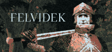
Felvidek capsule

Felvidek

In Felvidek, a JRPG set in 15th century Slovakia, you embrace the role of an alcoholic knight Pavol. Meet diverse and interesting characters to help you drive out the Hussites and Ottomans who blight this land.

$10.99Overwhelmingly Positive(169)
RPGMedievalDark Fantasy
Jozef Pavelka, Vlado GanajMar 29, 2024

Felvidek scores 68/100 — better than 22% of RPG capsules (n=3,703).

Overwhelmingly Positive (169 reviews) · $10.99 · Released Mar 29, 2024 · By Jozef Pavelka

Quick text summary

Felvidek scored 68/100 on Steam Analyzer — Solid for a RPG capsule. Top priority fix: [uniqueness_polish] Add a distinctive visual hook that communicates the historical Slovak setting or the alcoholic knight character concept, such as a beer mug detail, period-specific heraldry, or a storytelling pose that hints at the protagonist's defining trait.

Capsule scores by dimension

  • Genre Clarity: 7/10 — Medieval RPG clearly signaled. The pixelated knight character with sword and armor immediately communicates a fantasy RPG setting, and the 15th century aesthetic is legible at full size. At TINY size, the silhouette of an armored figure with weapon remains readable enough to suggest action-RPG gameplay, though the specific historical period and JRPG subgenre are harder to infer from visuals alone without text.
  • Title Readability: 8/10 — Strong serif title, scales well. FELVIDEK uses a clean, elegant serif typeface positioned in the upper left with excellent contrast against the dark background. The title remains readable at SMALL size (231x87) and maintains letter distinction at TINY size (120x45), though letterforms compress slightly; the consistent spacing and white-on-dark treatment ensures it survives the small scale well.
  • Contrast & Color: 7/10 — Warm tones pop against dark base. The rust-orange and terracotta pixelated knight character contrasts effectively against the dark teal-black background with mottled texture. The white title text creates strong value separation. At TINY size, the warm orange silhouette and white text both read clearly, though the textured background begins to flatten the midtone detail of the character sprite.
  • Uniqueness & Polish: 6/10 — Competent pixel art, modest hook. The pixelated knight sprite is cleanly rendered with solid craft and period-appropriate armor design, but the overall composition feels like a straightforward character portrait rather than a distinctive visual story or unique selling point. The historical JRPG angle is interesting conceptually but not visually communicated as a standout idea; this reads as a competent execution of a familiar medieval RPG template without a memorable distinctive twist.
  • Brand Consistency: 6/10 — Consistent pixel style, generic tone. The pixel art rendering is cohesive and the warm color palette (rust oranges, creams, dark greens) is consistent, but without access to the nine reference screenshots, the internal identity lacks a memorable signature motif or iconic character hook that would distinguish Felvidek's brand. The serif title font and mottled background texture suggest craft, but these alone do not create strong brand recall markers.
  • Composition: 7/10 — Clear focal point, balanced layout. The armored knight occupies the right two-thirds of the frame as the primary focal point, with the title anchored left and positioned in safe margins away from edges. The background texture provides depth layering without overwhelming the subject. At SMALL size, the composition holds; at TINY size, the knight silhouette remains the clear center of attention and the title is legible, though the textured background becomes visual noise.

What works

  • Strong title contrast and scalability. White serif text on dark background maintains readability from full size down to TINY thumbnail without loss of letter distinction.
  • Clear character focal point. Pixelated knight silhouette is immediately recognizable and draws the eye as the primary subject across all viewing sizes.
  • Warm color palette pops. Orange-rust and cream tones of the knight create effective value separation against the cool dark background, supporting quick visual recognition.

What hurts the capsule

  • Generic medieval RPG execution. The character portrait feels like a standard fantasy trope without a distinctive visual hook that communicates the unique historical JRPG premise or the alcoholic knight protagonist angle.
  • Textured background adds noise. The mottled dark texture with branching patterns competes with the character at smaller sizes, reducing clarity and making the composition feel cluttered in TINY view.
  • Limited memorable brand identity. No iconic symbol, signature color motif, or recognizable character trait emerges that would allow the capsule to be remembered or distinguished from other medieval RPG covers.

Priority fixes

  1. [uniqueness_polish] Add a distinctive visual hook that communicates the historical Slovak setting or the alcoholic knight character concept, such as a beer mug detail, period-specific heraldry, or a storytelling pose that hints at the protagonist's defining trait.
  2. [composition] Simplify or reduce the mottled background texture to prevent visual noise at SMALL and TINY sizes; consider a cleaner gradient or solid color that preserves contrast while reducing clutter.
  3. [brand_consistency] Establish a signature icon or color accent (e.g., a heraldic symbol, banner, or drink vessel) that can serve as a memorable brand marker across future marketing materials and store screenshots.

Store copy priority fixes

  1. [feature_communication] Expand the GAMEPLAY section with 1–2 specific examples of surreal enemies or supernatural mechanics encountered, and clarify the party system (how many companions, roles, progression).
  2. [uniqueness] Add a sentence explicitly contrasting this game from other JRPGs, such as 'The only medieval RPG where historical Hussite conflict meets surreal dark fantasy' or highlight a mechanical innovation.
  3. [hook_strength] Rewrite the short description opening to lead with Pavol's internal conflict or the surreal horror element before mentioning factions, e.g., 'In Felvidek, a JRPG where history meets nightmare, a flawed knight must confront both invaders and forces beyond understanding.'
  4. [feature_communication] Reposition the 3–4 hour runtime as a strength rather than a bare fact: 'Perfectly paced for a complete narrative arc without filler' or similar positioning that reframes brevity as intentional design.

Related guides

Steam app ID: 2299900 · Tags: RPG, Medieval, Dark Fantasy, Pixel Graphics, 2D