Scoring genre clarity...

Cthulhu Keeper capsule

Cthulhu Keeper

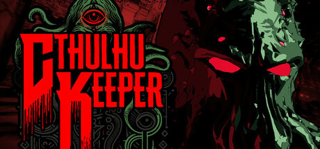
In this Lovecraftian real-time tactics game you play as a 1920s cult leader on a mission from the Old Ones. Build your cult, summon eldritch monsters, and undertake stealth tactics missions to spread insanity and amass power! In CTHULHU KEEPER you are the cosmic horror.

HorrorDark FantasyReal Time Tactics
KuuasemaTo be announced

Cthulhu Keeper scores 63/100 — better than 6% of Steam capsules we've analysed (n=22,658).

Released To be announced · By Kuuasema

Quick text summary

Cthulhu Keeper scored 63/100 on Steam Analyzer — Solid for a Steam capsule. Top priority fix: [genre_clarity] Incorporate a subtle strategy or management visual cue such as a miniature cult scene, top-down perspective hint, or iconographic symbol referencing tactics to signal the strategy genre at small size.

Capsule scores by dimension

  • Genre Clarity: 5/10 — Horror theme, genre ambiguous. The large Cthulhu entity and Lovecraftian iconography clearly communicate a cosmic horror theme, but strategy or tactics genre cues are entirely absent. At tiny size, this reads as a horror action or RPG game rather than a real-time tactics or cult management title. No UI hints, top-down perspective cues, or management iconography are present to suggest the strategy genre.
  • Title Readability: 7/10 — Bold logo reads at small size. The 'CTHULHU KEEPER' title uses a bold, dripping horror font in red with strong contrast against the dark background, making it readable at full and small sizes. The stacked layout with 'CTHULHU' above 'KEEPER' is compact and legible at the small capsule size. At tiny size the letterforms start to compress but the word shapes remain distinguishable due to the high contrast red-on-dark treatment.
  • Contrast & Color: 7/10 — Strong red and dark separation. The deep crimson reds pop well against the near-black background, and the muted green monster silhouette on the right creates visible separation from the dark backdrop. In grayscale, the red title and the glowing red eyes maintain strong value contrast against the background. At tiny size the creature silhouette on the right side risks blending into the dark background slightly, but the bold title area holds the contrast anchor.
  • Uniqueness & Polish: 6/10 — Competent horror art, generic execution. The Lovecraftian aesthetic is executed with a stylized comic or graphic novel feel, which adds some personality and distinguishes it from photorealistic competitors. However, the composition follows a very common 'big monster face on the right, logo on the left' template seen frequently in indie horror games. There is no unique visual selling point communicating the cult management or tactics angle, making it feel like a generic horror game capsule rather than a distinctive strategy title.
  • Brand Consistency: 7/10 — Cohesive Lovecraftian visual identity. The palette of deep reds, blacks, and muted greens is consistent and purposeful throughout the image, and the dripping logo font reinforces the horror tone. The graphic novel line art style applied to the monster gives the capsule a recognizable rendering style that could function as a brand signature. The eye motif in the top-left corner and the tentacle textures add layered identity cues that feel intentional and consistent.
  • Composition: 6/10 — Split layout with balanced weight. The left half is dominated by the title block and a decorative eye symbol, while the right half features the large creature face, creating a roughly balanced split composition. The focal hierarchy is acceptable but the eye motif in the top-left competes with the title for attention without adding clear narrative priority. At small and tiny sizes, the creature face on the right loses definition and the left title block carries most of the visual work, making the right side feel like wasted real estate.

What works

  • Bold, high-contrast title. The red dripping logo reads clearly at small size due to strong value contrast against the dark background.
  • Distinctive graphic novel art style. The stylized line art on the Cthulhu entity gives the capsule a more distinctive feel than photorealistic stock-art approaches common in indie horror.
  • Cohesive horror color palette. The deep red, black, and muted green palette is internally consistent and reads as a unified art direction choice.
  • Recognizable Lovecraftian iconography. The eye motif, tentacle details, and elder god silhouette immediately communicate the Cthulhu mythos to the target audience.

What hurts the capsule

  • Zero strategy genre signaling. Nothing in the capsule suggests tactics, cult management, or strategy gameplay, which will confuse or miss the target audience browsing the strategy category.
  • Creature silhouette loses clarity at tiny size. The right-side monster face blends into the dark background at tiny thumbnail size, reducing the impact of the primary visual element.
  • Generic monster-face-plus-logo template. The split logo-left, creature-right layout is overused in indie horror games and does not communicate a unique selling point or memorable hook.
  • Eye motif competes with title hierarchy. The large decorative eye in the upper-left area draws attention away from the title without serving a clear compositional purpose.

Priority fixes

  1. [genre_clarity] Incorporate a subtle strategy or management visual cue such as a miniature cult scene, top-down perspective hint, or iconographic symbol referencing tactics to signal the strategy genre at small size.
  2. [uniqueness_polish] Replace or supplement the static monster-face layout with a scene that communicates the unique cult-leader power fantasy, such as a figure commanding monsters or a cultist formation, to differentiate from generic horror capsules.
  3. [composition] Reduce the prominence of the decorative eye motif in the upper-left so it does not compete with the title, and use that space to reinforce the primary focal hierarchy.
  4. [contrast_color] Increase the edge lighting or rim light on the right-side creature silhouette to ensure it separates clearly from the dark background at tiny thumbnail size.

Store copy priority fixes

  1. [feature_communication] Clarify how missions interact with real-time lair management—can invasions interrupt missions, or are they separate phases? Add one sentence explaining the pacing loop.
  2. [feature_communication] Define the sanity mechanic explicitly: is it a player resource, cult morale, or narrative threshold? Currently the closing question feels disconnected from the feature set.
  3. [audience_targeting] Add one sentence signaling difficulty/accessibility level (e.g., 'pause-friendly for planning' or 'punishing ironman mode') to help strategy players self-select.

Related guides

Steam app ID: 2334320