Scoring genre clarity...
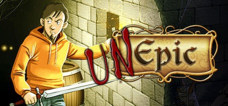
UnEpic capsule

UnEpic

Daniel was just an average guy. He was a great videogame player, a big fan of sci-fi movies, and a novice RPG player. In the midst of an RPG, he was teleported to a castle. At first, Daniel believed that he was having a massive hallucination.

$12.99Very Positive(12)
RPGIndieMetroidvania
@unepic_franJul 25, 2014

UnEpic scores 67/100 — better than 18% of RPG capsules (n=3,703).

Very Positive (12 reviews) · $12.99 · Released Jul 25, 2014 · By @unepic_fran

Quick text summary

UnEpic scored 67/100 on Steam Analyzer — Solid for a RPG capsule. Top priority fix: [composition] Remove or reposition the Greenlight badge and integrate the logo below the action area as a secondary footer element to reduce focal competition. [composition]

Capsule scores by dimension

  • Genre Clarity: 7/10 — Action RPG with dungeon setting clear. The capsule effectively communicates a fantasy action-RPG through the combination of a casual protagonist in orange, dark dungeon architecture, and armed enemies in combat-ready poses. At full size, the genre intent is obvious; at tiny size, the blue-armored enemies and stone dungeon walls still read as fantasy combat, though the protagonist's casual appearance becomes less distinct and the specific 'meta RPG' angle is lost.
  • Title Readability: 7/10 — Logo readable but placement at risk. The 'UnEpic' logo uses a bold serif font with ornate gold styling and a red banner underline that contrasts well against the green-lit left wall, maintaining legibility at small size. However, at tiny size (120x45), the decorative serifs begin to blur and the fine detail of the banner becomes muddy; the logo is still recognizable but loses some polish, and the Greenlight badge at bottom-left adds competing visual noise.
  • Contrast & Color: 7/10 — Strong light-dark separation overall. The composition leverages a bright golden-green left side with the protagonist and logo against a much darker blue-purple right side featuring the enemies, creating clear value separation. At tiny size, the silhouette contrast remains effective and the design does not collapse into a muddy mid-tone blend; however, the transition between light and dark zones is somewhat gradual rather than sharp-edged, which reduces the immediate pop in quick scroll.
  • Uniqueness & Polish: 6/10 — Competent but generic fantasy dungeon. The capsule presents a well-rendered scene with decent art direction, but the core visual—a casual hero facing enemies in a stone dungeon—is a common RPG template without a distinctive hook or memorable unique selling point. The meta premise (average gamer teleported to fantasy world) is clever but not visually communicated; the image reads as a standard fantasy action game rather than something mechanically or thematically distinct. Compared to top-tier genre capsules, this feels professionally competent but lacks a signature visual or story beat that would stand out in a crowded storefront.
  • Brand Consistency: 6/10 — Coherent but no iconic identity cues. The art style is internally consistent—character proportions, lighting, and enemy design all follow the same 2D/3D hybrid illustration approach—and the warm-to-cool color progression is cohesive. However, there are no memorable brand signals such as a unique character silhouette, recurring motif, or signature palette that would make this recognizable as UnEpic across multiple marketing materials; it remains a generic dungeon scene with competent execution.
  • Composition: 7/10 — Clear hierarchy with balanced depth. The focal point is the protagonist on the left-center, lit brightly against the wall, with enemies arrayed on the right as a secondary visual mass; this creates clear depth layering and guides the eye from hero to threat. At tiny size, the protagonist silhouette remains distinct and central, and the composition holds; however, the logo placement overlaps the primary action zone and competes slightly for attention, and the Greenlight badge at bottom introduces redundant branding that could be better integrated.

What works

  • Effective light-dark contrast. The bright golden-green left side pops clearly against the dark blue-purple enemy group and dungeon, maintaining silhouette clarity even at tiny size.
  • Clear hero-versus-threat composition. The protagonist on the left and enemy group on the right establish an immediate narrative conflict that reads instantly at all sizes.
  • Logo stands out with ornate framing. The gold serif 'UnEpic' with red banner has strong visual presence and remains readable at small size despite decorative detailing.

What hurts the capsule

  • Generic fantasy dungeon without unique hook. The scene reads as a standard RPG trope rather than communicating the distinctive meta-narrative (casual gamer transported to fantasy world) that makes UnEpic stand out.
  • No memorable brand identity signals. The character and enemies lack iconic visual markers or a signature palette that would make the game recognizable across multiple assets.
  • Logo placement competes with protagonist. The 'UnEpic' banner overlaps the primary hero area and creates visual tension that divides attention rather than enhancing the composition.
  • Greenlight badge adds redundant clutter. The bottom-left badge is dated branding that detracts from the capsule's polish and takes up valuable real estate.

Priority fixes

  1. [composition] Remove or reposition the Greenlight badge and integrate the logo below the action area as a secondary footer element to reduce focal competition. [composition]
  2. [uniqueness_polish] Add a visual storytelling element that hints at the meta-RPG premise—such as a speech bubble, HUD element, or book/game icon—to differentiate from generic fantasy action scenes. [uniqueness_polish]
  3. [title_readability] Thicken the serifs and outline of 'UnEpic' to maintain clarity at tiny size and reduce blur on fine decorative detail. [title_readability]
  4. [brand_consistency] Establish a signature color motif or character silhouette variant to create lasting brand recognition across marketing materials. [brand_consistency]

Store copy priority fixes

  1. [feature_communication] Add a sentence explaining how the dark spirit mechanic affects gameplay and combat—does it provide abilities, create hazards, or impact progression?
  2. [genre_clarity] Expand the 'RPG 2D platform game' line into a full sentence that describes the core loop: 'Explore a sprawling castle, battle enemies, unlock abilities, and reach the final boss.'
  3. [audience_targeting] Add explicit mention of co-op gameplay (if it's a selling point) or single-player focus to clarify who should buy based on play style preference.
  4. [feature_communication] Fix the typo 'for te ride' to 'for the ride' to improve perceived quality and professionalism.

Related guides

Steam app ID: 233980 · Tags: RPG, Indie, Metroidvania, Platformer, Action