Scoring genre clarity...

Slime 3K: Rise Against Despot capsule

Slime 3K: Rise Against Despot

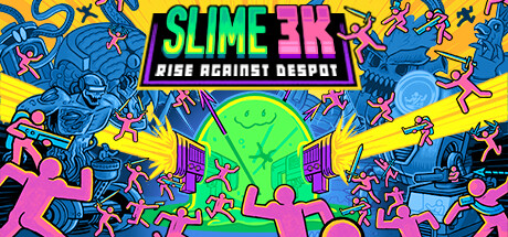
Welcome to Slime 3K, an unhinged roguelite bullet-heaven set in the Despot’s Game universe! Build a deck of crazy weapons, grow stronger and devour hordes of pink puny humans as a murderous jelly blob on a warpath of death, violence and pretzels.

$1.24Mostly Positive(21)
Action RoguelikeBullet HellRoguelite
Konfa GamesOct 31, 2024

Slime 3K: Rise Against Despot scores 78/100 — better than 84% of Steam capsules we've analysed (n=22,658).

Mostly Positive (21 reviews) · $1.24 · Released Oct 31, 2024 · By Konfa Games

Quick text summary

Slime 3K: Rise Against Despot scored 78/100 on Steam Analyzer — Good for a Steam capsule. Top priority fix: [title_readability] Increase the subtitle RISE AGAINST DESPOT font size or weight so it remains legible at small capsule size, or move it closer to the main logo to benefit from the banner contrast.

Capsule scores by dimension

  • Genre Clarity: 8/10 — Roguelite bullet-heaven chaos clear. The central slime blob character surrounded by swarming pink stickman enemies and radiating projectile beams strongly communicates a bullet-heaven horde survival roguelite. The overwhelming number of enemies and chaotic energy immediately signals the genre to anyone familiar with the Vampire Survivors style. At tiny size the central glowing green slime with radiating beams still reads as a horde survival game, though the specific roguelite deck-building nuance is lost.
  • Title Readability: 8/10 — Bold logo reads well at small. SLIME 3K uses a chunky, high-contrast white and green outlined font on a dark purple banner that isolates it cleanly from the busy background. The subtitle RISE AGAINST DESPOT is readable at full size but collapses to near-illegible at tiny size. At small capsule size the main SLIME 3K logo remains readable due to its strong weight and color contrast, which is a meaningful strength.
  • Contrast & Color: 8/10 — Vibrant neon palette pops well. The electric neon green, hot pink, and yellow palette creates strong separation against Steam's dark #1b2838 background, with the central glowing green slime acting as a natural focal beacon. The blue-toned left side enemies and pink stickmen provide clear value separation in grayscale. Minor issue is that the background yellow sunburst competes slightly with the central subject but the radial lighting still funnels focus toward the slime.
  • Uniqueness & Polish: 8/10 — Distinctive irreverent comic energy. The bold comic-book line art style with neon fills is genuinely distinctive and communicates the unhinged, humorous tone of the game effectively. The chaotic composition packed wall-to-wall with recognizable creature silhouettes and the glowing smiley-face slime create a memorable visual identity that stands apart from darker roguelite peers. Compared to genre benchmarks like Hades II, it sacrifices premium polish for anarchic personality, which feels intentional and on-brand.
  • Brand Consistency: 8/10 — Strong internal identity, cohesive style. The thick outlined comic illustration style, neon color palette, and pink stickman enemy design feel internally consistent and form a recognizable visual signature tied to the Despot's Game universe. The smiley-face slime blob is a memorable icon that could anchor brand recognition across assets. The uniform rendering style with no mixed techniques maintains cohesion across the busy composition.
  • Composition: 7/10 — Busy but focal point holds. The radial beam burst from the central glowing slime creates a strong compositional anchor that draws the eye to the middle despite extreme peripheral clutter from enemies and creatures. The title banner sits clearly in the upper center with adequate breathing room above the main action. At tiny size the composition becomes very dense and the peripheral characters become indistinct noise, but the glowing center still holds as a readable focal point.

What works

  • Strong central focal beacon. The neon green glowing slime with radial light beams creates an unmistakable focal point that survives compression to tiny thumbnail sizes.
  • Genre-legible chaos aesthetic. The swarming pink stickmen and horde density instantly communicate bullet-heaven survival to genre-aware shoppers even at a glance.
  • Distinctive comic art style. The thick outlined neon comic illustration stands out clearly against the darker, more realistic visual language of competing roguelite and action capsules.
  • Title placement on isolated banner. SLIME 3K sits on a dark purple banner that cleanly separates the logo from the noisy illustrated background, preserving readability.

What hurts the capsule

  • Subtitle collapses at tiny size. RISE AGAINST DESPOT becomes fully illegible at 120x45 thumbnail size, losing the secondary branding and genre flavor text entirely.
  • Peripheral clutter competes for attention. The large robot and monster figures on the left and right edges pull the eye away from the central subject and create visual noise at small sizes.
  • Yellow sunburst background reduces subject separation. The radiating yellow lines behind the slime partially merge with the surrounding chaos and reduce the clean silhouette pop of the central character.
  • No clear RPG or deck-building signal. The unique deck-building roguelite mechanic is not visually communicated, meaning the capsule undersells a key differentiator from standard bullet-heaven titles.

Priority fixes

  1. [title_readability] Increase the subtitle RISE AGAINST DESPOT font size or weight so it remains legible at small capsule size, or move it closer to the main logo to benefit from the banner contrast.
  2. [composition] Slightly reduce the scale or opacity of the large peripheral monster and robot figures on the far edges to tighten focus on the central slime and reduce noise at tiny sizes.
  3. [contrast_color] Deepen the dark vignette or shadow around the central slime to sharpen its silhouette separation from the yellow sunburst background, improving grayscale readability.
  4. [uniqueness_polish] Consider adding a subtle visual cue for the deck or weapon-building mechanic, such as a floating card or weapon icon near the slime, to differentiate from generic bullet-heaven competitors.

Store copy priority fixes

  1. [feature_communication] Remove the empty "Roadmap" heading or replace it with a brief roadmap update if content exists; otherwise it wastes space in the detailed description.
  2. [audience_targeting] Add one sentence specifying expected run length (e.g., 15-30 minutes per run) and whether difficulty is adjustable, to help players assess fit.
  3. [feature_communication] Expand the deckbuilding section with one concrete example of how card synergies work (e.g., "combine AK-47 with bullet-speed traits to chain kills") to clarify strategic depth beyond collection.
  4. [audience_targeting] Mention whether solo play is the focus and confirm controller support is strong, since tags list full controller support but copy doesn't acknowledge it.

Related guides

Steam app ID: 2348610