Scoring genre clarity...

Moonlighter 2: The Endless Vault capsule

Moonlighter 2: The Endless Vault

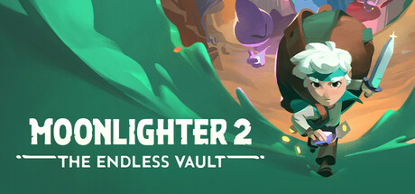
Live the double life of a fearless adventurer and a crafty merchant! Dive into vibrant dimensions brimming with shiny loot and pesky enemies. Grow your shop, tinker with weapons and gadgets, as well as make your mark among a ragtag community of castaways.

$23.99Very Positive(101)
Early AccessRPGShop Keeper
Digital SunNov 19, 2025

Moonlighter 2: The Endless Vault scores 72/100 — better than 44% of Steam capsules we've analysed (n=22,658).

Very Positive (101 reviews) · $23.99 · Released Nov 19, 2025 · By Digital Sun

Quick text summary

Moonlighter 2: The Endless Vault scored 72/100 on Steam Analyzer — Good for a Steam capsule. Top priority fix: [title_readability] Increase subtitle size or simplify to a single short word and remove the ornamental flanking lines so THE ENDLESS VAULT is legible at small capsule size.

Capsule scores by dimension

  • Genre Clarity: 7/10 — Action RPG dungeon crawler read. The white-haired protagonist mid-action with a sword in a cave-like environment strongly implies action RPG or dungeon crawler. Scattered gold coins on the ground hint at the loot and merchant loop, which is a nice secondary signal. At tiny size the character pose still reads as combat-adventure, though the merchant dual-life concept is not communicated.
  • Title Readability: 8/10 — Bold title reads well at small. MOONLIGHTER 2 uses a large, clean sans-serif with strong white color and a subtle shadow that separates it from the green background effectively. THE ENDLESS VAULT subtitle sits below in a smaller decorative style with flanking ornaments and is readable at full size but collapses to near illegibility at tiny size. At small capsule size the main title remains clear while the subtitle becomes a decorative blur.
  • Contrast & Color: 7/10 — Warm character pops on green. The warm-toned character with white hair contrasts well against the saturated green cave background, creating reasonable silhouette separation. The large green field risks blending into Steam's dark teal-adjacent sidebar colors slightly, but the value difference is sufficient. In grayscale the character reads cleanly as a light figure against a mid-tone green, and the white title text maintains strong separation.
  • Uniqueness & Polish: 7/10 — Polished but genre-familiar look. The isometric-leaning 3D art style is clean and well-rendered with a charming, approachable aesthetic that differentiates it from gritty AAA competitors. However the composition of hero-in-cave with glowing purple crystals is a fairly common indie action RPG trope, and compared to top-tier capsules like Sea of Stars or COCOON it lacks a truly distinctive visual hook. The coin scatter is a nice nod to the merchant mechanic but feels subtle.
  • Brand Consistency: 7/10 — Cohesive palette and character identity. The warm character design against the vibrant green palette feels internally cohesive and matches the playful-but-adventurous tone expected of the Moonlighter brand. The white-haired protagonist appears to be the same hero from the original game, providing franchise recognition for returning players. The ornamental subtitle treatment and logo style feel consistent with an established indie RPG identity.
  • Composition: 7/10 — Clear focal point with safe margins. The protagonist is placed in the right-center area in a dynamic diagonal pose, with the title text anchored to the lower-left creating a balanced visual split. The cave opening frames the character naturally and provides depth with background enemies visible in the upper right. At small and tiny sizes the character remains the clear primary subject, though the title competes slightly for attention in the lower third and the upper-right background details become irrelevant noise.

What works

  • Strong title legibility. MOONLIGHTER 2 in bold white sans-serif reads clearly even at small capsule size due to good contrast and generous letter sizing.
  • Dynamic hero pose communicates genre. The sword-wielding character in mid-action stance immediately signals action RPG to a quick-scrolling browser.
  • Warm-cool color contrast. The warm skin and clothing tones of the character against the cool green cave create natural visual separation that holds in near-grayscale.
  • Merchant loot hint via coins. Scattered gold coins subtly communicate the dual merchant-adventurer loop without cluttering the composition.

What hurts the capsule

  • Subtitle collapses at tiny size. THE ENDLESS VAULT with its flanking ornamental lines becomes completely unreadable at 120x45, reducing the subtitle to visual clutter.
  • Green background risks Steam blend. The dominant saturated green may compete with Steam's own dark teal UI chrome during quick browsing, slightly reducing pop.
  • Merchant concept undercommunicated. The core dual-life selling point is barely hinted at by a few coins and does not differentiate this from a standard dungeon crawler at small size.
  • Background detail adds noise at small sizes. The upper-right background enemies and purple crystals add visual busyness that serves no readable purpose at small or tiny sizes.

Priority fixes

  1. [title_readability] Increase subtitle size or simplify to a single short word and remove the ornamental flanking lines so THE ENDLESS VAULT is legible at small capsule size.
  2. [uniqueness_polish] Add a secondary visual element that communicates the shop or merchant mechanic more explicitly, such as a small shopfront icon or currency motif, to differentiate from generic dungeon crawlers.
  3. [contrast_color] Slightly darken or desaturate the mid-background green to increase depth separation and reduce the risk of blending with Steam's UI chrome in quick-scroll conditions.
  4. [composition] Simplify the upper-right background detail so that at tiny size only the hero silhouette and title compete for attention with no distracting secondary elements.

Store copy priority fixes

  1. [feature_communication] Add a sentence explicitly describing the combat system (e.g., 'Fast-paced real-time combat with dodge rolls and ability combos') to clarify what the 'action' in action-RPG means beyond just exploring.
  2. [audience_targeting] Insert a brief accessibility line such as 'Perfect for players who love both roguelikes and merchant sims—experience the dual gameplay at your own pace' to signal difficulty options and broaden appeal.
  3. [feature_communication] Clarify the village investment loop with one concrete example: 'Invest in the blacksmith to unlock better armor, or fund the fisherman's dock to unlock new shop items and customer types.'
  4. [hook_strength] Consider a short Early Access callout in the detailed description (e.g., 'We're in Early Access—follow the roadmap for upcoming features') to set player expectations and build community trust.

Related guides

Steam app ID: 2350790