Scoring genre clarity...

DRIFT ISLAND capsule

DRIFT ISLAND

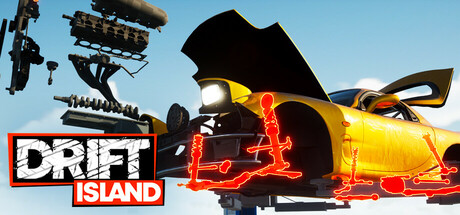
Rise as a drift master and missile car mechanic! DRIFT ISLAND is an open-world drift build-and-drive game. Create unique 'missile cars,' tune them, shred sideways, and test your skills! Earn cash, upgrade parts, and become a true drifting legend!

$6.15Mixed(85)
Immersive SimAutomobile SimRacing
ECC GAMESAug 28, 2025

DRIFT ISLAND scores 75/100 — better than 68% of Steam capsules we've analysed (n=22,658).

Mixed (85 reviews) · $6.15 · Released Aug 28, 2025 · By ECC GAMES

Quick text summary

DRIFT ISLAND scored 75/100 on Steam Analyzer — Good for a Steam capsule. Top priority fix: [genre_clarity] Integrate a stylized drifting car silhouette into the composition, such as a low missile car kicking up smoke beneath or beside the DRIFT logotype, to communicate racing gameplay without reading the title.

Capsule scores by dimension

  • Genre Clarity: 7/10 — Drift racing theme clear. The word DRIFT dominates the composition and paired with the Japanese torii gate and Mount Fuji silhouette, it clearly signals a Japan-influenced drift racing game. At tiny size the word DRIFT is still large enough to read, anchoring the genre immediately. The absence of any actual car imagery means the racing simulation subgenre relies entirely on text rather than visual gameplay cues.
  • Title Readability: 8/10 — Bold title reads well at small. DRIFT uses oversized chunky white letters with a strong black border on a diagonal-stripe background panel, giving excellent contrast and readability down to small sizes. ISLAND sits on a solid orange rectangle in white text, which also holds up well at small sizes. At tiny thumbnail size DRIFT remains legible while ISLAND may compress slightly but the orange bar still anchors it visually.
  • Contrast & Color: 8/10 — Strong orange-black palette pops. The warm orange gradient background contrasts effectively against the Steam dark navy background, creating immediate pop on the store page. The black silhouette of Mount Fuji and the torii gate provide strong dark anchor shapes against the glowing orange and white sky. In grayscale the value separation between the white DRIFT lettering, dark background panel, and bright sky holds up well at small sizes.
  • Uniqueness & Polish: 7/10 — Distinct style with minor generic feel. The flat graphic illustration style combined with the bold logo treatment and Japan-themed iconography gives this capsule a distinctive identity that stands apart from photorealistic racing titles like Forza or F1. The diagonal speed-line texture on the DRIFT panel adds a kinetic feel that suits the genre. However the overall composition reads more like a stylized logo mark than a game world scene, which limits the storytelling depth compared to top-tier capsules.
  • Brand Consistency: 8/10 — Cohesive orange Japan aesthetic. The orange, black, and white palette combined with the flat graphic illustration style and Japanese cultural iconography creates a strong and recognizable identity package. The torii gate and Mount Fuji work together as a signature motif that would be memorable on a second glance or in a wishlist. The bold stencil-style typography reinforces the garage and street racing culture tone consistently throughout the composition.
  • Composition: 7/10 — Logo-centric layout, clear hierarchy. The composition is organized as a single large logo lockup centered in the frame, with the scenic illustration acting as a background fill within the DRIFT letterforms and above it. The focal point hierarchy is clear: DRIFT first, then ISLAND, then the scenic background elements. At small and tiny sizes the torii gate on the right edge risks feeling cropped or cramped, and the overall logo-only approach means there is no character or car silhouette to add a secondary visual anchor.

What works

  • Bold readable title at small sizes. The oversized chunky DRIFT lettering with strong black border remains clearly legible even at 120x45 thumbnail size.
  • Distinctive Japan-themed visual identity. Mount Fuji silhouette and torii gate create a memorable cultural motif that differentiates this from generic racing capsules.
  • High contrast orange palette on Steam dark background. The warm orange gradient pops immediately against Steam's #1b2838 dark navy, ensuring strong shelf presence during quick scrolling.
  • Flat graphic illustration style feels intentional. The consistent flat art treatment across the logo panel and background illustration gives the capsule a polished and cohesive indie identity.

What hurts the capsule

  • No car or driving visual present. The absence of any vehicle means the racing simulation subgenre relies entirely on the word DRIFT, losing a key visual genre signal for browsers who skim without reading.
  • Torii gate crowds the right edge. At small and tiny sizes the right-side torii gate hugs the edge and may appear cropped or unbalanced, weakening the overall composition.
  • Logo-only approach limits storytelling. The capsule reads as a brand mark rather than a game world scene, missing an opportunity to communicate open-world gameplay or missile car culture visually.
  • Speed-line texture adds noise at tiny size. The diagonal stripe texture inside the DRIFT panel creates visual noise that slightly reduces clean readability of the letterforms at thumbnail sizes.

Priority fixes

  1. [genre_clarity] Integrate a stylized drifting car silhouette into the composition, such as a low missile car kicking up smoke beneath or beside the DRIFT logotype, to communicate racing gameplay without reading the title.
  2. [composition] Pull the torii gate slightly inward from the right edge and reduce its scale to avoid the cropped appearance at small sizes and better balance the overall layout.
  3. [uniqueness_polish] Add a subtle smoke or tire track graphic element below the ISLAND bar to reinforce drift culture and add kinetic energy that suggests movement and gameplay.
  4. [title_readability] Increase the stroke weight or add a subtle drop shadow on the DRIFT letterforms to fully eliminate the diagonal texture noise bleeding through the white letters at tiny sizes.

Store copy priority fixes

  1. [uniqueness] Replace 'Legendary Drift Island' description with specific, memorable landmark names or a unique selling point that explains why this island is distinct (e.g., 'volcanic crater roads,' 'abandoned city circuit,' 'dynamic weather that affects drift physics').
  2. [feature_communication] Expand the side gig section: explain how delivery missions feed into tuning progression or unlock new car parts—clarify its role in the core loop rather than treating it as flavor text.
  3. [hook_strength] Replace 'become a true drifting legend' with a concrete reward or emotional anchor specific to the game (e.g., 'unlock the island's most dangerous downhill course,' 'earn respect from the underground drifting crew').
  4. [audience_targeting] Add one sentence clarifying the multiplayer/social scope: are leaderboards present, is this purely single-player, or is there asynchronous competition? This will help players self-select.

Related guides

Steam app ID: 2353690