Scoring genre clarity...

Greymarsh capsule

Greymarsh

Small in scope, detailed, gritty text-based fantasy RPG. Recreates the gameplay of the old gamebooks. Simple battle system and hassle-free inventory management.

$1.19Positive(23)
Choose Your Own AdventureInteractive FictionRPG
Nimavoha InteractiveApr 7, 2023

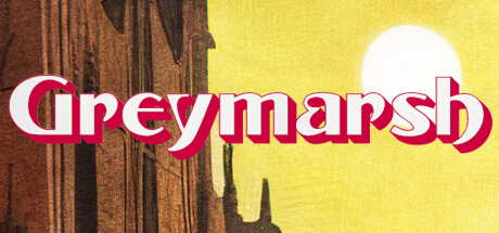
Greymarsh scores 65/100 — better than 11% of Steam capsules we've analysed (n=22,658).

Positive (23 reviews) · $1.19 · Released Apr 7, 2023 · By Nimavoha Interactive

Quick text summary

Greymarsh scored 65/100 on Steam Analyzer — Solid for a Steam capsule. Top priority fix: [title_readability] Simplify the title treatment by removing the red drop shadow and replacing it with a clean bold white outline or a semi-transparent dark backing panel to ensure legibility at tiny size.

Capsule scores by dimension

  • Genre Clarity: 7/10 — Dark fantasy RPG atmosphere clear. The cloaked figure from behind gazing at gothic architecture under a hazy yellow sun strongly communicates dark fantasy or adventure RPG. The moody, painterly style evokes classic gamebook or old-school RPG aesthetics, which aligns well with the actual product. At tiny size the hooded figure silhouette against the warm sky still reads as fantasy, though the text-based gamebook subgenre cannot be inferred from visuals alone.
  • Title Readability: 6/10 — Readable full size, struggles tiny. The bold white serif lettering with a red drop shadow on 'Greymarsh' is legible at full and small sizes, sitting across the lower third on a relatively controlled mid-tone background. However the decorative serif font and red-shadow treatment starts to collapse at tiny size, where the shadow reads as noise and the letterforms blur together. The placement over the figure's dark cloak helps contrast but the ornate style costs clarity at the smallest viewing size.
  • Contrast & Color: 7/10 — Warm yellows pop on dark Steam background. The warm yellow-orange sky and bright sun create strong value separation against Steam's dark #1b2838 background, making the capsule stand out on a browse page. The dark cloaked silhouette anchors the foreground with good contrast against the luminous background. In grayscale the figure still separates cleanly from the sky, though the lower portion of the image and the title area become muddier due to midtone building textures competing with the dark cloak.
  • Uniqueness & Polish: 6/10 — Evocative but feels slightly generic. The painterly illustration style has charm and the cloaked figure viewed from behind is a classic but effective choice for mystery-driven RPGs. However the composition — lone hooded figure, gothic city, hazy sun — is a familiar template seen across many fantasy titles, and compared to benchmark capsules like Metaphor: ReFantazio or Chants of Sennaar it lacks a distinctive visual hook or unique selling point. The title typography feels somewhat budget despite being legible, with the red drop-shadow treatment reading as slightly dated.
  • Brand Consistency: 6/10 — Cohesive palette, limited identity signal. The warm ochre and shadow palette feels internally consistent and the painterly illustration style is coherent throughout the image. However there is no memorable symbol, icon, or motif that would make this capsule instantly recognizable in a library or wish list. Without reference to the store screenshots the capsule alone does not establish a strong recurring visual identity, which is a missed opportunity for a text-based RPG that could lean into gamebook-specific iconography.
  • Composition: 7/10 — Clear focal point, good depth layering. The cloaked figure dominates the left-center as a strong primary focal point, with the gothic towers creating a compelling midground and the glowing sun providing depth in the background. The title sits in the lower third with reasonable margins and does not crowd the figure. At small size the layered depth still reads well, but the figure drifts slightly left of center and the bottom title area competes a little with the dark cloak edge, reducing the sense of clean separation.

What works

  • Strong silhouette contrast. The dark hooded figure against the warm yellow sky creates immediate value separation that pops on Steam's dark background even at small sizes.
  • Atmospheric painterly style. The illustration communicates a gritty, classic fantasy tone that aligns well with a gamebook-inspired RPG without relying on busy particle effects or clichéd UI elements.
  • Effective depth layering. Clear foreground figure, midground architecture, and glowing background sky create a convincing sense of scale and world.

What hurts the capsule

  • Title typography feels dated. The red drop-shadow serif treatment on 'Greymarsh' reads as budget at small size and does not match the quality level of benchmark titles in the genre.
  • No distinctive identity hook. The lone cloaked figure in a gothic city is a common fantasy template with no unique visual element that sets Greymarsh apart from dozens of similar capsules.
  • Title collapses at tiny size. At approximately 120x45 the decorative letterforms and red shadow merge into noise, making the title difficult to parse under quick scroll conditions.
  • Lower image area is muddy. The midtone building textures and dark cloak in the lower half reduce contrast and create a heavy bottom that feels unresolved at small sizes.

Priority fixes

  1. [title_readability] Simplify the title treatment by removing the red drop shadow and replacing it with a clean bold white outline or a semi-transparent dark backing panel to ensure legibility at tiny size.
  2. [uniqueness_polish] Introduce one distinctive visual element unique to Greymarsh — such as a gamebook page motif, a signature symbol, or an iconic in-game monster — to separate it from generic cloaked-figure fantasy capsules.
  3. [contrast_color] Lighten or desaturate the midground building textures slightly to create cleaner separation between the figure silhouette and the architectural background at small sizes.
  4. [brand_consistency] Establish a repeatable logo mark or typographic style for the title that can carry across capsule, header, and icon formats to build recognizable brand identity.

Store copy priority fixes

  1. [hook_strength] Rewrite the short description to lead with a player action or emotional hook: 'Experience a gritty fantasy city through branching text adventure, where every choice echoes—inspired by 1980s gamebooks' instead of starting with descriptors.
  2. [uniqueness] Strengthen the differentiation by explicitly stating what Greymarsh offers that modern text adventures lack: 'Unlike story-heavy games that bloat with side quests and endless choices, Greymarsh delivers a tight, intimate narrative in ~500 decision points.'
  3. [feature_communication] Add a single-sentence summary of the core gameplay loop early in the main copy, before the bullet lists: 'Each turn, you read a scene and choose from 2-4 actions—then fight, manage items, and fast-travel to shape your path through Greymarsh.'

Related guides

Steam app ID: 2367690