Scoring genre clarity...

S.O.V: Passenger 23 capsule

S.O.V: Passenger 23

A regular night shift turns into a chilling fight for survival. Explore a bustling rest stop, uncover dark secrets, and face the haunting legacy of a tragic accident in PASSENGER 23.

$3.99Mostly Positive(69)
HorrorPsychological HorrorRetro
IGNUS NEX ENTERTAINMENTMar 13, 2025

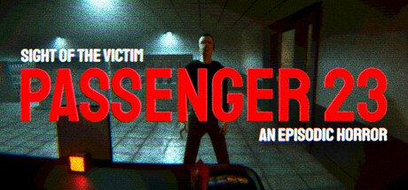
S.O.V: Passenger 23 scores 68/100 — better than 23% of Horror capsules (n=3,119).

Mostly Positive (69 reviews) · $3.99 · Released Mar 13, 2025 · By IGNUS NEX ENTERTAINMENT

Quick text summary

S.O.V: Passenger 23 scored 68/100 on Steam Analyzer — Solid for a Horror capsule. Top priority fix: [title_readability] Remove or significantly enlarge taglines, or consolidate to a single readable subtitle that maintains legibility at small size

Capsule scores by dimension

  • Genre Clarity: 7/10 — Horror setting clear, genre ambiguous. The dimly lit rest stop interior, overhead fluorescent lighting, and lone figure in shadows strongly communicate a horror atmosphere. However, the capsule does not clearly distinguish whether this is survival horror, psychological horror, or action-adventure with horror elements; the figure's pose and environment suggest exploration-based gameplay rather than combat-focused action. At tiny size, the silhouette and setting remain readable as horror, but specific gameplay subgenre remains unclear.
  • Title Readability: 8/10 — Title legible, taglines compressed. The bold red 'PASSENGER 23' text dominates the center and remains highly readable at all sizes, with strong contrast against the dark background and white outline support. The top tagline 'SIGHT OF THE VICTIM' and bottom tagline 'AN EPISODIC HORROR' compress significantly at small and tiny sizes, becoming difficult to parse without focused attention. At tiny size, only the main title reads confidently; supporting text loses clarity.
  • Contrast & Color: 8/10 — Strong value separation, focused lighting. The red title and warm orange/yellow practical lights in the environment create excellent separation against the cool dark teal and black background, with clear silhouettes of the central figure. The overhead lighting and glowing door accent provide natural depth and guide the eye effectively. In grayscale, the value hierarchy remains intact, and at tiny size the warm light pools and red text still pop clearly against the darker surround.
  • Uniqueness & Polish: 6/10 — Competent horror visual, generic execution. The capsule uses a familiar horror rest stop setting with moody lighting that effectively communicates tone but lacks a distinctive hook or memorable visual signature. The photograph-style rendering and composition resemble standard horror game promotion without standout art direction, thematic depth, or unique mechanical hint. While technically sound, it reads as competent genre work rather than premium or distinctive compared to top-tier horror titles like DREDGE or Lies of P.
  • Brand Consistency: 5/10 — Generic horror aesthetic, no identity cues. The capsule presents a generic dimly-lit rest stop with standard horror iconography (shadows, overhead lights, isolated figure) but contains no memorable character, logo, symbol, or signature palette that would be recognizable across other promotional materials. The red and dark teal color scheme is functional but not distinctive; without reference to the 18 available screenshots, there are no visible internal identity signals that establish a coherent brand presence unique to Passenger 23.
  • Composition: 7/10 — Clear focal point, safe margins held. The lone figure in the center-right creates a strong primary focal point, with background architecture and overhead lights providing supporting depth layers that guide attention inward. Title placement at top and bottom leaves breathing room around the central subject. At small and tiny sizes, the composition remains readable with the figure and title maintaining hierarchy; however, the equal visual weight between left and right side creates slight compositional flatness that could be more dynamic.

What works

  • Bold title contrast and readability. Red 'PASSENGER 23' text with white outline maintains exceptional legibility across full, small, and tiny sizes against the dark background.
  • Atmospheric lighting design. Practical overhead lights and glowing door accents create natural depth, focus the eye, and establish horror tone through warm-cool value separation.
  • Clear subject isolation. The central figure silhouette reads confidently at all sizes, creating an unambiguous primary focal point and preventing visual clutter.

What hurts the capsule

  • Tagline legibility collapse. Both 'SIGHT OF THE VICTIM' and 'AN EPISODIC HORROR' become unreadable at small and tiny sizes, reducing communication efficiency during quick scroll.
  • Generic horror treatment. The rest stop setting and moody lighting follow predictable horror game conventions without distinctive visual or thematic hooks that differentiate the game from similar titles.
  • No brand identity signals. Absent of recognizable character, icon, or signature palette elements that would reinforce brand recognition on repeated exposure or across other marketing materials.

Priority fixes

  1. [title_readability] Remove or significantly enlarge taglines, or consolidate to a single readable subtitle that maintains legibility at small size
  2. [uniqueness_polish] Introduce a distinctive visual element such as a character close-up, unique color grading, or thematic symbol that differentiates from generic horror templates
  3. [brand_consistency] Develop a recognizable visual motif or character silhouette specific to Passenger 23 that can anchor identity across marketing materials

Store copy priority fixes

  1. [feature_communication] Expand the core gameplay loop: clarify how the player balances shift work (sales, cleaning, tokens) with survival and horror elements—e.g., 'Between serving nervous passengers and restocking shelves, you'll investigate strange notes and fight to stay alive.' This transforms a vague task list into a coherent game loop.
  2. [uniqueness] Develop the true-story hook: add 1–2 sentences explaining what the '10-year-old accident' was and why it matters (e.g., 'A tour bus crash claimed 23 lives. Tonight, one of them may still be here.'). This differentiates the game and attracts narrative/mystery audiences.
  3. [audience_targeting] Add an explicit audience signal after the short description or in the opening of the detailed description—e.g., 'Perfect for fans of retro horror and narrative-driven exploration' or 'If you love psychological horror with a strong story, this is for you.' This clarifies who the game targets.
  4. [hook_strength] Consider reordering the short description to lead with conflict rather than setup—e.g., 'Uncover the dark secrets of a tragic accident while fighting for survival during a rest-stop night shift.' This removes the familiar 'ordinary turn extraordinary' trope and frontloads intrigue.

Related guides

Steam app ID: 2369810 · Tags: Horror, Psychological Horror, Retro, Indie, Exploration