Niktophobia scores 73/100 — better than 68% of Horror capsules (n=3,118).

Quick text summary

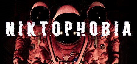
Niktophobia scored 73/100 on Steam Analyzer — Good for a Horror capsule. Top priority fix: [composition] Shift figures slightly upward or reduce lower leg detail to ensure safe margin from bottom edge crop on mobile views, maintaining silhouette clarity at tiny size.

Capsule scores by dimension

  • Genre Clarity: 8/10 — Sci-fi horror threat immediately clear. The dual suited figures with glowing eyes, eerie alien overhead silhouette, and deep red lighting communicate sci-fi horror and group threat instantly. At tiny size, the glowing eyes and menacing pose remain readable, clearly signaling action-horror rather than puzzle or exploration games. The space suit aesthetic and alien creature backdrop lock in the sci-fi survival angle without ambiguity.
  • Title Readability: 7/10 — Bold title holds at small size. NIKTOPHOBIA uses a heavily distressed, high-contrast white typeface that breaks up slightly at tiny size but remains decipherable due to strong letter forms and spacing. At full header size it is excellent; at small capsule (231×87) it reads clearly with minor glitch-effect artifacts adding thematic value rather than harming legibility. The positioning in the upper-mid region avoids clutter from the figures below, though the red horizontal accent bar slightly overlaps letter spacing.
  • Contrast & Color: 8/10 — High-contrast lighting pops sharply. The combination of bright white title, luminous green eye accents on the alien, and glowing suit details creates strong value separation against the dark background. The red gradient and black void mid-tones read well in grayscale, with the suited figures' silhouettes remaining distinct even at tiny size. The white facial highlights and suit seams cut through the murk effectively, though the lower body suit merges slightly into shadow.
  • Uniqueness & Polish: 7/10 — Polished horror aesthetic, group focus. The dual-astronaut composition with synchronized poses, coupled with the menacing alien overhead, communicates cooperative survival with a distinctive visual hook. Lighting effects, texture detail on suits, and the glitch-style title treatment show deliberate craft and thematic coherence. The design avoids generic space marine clichés by emphasizing vulnerability (featureless helmets, small figures vs. looming threat) and teamwork framing rather than individual heroics.
  • Brand Consistency: 7/10 — Coherent sci-fi horror visual identity. The rendering style—high-contrast digital figure compositing, glowing accent lighting, and distressed typography—maintains internal consistency with a recognizable indie sci-fi horror brand voice. The alien silhouette, suit design, and red-and-black palette with neon accents create memorable identity cues that could be recognized across store screenshots. The approach feels intentional and cohesive without relying on franchise IP or generic templates.
  • Composition: 7/10 — Clear hierarchy, tight focal balance. The title anchors the top, the twin suited figures provide symmetric ground-level weight, and the alien creature looms as the apex threat—creating a natural eye flow from threat to team to name. At small and tiny sizes, the silhouettes remain visually distinct and the title does not collide with figures, preserving readability. The composition avoids dead center void and uses the full frame effectively, though the lower suit details near edges risk minor Steam crop loss on extreme mobile views.

What works

  • Strong sci-fi horror genre signal. The glowing-eyed alien, suited figures, and menacing overhead composition instantly communicate sci-fi survival horror without ambiguity.
  • Excellent contrast and silhouette clarity. Bright white title and luminous suit details cut sharply against the dark void, maintaining readability even at tiny thumbnail size.
  • Cooperative threat framing. The paired astronaut composition emphasizes team vulnerability against an overwhelming alien presence, reinforcing the 1–4 player co-op hook.
  • Polished thematic typography. The distressed white title font feels intentional and horror-themed, adding craft and personality rather than reading as cheap damage.

What hurts the capsule

  • Title glitch artifacts may confuse at glance. The intentional distortion in letters could be misread as poor compression or rendering error during rapid scroll on slower connections.
  • Lower suit details risk edge crop loss. The astronaut figures' legs and equipment sit close to the bottom edge, which may be partially cut on extreme Steam mobile or carousel crops.
  • Mid-tone murk in lower third. The black void below the suits creates a heavy-weight imbalance that can feel slightly cramped at very small sizes when the title scales down.

Priority fixes

  1. [composition] Shift figures slightly upward or reduce lower leg detail to ensure safe margin from bottom edge crop on mobile views, maintaining silhouette clarity at tiny size.
  2. [title_readability] Add a subtle dark outline or shadow behind NIKTOPHOBIA to reduce glitch artifact confusion and ensure it reads as intentional distortion rather than rendering error on low-bandwidth previews.
  3. [contrast_color] Introduce a faint secondary accent color (e.g., cyan or purple rim light) on suit edges to further separate the astronauts from the black void and enhance silhouette pop at 120×45 thumbnail size.

Store copy priority fixes

  1. [feature_communication] Replace 'various tools' with 2–3 specific examples (e.g., 'motion tracker, energy scanner, portable lights') to give players a clearer sense of what they'll carry and use.
  2. [uniqueness] Add a sentence that articulates the core tension unique to Niktophobia, e.g., 'manage a shared power supply while an AI threat tracks your every decision' to differentiate it from standard co-op horror.
  3. [feature_communication] Expand the 'Persistent threat' section to explain how players can mitigate or interact with the AI—does stealth work, can you trick it, does cooperation change its behavior?
  4. [feature_communication] Clarify the reward system's role—does it unlock upgrades, affect difficulty, or unlock new missions? Link it directly to replayability or progression.

Related guides

Steam app ID: 2398680 · Tags: Horror, Multiplayer, VR, Action, Space