Scoring genre clarity...

Mansion Mystery capsule

Mansion Mystery

Dive into 'Mansion Mystery,' an immersive VR puzzler. In a haunted mansion governed by real-world physics, ignite matches, shatter plates, solve intricate puzzles. Will you unravel the secrets and escape or be trapped forever?

$4.992 user reviews
AdventurePuzzleVR
GarageVRAug 4, 2023

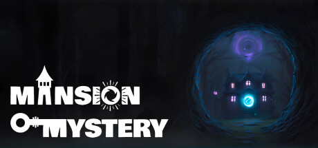
Mansion Mystery scores 67/100 — better than 15% of Steam capsules we've analysed (n=22,658).

2 user reviews · $4.99 · Released Aug 4, 2023 · By GarageVR

Quick text summary

Mansion Mystery scored 67/100 on Steam Analyzer — Solid for a Steam capsule. Top priority fix: [title_readability] Simplify or enlarge the icon-substitution letterforms in the logo so they remain decipherable at 120x45 thumbnail size, or replace with a cleaner secondary icon below the wordmark.

Capsule scores by dimension

  • Genre Clarity: 7/10 — Haunted mansion puzzle adventure clear. The glowing cyan portal, dark gothic mansion silhouette, and eerie purple swirling symbol overhead strongly communicate a mystery or puzzle-adventure in a haunted setting. The VR angle is not communicated visually but the genre of spooky puzzle exploration reads well. At tiny size the glowing mansion framed in the circular portal still reads as a mystery or horror-adjacent adventure game.
  • Title Readability: 6/10 — Readable at full, tight at tiny. The white stacked title 'MANSION MYSTERY' is bold and high contrast against the dark background on the left side, reading clearly at full size. The clever icon replacements for letters (the mansion tower replacing an 'A', a key icon replacing text) are charming but the letter-substitution icons collapse and become unreadable at tiny size, potentially making the title harder to parse. The bottom line 'MYSTERY' with a key icon reads slightly better than the top line at small sizes.
  • Contrast & Color: 7/10 — Strong dark contrast, cyan focal pop. The predominantly dark near-black background creates strong contrast against Steam's #1b2838, and the cyan glowing portal and mansion doorway provide a clear luminous focal point. The white title text separates cleanly from the dark left region. In grayscale the circular portal frame and glowing mansion still hold separation, though the purple swirl overhead merges partially into the dark sky at tiny size.
  • Uniqueness & Polish: 6/10 — Competent but genre-familiar execution. The circular glowing portal framing a haunted mansion is a recognizable and somewhat overused motif in mystery and horror titles, lending a slightly template-like feel. The execution is clean with good lighting work on the mansion and a consistent eerie palette, but compared to benchmark titles like COCOON or Buckshot Roulette it lacks a truly distinctive visual hook or unexpected idea. The icon-as-letter typography is a nice stylistic touch that adds some personality.
  • Brand Consistency: 7/10 — Cohesive dark mystery identity. The cyan and purple glow palette, gothic mansion silhouette, and dark moody atmosphere form a coherent internal visual identity that would translate reasonably to screenshots and UI. The custom logotype with embedded icons (mansion tower, key) creates a recognizable brand mark. The art direction is consistent in style and tone throughout, suggesting a developer with a clear visual direction for the game.
  • Composition: 7/10 — Clear left-right split hierarchy. The layout divides cleanly into a left title zone and a right focal illustration zone, creating a readable hierarchy with the glowing mansion as the primary subject framed by the circular portal. The stacked title in the lower-left anchors well and avoids edge crowding. At small size the circular portal and mansion remain the dominant visual element, though the large dark void in the upper-left corner is wasted real estate that could reinforce mood or branding more deliberately.

What works

  • Strong contrast focal point. The cyan glowing portal and mansion doorway create a luminous anchor that draws the eye immediately even at small scroll sizes.
  • Readable title placement. White stacked title text is placed over a consistently dark region ensuring reliable contrast without relying on the busy illustration area.
  • Coherent atmosphere. Dark palette with cool cyan and purple accents communicates a unified haunted mystery tone that aligns with the game's genre and setting.
  • Custom branded logotype. The icon-substitution letters in the title add personality and create a more distinctive logo mark compared to plain typography.

What hurts the capsule

  • Icon substitutions collapse at tiny size. The mansion tower and key icons replacing letters in the title become unidentifiable at tiny thumbnail size, potentially making the game name harder to read.
  • Large wasted dark zone top-left. The upper-left quadrant is almost entirely empty black, missing an opportunity to add depth, atmosphere, or a brand element.
  • Portal framing motif is genre-generic. Circular glowing portals framing a spooky house are a common visual trope in mystery games, reducing distinctiveness against similar titles.
  • VR differentiator absent visually. The VR puzzle mechanic is a key selling point but nothing in the capsule communicates immersive VR gameplay, missing a strong differentiator.

Priority fixes

  1. [title_readability] Simplify or enlarge the icon-substitution letterforms in the logo so they remain decipherable at 120x45 thumbnail size, or replace with a cleaner secondary icon below the wordmark.
  2. [uniqueness_polish] Replace or supplement the generic glowing portal with a more specific visual gameplay cue such as a floating match, shattered plate, or physics puzzle element to communicate the VR puzzle mechanic.
  3. [composition] Use the empty upper-left dark zone to add a subtle atmospheric element such as floating ghost silhouettes, drifting particles, or a small VR controller icon to fill dead space and reinforce identity.
  4. [genre_clarity] Introduce a small UI or gameplay-hint visual element that signals VR or puzzle interaction to differentiate from pure horror or walking-sim genre expectations.

Store copy priority fixes

  1. [feature_communication] Replace the second paragraph with 3–4 concrete puzzle examples (e.g., 'arrange books on a shelf to reveal a safe,' 'collect chemical bottles to craft an unlock potion') to give players a clear mental model of puzzle structure.
  2. [tone_match] Rewrite the detailed description opening to match the Horror tag—shift from 'unforgettable experience' to atmospheric language that acknowledges the haunted setting and builds dread, not just casual curiosity.
  3. [uniqueness] Add a sentence explicitly differentiating this game: 'Unlike traditional escape rooms, every interactive object responds to physics-based destruction—solve puzzles by burning, shattering, and manipulating the mansion itself' or similar.
  4. [audience_targeting] Replace 'players of all ages' with a specific audience signal (e.g., 'designed for experienced escape room solvers seeking a VR physics-based challenge' or 'perfect for horror fans who want puzzle-driven exploration over jump scares').

Related guides

Steam app ID: 2424630