Scoring genre clarity...

Smash it Wild: Tactical Volleyball Roguelike capsule

Smash it Wild: Tactical Volleyball Roguelike

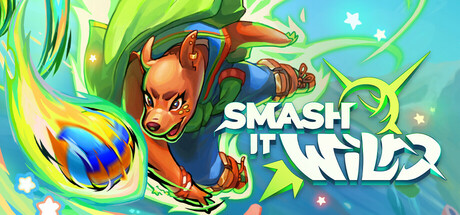
Smash it Wild is a tactical turn-based game combining volleyball and dodgeball in a fantasy universe. Upgrade your players and defeat your opponents in an intense roguelike competition!

$11.99Very Positive(19)
RPGVolleyballTurn-Based Tactics
Goblinz Studio, ErnestineApr 16, 2026

Smash it Wild: Tactical Volleyball Roguelike scores 73/100 — better than 62% of RPG capsules (n=3,544).

Very Positive (19 reviews) · $11.99 · Released Apr 16, 2026 · By Goblinz Studio

Quick text summary

Smash it Wild: Tactical Volleyball Roguelike scored 73/100 on Steam Analyzer — Good for a RPG capsule. Top priority fix: [genre_clarity] Incorporate subtle tactical UI elements or grid hints in the background to signal turn-based strategy and roguelike progression mechanics alongside the action visual.

Capsule scores by dimension

  • Genre Clarity: 7/10 — Clear action sport with fantasy RPG elements. The central character is a fox-like creature in an action pose hurling a flaming projectile, immediately signaling sports/action gameplay with magical fantasy theming. At tiny size, the dynamic pose and glowing energy effect read as competitive action, though the specific volleyball/dodgeball mechanic is not obvious from visuals alone. The bright fantasy aesthetic and athletic stance communicate an action-oriented sports title effectively.
  • Title Readability: 8/10 — Bold white logo with strong legibility. The title 'SMASH IT WILD' is rendered in large, thick white letters with an outline that maintains clarity across all viewing sizes. The logo placement in the right-center area avoids the character subject, ensuring it remains readable even at tiny size. At small and tiny scales, the text holds up well with good letter spacing and no decorative erosion that would collapse readability.
  • Contrast & Color: 8/10 — Vibrant palette pops against dark Steam background. The capsule employs a bright turquoise sky, lime-green accents, and warm orange/gold highlights on the character that create strong value separation against the dark Steam UI. The white title text has excellent contrast and reads clearly even at tiny size. At grayscale, the character silhouette and projectile still separate well from the background due to careful value distribution.
  • Uniqueness & Polish: 7/10 — Polished cartoon style with distinctive character design. The art style features clean vector-like illustration with a confident, expressive fox protagonist that demonstrates intentional character design rather than generic asset use. The flaming projectile and dynamic action pose create visual interest and communicate the sport-action hybrid concept. However, the bright colorful fantasy aesthetic, while well-executed, falls into a broader indie sports roguelike visual category that has become more common.
  • Brand Consistency: 6/10 — Coherent style but limited recognizable identity. The capsule maintains consistent art direction with a unified cartoon illustration style, warm-to-cool color palette, and clear character focus. However, without reference to the nine store screenshots mentioned, the visual identity does not yet establish a distinctive motif or iconic element that would be immediately recognizable across marketing materials. The design is competent and cohesive but does not feature a standout signature visual hook.
  • Composition: 8/10 — Strong focal point with effective visual hierarchy. The fox character occupies the left-center focal area with the flaming projectile as a dynamic secondary element, creating a clear primary subject that reads at all sizes. The title sits in the right-center with balanced negative space, avoiding clutter and maintaining clean margins. At tiny size, the composition remains scannable with the character and title as distinct focal zones that guide the eye without competing.

What works

  • Excellent title contrast and legibility. White outlined text remains crisp and readable at all sizes, from full header to tiny thumbnail, with strategic placement that avoids the character subject.
  • Dynamic action pose communicates gameplay energy. The fox's athletic stance and flaming projectile immediately convey action and competition, setting correct genre expectation for a sports-action title.
  • Vibrant color palette creates visual pop. Turquoise, lime-green, and warm orange tones create strong separation from the dark Steam background and maintain saturation that reads well at small sizes.
  • Clean composition with clear focal hierarchy. Primary character subject and secondary title anchor distinct visual zones that guide the eye effectively without scattered attention or clutter.

What hurts the capsule

  • Genre-specific mechanic not visually apparent. While the action is clear, the volleyball/dodgeball/turn-based tactical aspect is not communicated through the visuals; it reads as generic action-sport rather than strategic roguelike.
  • Limited brand identity differentiation. The bright cartoon fantasy aesthetic, while well-polished, aligns with common indie sports roguelike visual language and lacks a distinctive signature element that would stick in memory.
  • Roguelike and turn-based strategy underrepresented. The dynamic action pose and motion-heavy energy suggest real-time action rather than the turn-based tactical gameplay described in the game concept.

Priority fixes

  1. [genre_clarity] Incorporate subtle tactical UI elements or grid hints in the background to signal turn-based strategy and roguelike progression mechanics alongside the action visual.
  2. [uniqueness_polish] Develop a distinctive visual motif or character design element that becomes iconographic across all marketing—consider a signature team color, emblem, or character detail that differentiates from similar indie sports titles.
  3. [brand_consistency] Establish and apply a consistent visual identity system across all assets that reinforces the tactical RPG-sports hybrid identity beyond the illustration style alone.

Store copy priority fixes

  1. [hook_strength] Rewrite the opening line to lead with the unique sport mechanic and world: 'Master the art of magical volleyball and dodgeball in a roguelike tournament where every match matters.' This puts the unusual gameplay first and hints at stakes.
  2. [uniqueness] Add 2-3 sentences explaining what makes this sport-tactics hybrid mechanically distinct—e.g., how volleyball and dodgeball interact, what unique decision-space the combination creates, or how synergies leverage both sports.
  3. [tone_match] Replace generic motivational language ('opportunity to learn') with world-fitting, slightly edgier phrasing (e.g., 'Each defeat teaches you brutal lessons your rivals won't forgive twice') to match the roguelike and fantasy tone.
  4. [audience_targeting] Clarify early whether this is a hardcore tactical-optimization game or a more approachable family-friendly roguelike, since both signals are present but not reconciled.

Related guides

Steam app ID: 2432240 · Tags: RPG, Volleyball, Turn-Based Tactics, Roguelite, Roguelike