Scoring genre clarity...

MENACE capsule

MENACE

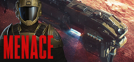
Lead a strike force against an alien threat in this turn-based tactical RPG from the developers of Battle Brothers. Answer distress calls across different worlds, train and equip infantry, deploy tanks and mechs, and plan and execute missions in detailed turn-based battles.

$29.99Very Positive(414)
RPGStrategyTurn-Based Combat
Overhype StudiosFeb 5, 2026

MENACE scores 70/100 — better than 30% of Steam capsules we've analysed (n=22,658).

Very Positive (414 reviews) · $29.99 · Released Feb 5, 2026 · By Overhype Studios

Quick text summary

MENACE scored 70/100 on Steam Analyzer — Good for a Steam capsule. Top priority fix: [genre_clarity] Add a visual cue that implies turn-based tactics, such as a hex grid overlay, action point indicator, or squad formation silhouette, to differentiate from action games

Capsule scores by dimension

  • Genre Clarity: 7/10 — Sci-fi tactical military vibes. The armored soldier in the foreground and large spaceship in the background clearly communicate a sci-fi military setting, which aligns well with turn-based tactical RPG expectations. At small size the soldier silhouette and ship read as a space combat game, though the turn-based strategy element is not immediately obvious from visuals alone. At tiny size the genre reads broadly as sci-fi action or strategy rather than pinpointing tactical RPG.
  • Title Readability: 8/10 — Bold red title reads well. The title MENACE is rendered in large, bold red uppercase letters in the bottom-left area, with strong contrast against the darker lower region of the image. At small size the word is still clearly legible due to its weight and color. At tiny size the letters compress but the short single-word title and high contrast red keep it readable, though the letterforms lose some crispness.
  • Contrast & Color: 7/10 — Strong red-dark contrast, mid tones compete. The red title pops strongly against the dark background and Steam's #1b2838 surround. The soldier in the foreground has a gold-olive armor tone that separates reasonably from the dark mid-section, but the large spaceship blends somewhat into the murky red-brown atmospheric background. In grayscale the ship silhouette becomes harder to distinguish from the background haze, reducing clarity at tiny size.
  • Uniqueness & Polish: 6/10 — Competent but genre-generic execution. The composition of soldier foreground plus looming spaceship background is a very common sci-fi capsule trope, reminiscent of Halo, Mass Effect, and similar franchises. The craft is solid and the lighting on the soldier is detailed, but there is no distinctive visual hook that communicates the Battle Brothers pedigree or turn-based tactics angle. It reads as competent but does not stand out against benchmarks like Warhammer 40K: Rogue Trader or Homeworld 3.
  • Brand Consistency: 7/10 — Cohesive gritty sci-fi identity. The dark, gritty palette with warm rust and red atmospheric tones, combined with the heavily detailed soldier armor and realistic ship rendering, forms a consistent internal visual identity. The color language and rendering style feel unified across the capsule. However, there is no immediately iconic motif or symbol that would make the brand instantly recognizable in a series context, which limits long-term brand recall.
  • Composition: 7/10 — Clear foreground subject, ship fills space. The soldier anchors the left foreground as the primary focal point, while the spaceship dominates the center-right creating a strong depth layering of foreground character and background vehicle. The title placement in the lower-left is safe and clear. At small size the two-element composition still reads with a clear hierarchy. The soldier's head and helmet sit near the top-left edge, which risks crop issues on some aspect ratios, and the composition is somewhat split in attention between soldier and ship at tiny size.

What works

  • Bold single-word title. MENACE in large red uppercase is short enough and high-contrast enough to remain legible even at tiny thumbnail size.
  • Effective depth layering. The foreground soldier and large background spaceship create immediate spatial depth that communicates scale and a rich sci-fi world.
  • Strong atmospheric color mood. The rust-red nebula background and dark armor tones establish a consistent gritty tone that fits the tactical military theme.
  • Soldier silhouette clarity. The armored soldier in the foreground has enough edge lighting and contrast to maintain a readable silhouette at small size.

What hurts the capsule

  • Spaceship blends into background. The large ship shares similar warm dark tones with the atmospheric haze, causing it to lose definition in grayscale and at tiny size.
  • No tactical or turn-based genre cue. Nothing in the visual signals turn-based tactics or RPG mechanics, making it indistinguishable from a generic sci-fi action shooter capsule.
  • Generic soldier-plus-ship composition. The foreground character plus background vehicle arrangement is overused in the sci-fi genre and does not create a distinctive or memorable identity.
  • Soldier head near top-left crop zone. The helmet sits close to the top-left corner edge, risking partial crop on certain Steam display contexts and losing the key character detail.

Priority fixes

  1. [genre_clarity] Add a visual cue that implies turn-based tactics, such as a hex grid overlay, action point indicator, or squad formation silhouette, to differentiate from action games
  2. [uniqueness_polish] Introduce a distinctive compositional hook or motif unique to MENACE, such as a signature alien enemy or iconic emblem, to avoid the generic soldier-ship trope
  3. [contrast_color] Increase the value separation between the spaceship and the background by brightening the ship hull or darkening the atmospheric haze so the silhouette reads clearly in grayscale
  4. [composition] Shift the soldier slightly inward from the top-left edge to ensure the helmet and head remain safe from cropping across all Steam capsule aspect ratios

Store copy priority fixes

  1. [feature_communication] Add 2-3 sentences to the vehicles section explicitly explaining vehicle progression: Can players capture and permanently unlock new vehicle types? Are they consumed per-mission or persistent? This closes a major gap in understanding resource management.
  2. [uniqueness] Insert a comparison sentence after the developer credit: 'Unlike XCOM-style games where you manage a global base, MENACE grounds you in procedurally evolving operations where every faction choice and squad loss reshapes the path forward.' This clarifies differentiation.
  3. [genre_clarity] Add a single sentence to the alien threat section describing one concrete mechanical difference: 'The MENACE operates under different tactical rules than human foes—their movements are unpredictable and they lack cover dependency, forcing adaptive squad composition.' This clarifies the late-game strategic challenge.
  4. [audience_targeting] Include a sentence about difficulty or accessibility: 'Expect punishing difficulty where single mistakes cascade into cascading failures—this is a game for players who embrace permanent consequences and emergent storytelling.' This filters audience appropriately early.

Related guides

Steam app ID: 2432860