Scoring genre clarity...

Towerborne capsule

Towerborne

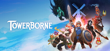
Towerborne is an exciting side-scrolling Action RPG Brawler. As an immortal warrior journey across a crumbling world, uncover the mystery of the fallen City of Numbers, and push back the corruption threatening humanity’s survival.

$17.49Mostly Positive(1,029)
Action RPGLootCo-op
StoicFeb 26, 2026

Towerborne scores 65/100 — better than 11% of Steam capsules we've analysed (n=22,658).

Mostly Positive (1,029 reviews) · $17.49 · Released Feb 26, 2026 · By Stoic

Quick text summary

Towerborne scored 65/100 on Steam Analyzer — Solid for a Steam capsule. Top priority fix: [title_readability] Add a subtle dark drop shadow or thin dark outline to the TOWERBORNE logotype to improve contrast against the pale sky blue background at small and tiny sizes.

Capsule scores by dimension

  • Genre Clarity: 7/10 — Action RPG brawler party clear. The ensemble cast of diverse fantasy characters wielding weapons, a large dragon looming in the background, and colorful cartoonish art style strongly suggest an action RPG or brawler. The sword-and-shield protagonist at center and varied companion silhouettes communicate cooperative or party-based combat well. At tiny size the genre impression softens to generic fantasy action, but still reads as an action RPG rather than anything misleading.
  • Title Readability: 7/10 — Clean serif logo reads well. The 'TOWERBORNE' logotype in white serif with subtle shadow sits against a clear sky blue upper-left region, providing good contrast and legibility at full and small sizes. At tiny size the letterforms compress but the bright white on light-blue is the weakest point, reducing contrast against the pale sky backdrop. The word is long enough that at 120x45 it becomes difficult to parse individual letters, though the overall shape is recognizable.
  • Contrast & Color: 6/10 — Bright palette but sky bleeds steam bg. The warm orange-to-sky-blue gradient background separates well from the Steam dark UI at the bottom half, but the light sky blue upper region creates a soft edge against the dark #1b2838 browser frame. Character silhouettes are varied and colorful, with the center hero's blue shield and warm lighting creating decent mid-ground separation. In grayscale the characters cluster into a mid-tone mass in the lower half, reducing silhouette distinction at tiny size.
  • Uniqueness & Polish: 6/10 — Competent but familiar ensemble pose. The capsule follows a well-worn 'cast lineup' composition common across action RPGs and live-service games, offering little that visually distinguishes Towerborne from peers like Sea of Stars or similar colorful action RPGs. The art style is clean and polished with appealing character designs, but the overall layout and concept feel template-like for the genre. There is no unique visual hook or standout mechanic communicated beyond 'colorful fantasy brawler with friends.'
  • Brand Consistency: 7/10 — Cohesive cartoon fantasy identity. The warm, saturated cartoon aesthetic, consistent cel-shaded rendering across all characters, and the distinctive bright sky gradient create a recognizable visual identity. The logotype style and character design language feel coherent and would be recognizable across store assets. The color palette of warm oranges, blues, and saturated character accents forms a consistent brand signal, though it lacks a single truly iconic motif that would make it unmistakable at a glance.
  • Composition: 6/10 — Busy ensemble crowds lower half. The title sits top-left over clean sky, which is a sound placement, but the lower two-thirds are densely packed with eight or more characters all at roughly equal visual weight, creating a cluttered band without a clear secondary focal point behind the center hero. The large dragon silhouette top-right adds drama but competes with the title zone and the character cluster simultaneously. At small and tiny sizes the character mass collapses into an indistinct colorful blob, and the title becomes the only clear readable element.

What works

  • Title placement over clean sky. The white logotype sits against uncluttered light blue sky in the upper-left, giving it maximum contrast and breathing room away from the busy character cluster.
  • Appealing cartoon art style. The consistent cel-shaded character designs are visually appealing and communicate a friendly, accessible tone that aligns well with the game's co-op action RPG positioning.
  • Dragon silhouette adds epic scale. The large green dragon looming in the upper-right corner quickly signals high-stakes fantasy combat and adds visual drama that elevates the overall composition.
  • Warm gradient background creates depth. The orange-to-sky-blue gradient provides a natural warm-light atmospheric layer that separates the image from the Steam dark UI and adds a sense of open-world scale.

What hurts the capsule

  • Character cluster becomes unreadable blob at tiny size. Eight-plus characters packed into the lower half merge into an indistinct colorful mass at 120x45, eliminating the individual character appeal that is the capsule's main selling point.
  • Logo contrast weakens against pale sky. The white serif text over light sky blue has insufficient value contrast, especially at small sizes where the letterforms compress and the lack of a strong dark outline or drop shadow hurts legibility.
  • Generic cast-lineup composition. The side-by-side hero roster layout is extremely common in live-service and co-op RPGs, making the capsule blend in with competitors rather than stand out on a crowded store page.
  • No unique gameplay hook communicated. The capsule shows characters but nothing about the tower, side-scrolling brawler mechanics, or the corrupted world concept that would differentiate Towerborne from any other fantasy action RPG.

Priority fixes

  1. [title_readability] Add a subtle dark drop shadow or thin dark outline to the TOWERBORNE logotype to improve contrast against the pale sky blue background at small and tiny sizes.
  2. [composition] Reduce the character count to three or four hero silhouettes with more spacing and depth separation so they remain distinct at tiny thumbnail size instead of merging into a single mass.
  3. [uniqueness_polish] Introduce a visual hook tied to the game's core identity such as the tower structure, a side-scrolling brawl action moment, or environmental corruption effect to differentiate the capsule from generic fantasy ensemble art.
  4. [contrast_color] Darken or add atmospheric haze to the upper sky region to increase value contrast between the light background and the white title text, and to better separate the capsule from the Steam dark UI frame.

Store copy priority fixes

  1. [hook_strength] Rewrite the short description to lead with a concrete differentiator (e.g., 'Master combo-based brawler combat and build a uniquely powerful Ace in this co-op Action RPG') instead of 'exciting' and move the mystery hook to the end.
  2. [feature_communication] Add a dedicated sentence or bullet list explaining loot mechanics: rarity tiers, drop sources, how customization through gear and aspects works, and what progression rewards look like.
  3. [uniqueness] Articulate one specific feature that sets Towerborne apart (e.g., 'the only brawler where offline progress syncs seamlessly with online co-op' or a unique combat mechanic) and feature it prominently in the short description.
  4. [structure] Reorder so the 'About the Game' section appears before or alongside the Deluxe Edition; lead with core gameplay, not cosmetics.

Related guides

Steam app ID: 2458830