Scoring genre clarity...

Hellwatch capsule

Hellwatch

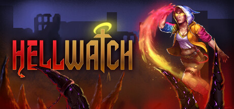
Join a squad of 4 desperate daredevils to protect a celestial artifact from demon invasion in this online cooperative roguelite. Act like a munchkin way: support your team or drain their power. Fight your way to better gear and beware the consequences of death. Kill, die, defeat, repeat!

$1.99Mixed(27)
RoguelikeAction RoguelikeHack and Slash
FGOct 24, 2024

Hellwatch scores 63/100 — better than 6% of Steam capsules we've analysed (n=22,658).

Mixed (27 reviews) · $1.99 · Released Oct 24, 2024 · By FG

Quick text summary

Hellwatch scored 63/100 on Steam Analyzer — Solid for a Steam capsule. Top priority fix: [contrast_color] Darken and desaturate the background behind the right character to create stronger silhouette separation and prevent the warm armor from merging with the hellfire.

Capsule scores by dimension

  • Genre Clarity: 7/10 — Action RPG co-op combat clear. Two distinct characters with magical/combat abilities — a hooded woman wielding colorful energy and an armored fighter with a glowing staff — strongly suggest action RPG with co-op elements. The hellish fiery background and demonic horn elements reinforce the dark fantasy setting. At tiny size the combat poses and glowing effects still read as action RPG, though the roguelite or MMO nuance is impossible to convey visually.
  • Title Readability: 7/10 — Bold title reads at most sizes. HELLWATCH uses a chunky, high-contrast red and white stylized font centered at the bottom that reads clearly at full size and small capsule size. At tiny size the lettering compresses but the strong red color and bold weight keeps it parseable. The split treatment between HELL in red and WATCH in lighter tone adds visual interest without sacrificing legibility.
  • Contrast & Color: 6/10 — Warm palette competes internally. The warm orange and red fire background partially merges with the warm skin tones and equipment of the right character, reducing silhouette separation in grayscale. The left character's colorful energy trail in pink and cyan provides the strongest contrast pop against the background. At small size the two characters begin to blend into the busy mid-tone background, weakening the hero readout.
  • Uniqueness & Polish: 6/10 — Competent but genre-generic feel. The illustration quality is solid with good linework and painted detail on both characters, but the overall composition of two heroes posed against a fiery hellscape is a familiar action RPG trope seen in many mid-tier indie capsules. The colorful magic energy on the left character adds a distinguishing touch, but compared to top-tier benchmarks like Diablo IV or Baldur's Gate 3 the capsule lacks a truly distinctive visual hook or memorable identity signal. No unique selling point — the co-op roguelite mechanic — is visually communicated.
  • Brand Consistency: 6/10 — Coherent style, limited identity. The hand-painted illustration style is internally consistent between the two characters and the environment with a matching warm color palette and similar rendering technique. However there is no iconic symbol, motif, or signature visual element beyond the title treatment that could be recognized in a thumbnail without the text. The glowing celestial artifact on the staff is a potential brand anchor but it is too small to register as a recurring identity cue.
  • Composition: 6/10 — Dual character split with center title. The two characters flank the center with the title text sitting below them in a readable zone against the darker fire ground, which is a functional layout. However the composition lacks a clear single focal point — both characters receive roughly equal visual weight which splits attention, and at small size neither character dominates as a memorable hero silhouette. The demonic horn element at the bottom right edge is an interesting depth cue but risks being cropped in some Steam display contexts.

What works

  • Strong title legibility. The bold red and white HELLWATCH logotype holds up at small capsule size due to its chunky weight and high contrast placement against the darker ground area.
  • Distinct character differentiation. The two characters have clearly different silhouettes, color coding, and ability effects that help communicate the co-op multi-character premise at a glance.
  • Genre-appropriate atmosphere. The hellfire background, demonic elements, and glowing magic effects immediately place this in dark fantasy action territory without ambiguity.
  • Colorful energy trail adds visual pop. The left character's swirling pink and cyan energy is the most visually distinctive element and helps the capsule stand out slightly against darker genre peers.

What hurts the capsule

  • Characters blend into warm background. The right character's warm brown armor and skin tones merge with the orange fire background at small and tiny sizes, weakening the hero silhouette read in grayscale.
  • No unique mechanic communicated. The cooperative roguelite munchkin mechanic that makes this game distinctive is completely absent from the visual language, making it look like a generic action RPG.
  • Split focal point hurts tiny readability. Two equally weighted characters with no clear primary subject means the eye has no anchor at tiny size and the composition reads as busy rather than heroic.
  • Below benchmark polish level. Compared to top-performing peers in the genre the capsule lacks the cinematic lighting, strong silhouette clarity, and premium finish that would make it competitive in quick scroll.

Priority fixes

  1. [contrast_color] Darken and desaturate the background behind the right character to create stronger silhouette separation and prevent the warm armor from merging with the hellfire.
  2. [composition] Establish a single dominant hero as the primary focal point, pushed slightly forward with stronger lighting, while the second character recedes as a supporting element.
  3. [uniqueness_polish] Introduce a visual storytelling cue that hints at the cooperative or munchkin mechanic — such as a shared glowing artifact between characters or a team dynamic pose — to differentiate from generic action RPG capsules.
  4. [brand_consistency] Elevate the celestial artifact or a recurring symbol to a larger, more prominent position so it can function as a recognizable brand anchor across capsule sizes.

Store copy priority fixes

  1. [feature_communication] Replace the philosophical narrative section with a bulleted breakdown of core mechanics: Permadeath system, item types and rarity, squad roles or classes, and how the Soulforge changes between runs. Include 1–2 sentences of flavor to maintain tone.
  2. [feature_communication] Fix the corrupted sentence 'You can't .' and complete the thought—likely 'You can't memorize the layout' or similar—to maintain reader trust.
  3. [audience_targeting] Add a sentence explicitly addressing solo players: clarify whether the game is balanced for 1–4 players, whether AI fills gaps, or whether solo runs are intentionally difficult for narrative/mechanical reasons.
  4. [feature_communication] Expand on the 'munchkin way' mechanic with one concrete example of how drain/support playstyles diverge mechanically (e.g., 'drain enemy buffs to empower yourself' vs. 'share health pools'), so players understand the depth.

Related guides

Steam app ID: 2468720