Scoring genre clarity...

INFERIUS capsule

INFERIUS

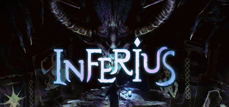
A blend of Dante’s Inferno and Lovecraftian horror. A first-person roguelike deckbuilder using the Major Arcana Tarot Cards to strategize against the horrors lurking in the darkness. Build the perfect deck, challenge each ruler of the 9 levels of hell, die often... and repeat.

Dark FantasyHorrorCard Game
Lucid Rain StudiosComing soon

INFERIUS scores 82/100 — better than 94% of Dark Fantasy capsules (n=1,267).

Released Coming soon · By Lucid Rain Studios

Quick text summary

INFERIUS scored 82/100 on Steam Analyzer — Good for a Dark Fantasy capsule. Top priority fix: [genre_clarity] Integrate a visible tarot card element (Major Arcana imagery) into the composition to signal deckbuilder identity and differentiate from generic dark fantasy horror.

Capsule scores by dimension

  • Genre Clarity: 8/10 — Dark fantasy horror immediately clear. The demonic horned creature framed symmetrically against a hellish background communicates dark fantasy/horror unambiguously at all sizes. Tarot and roguelike deckbuilder elements are not visually apparent, but the core horror-adventure tone reads strongly even at tiny size through silhouette and atmosphere alone. Genre positioning is clear though specific mechanics (deckbuilder, tarot) remain hidden.
  • Title Readability: 9/10 — Excellent legibility across all sizes. INFERIUS uses a strong, geometric serif font with bright cyan-white glow that creates excellent contrast against the dark background and demon silhouette. The title remains readable at tiny size due to bold letterforms, generous letter spacing, and strategic placement in the upper-center safe zone. No decorative degradation occurs when scaled down.
  • Contrast & Color: 9/10 — Striking value separation and pop. The bright cyan-white glowing title creates dramatic contrast against the very dark background (#1b2838-like tones), while the darker demon silhouette provides layered depth. In grayscale, the light title and darker demon create clear separation with no muddy midtones. At tiny size, the glow effect maintains visibility and the composition does not collapse.
  • Uniqueness & Polish: 8/10 — Polished, thematic, intentional craft. The symmetrical demon composition with glowing arcane symbols, layered chains, and atmospheric lighting suggests premium production quality and purposeful art direction. The tarot/occult aesthetic aligns authentically with the Dante/Lovecraft description, though the visual does not explicitly communicate the deckbuilder or roguelike mechanics that differentiate it. Craft is excellent but the unique selling point (tarot deckbuilding) is not visually emphasized.
  • Brand Consistency: 7/10 — Cohesive dark fantasy identity. The cyan-glow typography, symmetric demon framing, arcane symbol scatter, and shadowy atmosphere create a recognizable dark fantasy brand identity. The palette and rendering style suggest internal consistency, though without reference to other capsules and in-game assets, brand distinctiveness cannot be fully confirmed. The visual would likely be recognizable as INFERIUS-related material based on the glowing title treatment and demon motif.
  • Composition: 8/10 — Strong hierarchy, balanced focal point. The demonic creature centered with title above creates clear primary focus that reads at all sizes, supported by symmetrical background framing that does not distract. Safe margins are respected and no critical elements touch edges or risk Steam crop loss. The layered background (chains, symbols, dark atmospheric depth) guides the eye without clutter, though at tiny size only the title and demon silhouette register clearly.

What works

  • Bold glowing title treatment. Cyan-white glow creates immediate visual impact and remains perfectly legible at tiny thumbnail size with no decorative collapse.
  • Symmetrical, iconic focal point. Centered horned demon silhouette is instantly recognizable as a dark fantasy icon and maintains strong read across all size reductions.
  • Premium atmospheric craftsmanship. Layered depth with chains, symbols, and lighting creates a polished, intentional aesthetic that feels AAA-quality rather than template-based.
  • Excellent contrast against Steam background. Bright cyan glow and dark demon silhouette create strong value separation in grayscale, ensuring visibility during quick scrolls.

What hurts the capsule

  • Deckbuilder mechanic invisible. Tarot card theming and roguelike deckbuilding—the game's unique hook—are not communicated visually; capsule reads as generic dark fantasy horror.
  • Minimal gameplay clarity. No UI hints, card imagery, or strategic elements visible; viewers cannot infer this is a deckbuilder rather than an action-adventure from visuals alone.
  • Background symbols lose definition at tiny size. Arcane symbols and fine chain details blur into ambient noise at thumbnail scale, reducing layers of intentional worldbuilding.

Priority fixes

  1. [genre_clarity] Integrate a visible tarot card element (Major Arcana imagery) into the composition to signal deckbuilder identity and differentiate from generic dark fantasy horror.
  2. [uniqueness_polish] Add a subtle card or arcane UI overlay near the title or in the lower third to communicate the tarot deckbuilding mechanic and raise distinctiveness.
  3. [composition] Consider right-weighting or adding a prominent card silhouette on the right edge to balance the centered demon and reinforce the roguelike deckbuilder positioning.

Store copy priority fixes

  1. [feature_communication] Rewrite the sigils/brands sentence to be concrete: 'Apply sigils to your Arcana cards to multiply their effects in combat—a defensive sigil might double shield generation, while an offensive one chains damage across enemy waves.' This transforms vague marketing into a clear tactical example.
  2. [feature_communication] Add a 1-2 sentence explanation of how the lantern and stealth mechanic integrate with deckbuilding: 'Use your lantern to manipulate darkness and avoid detection between rounds. Stealth rewards players who build decks that enable patient, evasive gameplay rather than direct confrontation.' This bridges the first-person and card layers.
  3. [hook_strength] Strengthen the 'die often... and repeat' ending with a reason to repeat: 'Die often... and repeat. Every failed descent unlocks new Arcana variants and stronger sigils, pushing you incrementally toward the final confrontation.' This transforms grind into progression.
  4. [audience_targeting] Add one sentence explicitly naming the intended player: 'Perfect for fans of deck-building roguelikes who crave a narrative-driven horror experience over pure mechanical optimization.' This signals whether story or systems are the priority.

Related guides

Steam app ID: 2470790 · Tags: Dark Fantasy, Horror, Card Game, First-Person, Deckbuilding