Scoring genre clarity...

Bullets & Brains capsule

Bullets & Brains

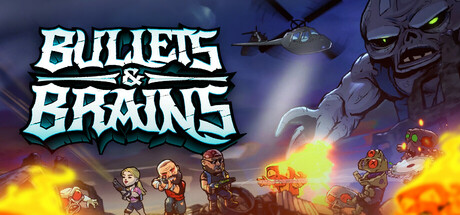
Bullets & Brains is an adrenaline-pumping arcade top-down 3D shooter set in a post-apocalyptic world overrun by brain-hungry hordes of zombies. Prepare yourself for an intense battle against the never-ending onslaught of the undead.

$14.99Positive(15)
Controller3DArcade
Ajvar StudioJun 26, 2025

Bullets & Brains scores 70/100 — better than 30% of Steam capsules we've analysed (n=22,658).

Positive (15 reviews) · $14.99 · Released Jun 26, 2025 · By Ajvar Studio

Quick text summary

Bullets & Brains scored 70/100 on Steam Analyzer — Good for a Steam capsule. Top priority fix: [contrast_color] Darken or add a rim-light edge to the giant zombie creature to improve its silhouette separation from the sky background, especially in grayscale and at tiny size.

Capsule scores by dimension

  • Genre Clarity: 8/10 — Zombie shooter genre clearly signaled. The capsule immediately communicates a zombie shooter genre through the combination of armed soldier characters in the midground, a looming giant zombie skull creature in the upper right, and explosive fire effects. At tiny size, the silhouette of armed humans versus a monstrous undead figure still reads clearly as a combat-versus-zombies game. The helicopter in the background reinforces a modern military tone alongside the arcade aesthetic.
  • Title Readability: 7/10 — Bold title reads well at small sizes. The title 'Bullets & Brains' uses a chunky, outlined stylized font in white with a dark green stroke that provides good contrast against the relatively darker upper-left background. At small capsule size it remains legible, though the ampersand and '&' secondary text between the two words becomes harder to parse. At tiny size the two main words are still recognizable but the decorative letterform details in the font begin to collapse slightly.
  • Contrast & Color: 7/10 — Warm explosions pop on dark background. The orange and red fire and explosion effects in the lower midground create strong warm contrast against the dark steam background, helping the capsule pop during quick scrolling. The character silhouettes are reasonably separated from the background due to the bright fire glow behind them. In grayscale, the giant zombie figure on the right blends somewhat into the mid-gray sky, reducing its separation at tiny size.
  • Uniqueness & Polish: 6/10 — Competent but genre-familiar execution. The composition follows a familiar zombie shooter template — small heroes against a giant monster with explosions — which is effective but not distinctive. The cartoon-stylized rendering is clean and the character designs have personality, but the overall layout and concept do not introduce a unique visual hook that separates it from other indie zombie shooters. The polish level is competent with no glaring craft issues, but it lacks a memorable signature element.
  • Brand Consistency: 7/10 — Cohesive cartoon-military art style. The capsule maintains a consistent cartoon-stylized rendering across all visible elements — soldiers, zombie giant, helicopter, and environment — suggesting a unified art direction. The color palette of greens, oranges, and browns feels thematically coherent with the post-apocalyptic zombie setting. The bold outlined title font matches the chunky, exaggerated character designs, reinforcing internal brand cohesion.
  • Composition: 7/10 — Clear hero group versus monster hierarchy. The composition establishes a solid foreground group of armed heroes in the lower center, with the giant zombie dominating the upper right as the clear threat, creating an effective narrative tension. The title is placed in the upper left, balancing the monster on the right and avoiding clutter over the character group. At small size the primary focal points — title and character cluster — remain readable, though the busy explosion effects and the helicopter in the upper center add visual noise that competes slightly with the main subjects.

What works

  • Genre instantly communicated. The armed soldier group versus giant zombie creature pairing makes the zombie shooter genre identifiable even at tiny thumbnail size.
  • Title placement on controlled background. The title sits in the upper left against a relatively dark, low-detail sky area, giving the letterforms room to breathe and remain legible.
  • Warm explosion contrast. The orange fire effects create strong warm-versus-cool contrast that helps the capsule pop against Steam's dark #1b2838 background in a quick scroll.
  • Consistent cartoon art direction. All elements share the same chunky cartoon-stylized rendering which creates a cohesive and professional indie aesthetic.

What hurts the capsule

  • Giant zombie blends into background at tiny size. The large zombie skull creature in the upper right shares similar mid-tone grays with the sky, reducing its silhouette clarity in grayscale and at tiny thumbnail size.
  • Generic zombie shooter template. The layout of small heroes plus big monster plus explosions is a well-worn visual formula for the genre and does not introduce a memorable unique hook.
  • Upper center helicopter adds visual noise. The helicopter silhouette in the upper center competes with the title and the zombie creature for attention without adding meaningful genre clarity.
  • Ampersand detail collapses at tiny size. The decorative '&' and connecting text between 'Bullets' and 'Brains' becomes unreadable at tiny thumbnail size, slightly fragmenting the title.

Priority fixes

  1. [contrast_color] Darken or add a rim-light edge to the giant zombie creature to improve its silhouette separation from the sky background, especially in grayscale and at tiny size.
  2. [uniqueness_polish] Introduce a distinctive visual hook unique to this game — such as a signature character pose, a recognizable logo mark, or a gameplay-specific visual element — to differentiate from generic zombie shooter capsules.
  3. [title_readability] Simplify or enlarge the connecting ampersand between 'Bullets' and 'Brains' so the full title reads as a single unit at tiny thumbnail size.
  4. [composition] Remove or reduce the helicopter in the upper center to reduce competing focal points and give the title and zombie creature cleaner visual dominance.

Store copy priority fixes

  1. [uniqueness] Add a specific, concrete differentiator in the short description or opening paragraph: explain what makes this game's progression, character design, or zombie types meaningfully different from competitors (e.g., 'Each character class fundamentally changes how you fight: tank melee builds vs. ranged glass cannons').
  2. [feature_communication] Replace vague ability language with concrete progression examples: instead of 'powerful abilities,' write 'unlock dual-wield shotguns, area-of-effect explosions, and defensive shield abilities as you level up'.
  3. [tone_match] Remove or soften the high-stakes dramatic language ('The fate of humanity rests in your hands') to match the lighter, arcade-action tone established by the co-op and character sections; keep it fun and energetic throughout.
  4. [audience_targeting] Add clarity on difficulty progression and player skill curve: specify whether this is a casual pick-up-and-play experience or rewards strategic loadout building and mastery of enemy patterns.

Related guides

Steam app ID: 2485430