Scoring genre clarity...

Caster's Trap capsule

Caster's Trap

Enter the vanishing cabin and discover its secrets and magic, while avoiding ghastly entities.

$3.246 user reviews
HorrorMysteryPuzzle
TheOdieSep 19, 2023

Caster's Trap scores 73/100 — better than 67% of Horror capsules (n=3,252).

6 user reviews · $3.24 · Released Sep 19, 2023 · By TheOdie

Quick text summary

Caster's Trap scored 73/100 on Steam Analyzer — Good for a Horror capsule. Top priority fix: [composition] Increase negative space between the two pixel characters to reduce upper-area crowding and strengthen the focal point hierarchy.

Capsule scores by dimension

  • Genre Clarity: 7/10 — Pixel art mystery with supernatural hints. The pixelated art style and cabin setting communicate indie adventure/mystery clearly. The skeletal figure and ghostly silhouettes suggest supernatural or horror elements, aligning with the trap-based exploration theme. At tiny size, the pixel art and character silhouettes remain readable enough to convey a quirky indie game, though the specific 'trap' mechanic is not visually obvious.
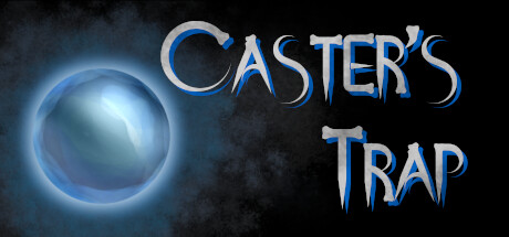
  • Title Readability: 8/10 — Bold white text with strong outline. CASTER'S TRAP uses white serif lettering with a blue glow/outline that contrasts sharply against the dark background and pixelated character art. The title placement in the lower half keeps it clear of the busy pixel art above. At small and tiny sizes, the text remains legible due to the outline and color separation, though some fine detail in the serifs may soften slightly.
  • Contrast & Color: 8/10 — Strong value separation and glowing accents. The white title with blue glow pops distinctly against #1b2838, and the light-skinned character contrasts well against darker pixel elements. The color palette uses cool blues and warm flesh tones that create clear silhouettes. At tiny size, the composition maintains readable value hierarchy and the glow effect helps the title stand out in a quick scroll.
  • Uniqueness & Polish: 7/10 — Charming pixel art with cohesive identity. The deliberate pixel art style and character design suggest intentional artistic direction rather than generic asset assembly. The skeletal/ghostly figure paired with the human character establishes a unique supernatural-mystery vibe. Execution is clean and the visual hook is memorable, though the overall composition feels somewhat typical for indie horror-mystery titles in the current market.
  • Brand Consistency: 7/10 — Consistent pixel art style and color palette. The pixelated character rendering, blue-and-cream color palette, and supernatural iconography (skeletal figure, dark cabin atmosphere) form a coherent visual identity. The seriffed title treatment with glow effect reinforces a premium indie aesthetic. Internal elements align well, though without access to other brand materials, broader franchise consistency cannot be fully evaluated.
  • Composition: 7/10 — Clear focus with slight crowding at top. The title anchors the lower third effectively, and the two pixel characters occupy the upper-center as the primary focal point. The layering (background darkness, midground character, foreground title) creates readable depth. At tiny size the composition holds, but the upper pixel art area is slightly crowded; a bit more breathing room between the characters would improve overall balance and clarity.

What works

  • High-contrast title treatment. White serif text with blue glow outline provides excellent pop against the dark background and remains legible at all sizes.
  • Clear indie-supernatural aesthetic. Pixel art style and character design immediately communicate the game's quirky, spooky tone and mystery-driven nature.
  • Well-structured visual hierarchy. Title placement in the lower third prevents overlap with key art and ensures safe margins for Steam display variations.

What hurts the capsule

  • Crowded upper pixel art area. The two characters sit close together at the top with limited negative space, creating visual density that dilutes focal point clarity.
  • Limited genre specificity in visuals. While spooky, the image does not clearly signal 'strategy' or 'trap-based puzzle' mechanics—the gameplay hook is subtle or absent.
  • Generic pixel art presentation. While well-executed, the overall pixel art style and character design do not feel distinctly memorable compared to top-tier indie titles like Balatro or DREDGE.

Priority fixes

  1. [composition] Increase negative space between the two pixel characters to reduce upper-area crowding and strengthen the focal point hierarchy.
  2. [genre_clarity] Consider adding a visual element (e.g., a trap mechanism, magical glyph, or environmental detail) that hints at the strategy or trap-avoidance core mechanic.
  3. [uniqueness_polish] Refine the pixel art with more detailed shading or animation frames in the character silhouettes to elevate perceived production value and memorability.

Store copy priority fixes

  1. [hook_strength] Move the opening quote 'Say Mouse, I take it that you are not a Caster' to the top of the detailed description, immediately after removing the version notes, to establish character and intrigue before the cabin description.
  2. [feature_communication] Expand the Features section to explain the puzzle-and-revisit loop: 'Collect items to unlock new areas and solve environmental puzzles that deepen the cabin's lore and reveal its tragic history.'
  3. [tone_match] Rewrite 'Get occasionally berated by a blonde girl who supposedly knows better' to maintain the dark, atmospheric tone: 'Interact with a mysterious blonde girl whose cryptic warnings blur the line between help and deception.'
  4. [uniqueness] Add a sentence after the genre statement that articulates the game's distinctive hook: 'Uncover how forbidden magic twisted the fate of the cabin and shaped the spectral beings trapped within' to differentiate from generic haunted-house games.

Related guides

Steam app ID: 2490440 · Tags: Horror, Mystery, Puzzle, Atmospheric, Magic