Scoring genre clarity...

Hello Kitty Island Adventure capsule

Hello Kitty Island Adventure

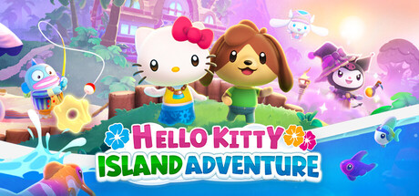
Embark on a cozy, open-world adventure with Hello Kitty and Friends. Befriend beloved characters as you explore and restore a mysterious island, solve ancient puzzles, cook delicious dishes, customize yourself and your cabins, and so much more.

$23.99Very Positive(253)
CozyOpen WorldAdventure
SunblinkJan 30, 2025

Hello Kitty Island Adventure scores 77/100 — better than 77% of Steam capsules we've analysed (n=22,658).

Very Positive (253 reviews) · $23.99 · Released Jan 30, 2025 · By Sunblink

Quick text summary

Hello Kitty Island Adventure scored 77/100 on Steam Analyzer — Good for a Steam capsule. Top priority fix: [genre_clarity] Add subtle visual cues like a cooking pot, puzzle element, or cabin detail to hint at gameplay depth beyond exploration and befriending characters.

Capsule scores by dimension

  • Genre Clarity: 8/10 — Cozy adventure with clear charm. The capsule immediately communicates a casual, family-friendly adventure through Hello Kitty and character companions, bright pastel colors, and a vibrant island setting with whimsical elements (floating objects, magical aura). At TINY size, the recognizable character silhouettes and cheerful color palette still convey the cozy adventure tone, though specific mechanics become less clear. The genre reads as lighthearted exploration and adventure rather than action or combat-focused.
  • Title Readability: 8/10 — Bold, colorful text with good separation. The 'HELLO KITTY' text in pink and 'ISLAND ADVENTURE' in green/blue are large, chunky, and highly legible at all sizes due to strong outline work and color separation from the background. At SMALL and TINY sizes, the title remains readable though the outline becomes slightly thinner, but the word shapes and colors are distinct enough to parse instantly. The two-line layout with varying colors helps maintain clarity even under quick-scroll conditions.
  • Contrast & Color: 8/10 — Vibrant saturation against dark background. The capsule uses a bright, warm pastel palette (pinks, yellows, purples, blues) that pops strongly against the Steam dark background #1b2838, with the glowing light source in the upper right adding luminosity and depth. The colorful character subjects and candy-like environment have excellent value separation and read clearly in grayscale due to well-lit midtones. At TINY size, the bright spot and character warm tones still separate from the cool background, though some mid-tone details blend slightly.
  • Uniqueness & Polish: 7/10 — Polished charm with licensed character appeal. The capsule benefits from Hello Kitty's iconic brand recognition and the clean, polished aesthetic consistent with Sanrio's visual style, creating an immediately appealing and premium feel. The composition shows intentional depth layering and character placement, though the overall scene reads somewhat like a typical Sanrio promotional render rather than a unique game-specific hook that differentiates it from other casual titles. The craftsmanship is solid and the cozy island aesthetic is well-executed, but the scene doesn't communicate a standout mechanic or unique selling point visually.
  • Brand Consistency: 8/10 — Strong Sanrio style identity recognition. The capsule perfectly embodies Sanrio's signature pastel palette, rounded character designs, and cheerful illustration style, making it instantly recognizable as a Hello Kitty product. The warm color harmony, soft lighting, and character companions align with established brand visual language seen across Sanrio media. The iconic Hello Kitty silhouette and bow motif are prominently featured, ensuring brand recognition at any size.
  • Composition: 7/10 — Layered scene with clear focal point. Hello Kitty and the brown character occupy the center-foreground as the primary focal point, with supporting characters and environmental elements creating depth in the background and sides. The title placement at the bottom is clean and doesn't compete with the character subjects, and the overall composition feels balanced with intentional positive space. At SMALL and TINY sizes, the central characters remain the clear focus, though the supporting cast on the edges becomes harder to distinguish, and some background elements blend into the overall warm glow.

What works

  • Excellent color contrast and pop. Vibrant pastel colors create strong visual separation from the dark Steam background, maintaining clarity and visual appeal at all viewing sizes.
  • Iconic character and brand recognition. Hello Kitty's instantly recognizable silhouette and Sanrio's signature aesthetic immediately communicate the game's identity and appeal.
  • Large, readable title typography. Bold two-line title with color separation and outline work remains legible even at TINY size during quick scrolling.
  • Clear depth and composition hierarchy. Foreground characters, midground elements, and background lighting create a layered composition that guides eye focus effectively.

What hurts the capsule

  • Generic promotional render feel. The scene reads as a standard Sanrio asset showcase rather than communicating specific gameplay mechanics or a unique hook that differentiates the game from other casual titles.
  • Supporting characters lose clarity at TINY. Background companions and peripheral elements become difficult to distinguish at thumbnail size, reducing visual richness in the most critical viewing condition.
  • Limited gameplay visual communication. While the cozy adventure tone is clear, specific activities like cooking, puzzle-solving, and customization are not visually represented in the capsule composition.

Priority fixes

  1. [genre_clarity] Add subtle visual cues like a cooking pot, puzzle element, or cabin detail to hint at gameplay depth beyond exploration and befriending characters.
  2. [uniqueness_polish] Incorporate a distinctive island landmark or unique environmental feature that differentiates this adventure from generic cozy game aesthetics.
  3. [composition] Ensure secondary characters on the edges remain visually distinct at TINY size by increasing their size or adjusting background overlap.

Store copy priority fixes

  1. [feature_communication] Reorder the detailed description to move the 'About the Game' section before Deluxe Edition bundles, so core gameplay is the first thing players read after the short description.
  2. [hook_strength] Replace 'and so much more' in the short description with a specific third activity or feature (e.g., 'fish, garden, and brew potions with friends') to eliminate vagueness and create a more compelling hook.
  3. [audience_targeting] Add an explicit statement in the opening or early in the detailed description such as 'Perfect for players who love relaxation, friendship-building, and exploration over combat or time pressure' to immediately reassure the cozy-game audience.
  4. [uniqueness] Include a line comparing this to or distinguishing it from similar cozy games (e.g., 'Imagine Animal Crossing meets Stardew Valley with the charm of Hello Kitty and 40+ beloved characters') to help players understand why to choose this over alternatives.

Related guides

Steam app ID: 2495100