Scoring genre clarity...

How to Survive capsule

How to Survive

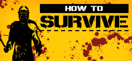
“A real Gem” – Destructoid at E3 “Offers a different experience for zombie game veterans” – Co-Optimus“Has a lot more going for it than smashing brains and gory, red goo ... With a surprisingly deep crafting system” – GamesRadarYou're shipwrecked on an isolated island, a desperate castaway in a total freakshow world. How will you survive?

$3.74Mostly Positive(11)
SurvivalZombiesCrafting
Eko SoftwareAug 29, 2014

How to Survive scores 72/100 — better than 44% of Steam capsules we've analysed (n=22,658).

Mostly Positive (11 reviews) · $3.74 · Released Aug 29, 2014 · By Eko Software

Quick text summary

How to Survive scored 72/100 on Steam Analyzer — Good for a Steam capsule. Top priority fix: [title_readability] Increase the size of 'HOW TO' text or merge both lines into a single unified bold title treatment so the full game name reads at tiny size.

Capsule scores by dimension

  • Genre Clarity: 7/10 — Zombie survival action clear. The bold black silhouette of an armored figure holding a weapon, combined with dark red blood splatter on a vivid yellow background, immediately communicates a survival or zombie-action theme. The blood splatter and combat-ready pose strongly hint at action-survival gameplay. At tiny size the silhouette and splatter still read as violent/survival content, though the RPG or crafting depth is not implied.
  • Title Readability: 8/10 — Bold white text reads well. The title 'HOW TO SURVIVE' uses a heavy sans-serif font on a black banner strip, giving strong white-on-black contrast that remains legible even at small sizes. At tiny size 'SURVIVE' in large bold letters is still readable due to its scale advantage, while 'HOW TO' in the smaller black box above may collapse but the dominant word carries the message. No taglines or unreadable sub-text clutters the composition.
  • Contrast & Color: 8/10 — High contrast yellow pops on Steam. The saturated yellow-orange background creates strong separation from Steam's dark #1b2838 background, making this capsule immediately noticeable in a scroll. The pure black silhouette against yellow provides excellent value contrast and a clean silhouette read in grayscale. The dark red blood splatter adds a secondary layer of contrast without muddying the overall palette.
  • Uniqueness & Polish: 6/10 — Bold but dated graphic style. The flat black silhouette with blood splatter on yellow is a deliberate stylistic choice that gives it personality and stands apart from photorealistic capsules, but the execution feels like a design trend from the early 2010s and lacks the polish of top-tier benchmarks like Resident Evil 4 or Ghost of Tsushima. The dashed line under 'SURVIVE' adds minor character but does not elevate the design significantly. It is competent and memorable in concept but feels dated compared to current genre leaders.
  • Brand Consistency: 7/10 — Consistent silhouette and palette identity. The yellow-and-black high-contrast palette with blood red accents forms a coherent and recognizable visual identity that could be carried across franchise materials. The armored silhouette character is a strong recurring icon that creates brand recall. The bold typographic treatment on a black bar reinforces the flat graphic design language throughout.
  • Composition: 7/10 — Clear hierarchy, safe focal placement. The left-anchored black silhouette acts as a clear primary focal point, with the title banner occupying the right half and creating a natural left-to-right visual flow from character to title. The blood splatter fills negative space without competing with the title or character. At small and tiny sizes the composition holds up well because the two dominant elements — silhouette and bold title — are large enough to survive cropping and compression.

What works

  • Instant Steam shelf pop. The saturated yellow background creates immediate separation from Steam's dark interface, ensuring the capsule catches the eye in a fast scroll.
  • Strong silhouette readability. The pure black armored character silhouette remains clearly identifiable even at tiny 120x45 thumbnail size due to extreme value contrast against yellow.
  • Clear dominant title word. 'SURVIVE' in large bold white letters on a black bar remains legible at small size, anchoring the brand even when fine details are lost.
  • Coherent visual identity. Yellow, black, and blood-red form a tight, memorable three-color palette that reads as a deliberate brand rather than an accidental one.

What hurts the capsule

  • Dated flat graphic aesthetic. The early-2010s silhouette-on-yellow style looks noticeably behind modern top-genre capsules and may signal an older or lower-budget title to browsing players.
  • Genre depth not communicated. The crafting and RPG progression elements described in the game's pitch are completely absent from the visual, missing an opportunity to differentiate from a pure brawler.
  • Blood splatter feels generic. Dark red splatter is a common shorthand for zombie games and adds little unique storytelling value beyond confirming a violent tone.
  • 'HOW TO' banner collapses at tiny size. The smaller black box containing 'HOW TO' becomes unreadable at 120x45, leaving only 'SURVIVE' as the conveyed title, which loses the game's name entirely.

Priority fixes

  1. [title_readability] Increase the size of 'HOW TO' text or merge both lines into a single unified bold title treatment so the full game name reads at tiny size.
  2. [uniqueness_polish] Introduce a subtle background detail — an island, zombies, or crafting element — to hint at the game's unique survival-crafting hook without breaking the flat graphic style.
  3. [genre_clarity] Add a secondary visual cue such as a zombie silhouette in the background or a makeshift weapon prop to reinforce the zombie survival subgenre more specifically.
  4. [uniqueness_polish] Modernize the typography with a slightly more refined font choice or add a subtle texture to the title banner to lift the overall polish level toward current genre standards.

Store copy priority fixes

  1. [hook_strength] Move the core premise 'You're shipwrecked on an isolated island' to the very first line of the short description, and relegate review quotes to a secondary endorsement block below or within the detailed section.
  2. [uniqueness] Add a sentence explaining what differentiates the crafting system—e.g., 'Over 100 handmade weapons blend looted materials with discovered recipes, letting you tailor your loadout to survival challenges' instead of just listing the number.
  3. [feature_communication] Expand the crafting mention in the main body with concrete examples: 'Scavenge island resources and experiment with survival recipes to build weapons ranging from crude spears to explosives—each craft choice impacts your survival strategy.'
  4. [tone_match] Open the detailed description with the conversational survival narrative (e.g., 'Figure it out with pages of a Survival Guide...') rather than review quotes, establishing consistent voice before feature details.

Related guides

Steam app ID: 250400