Scoring genre clarity...

The Binding of Isaac: Rebirth capsule

The Binding of Isaac: Rebirth

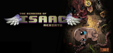
The Binding of Isaac: Rebirth is a randomly generated action RPG shooter with heavy Rogue-like elements. Following Isaac on his journey players will find bizarre treasures that change Isaac’s form giving him super human abilities and enabling him to fight off droves of mysterious creatures, discover secrets and fight his way to safety.

$1.49Overwhelmingly Positive(5,815)
Action RoguelikeRoguelikeIndie
Nicalis, Inc., Edmund McMillenNov 4, 2014

The Binding of Isaac: Rebirth scores 75/100 — better than 68% of Steam capsules we've analysed (n=22,658).

Overwhelmingly Positive (5,815 reviews) · $1.49 · Released Nov 4, 2014 · By Nicalis, Inc.

Quick text summary

The Binding of Isaac: Rebirth scored 75/100 on Steam Analyzer — Good for a Steam capsule. Top priority fix: [title_readability] Increase the size or weight of 'REBIRTH' subtitle text and add a subtle dark outline or backing so it remains readable at small capsule sizes alongside the main ISAAC logo

Capsule scores by dimension

  • Genre Clarity: 7/10 — Dark roguelike horror shooter implied. The grotesque monster collage in the top right and the vulnerable crying child character clearly communicate a dark, horror-tinged action game. The pixelated logo font reinforces an indie roguelike aesthetic familiar to the genre. At tiny size the monster pile and small child figure still suggest danger and combat, though the specific roguelike-shooter subgenre requires prior knowledge to confirm.
  • Title Readability: 7/10 — Pixel logo reads at full, fades tiny. At full size, 'THE BINDING OF ISAAC: REBIRTH' is clearly legible with the chunky pixel-block lettering for 'ISAAC' anchored by white angel wings on either side providing strong contrast against the dark left half. The smaller 'THE BINDING OF' and 'REBIRTH' subtitle text, while readable at full size, collapses to near-illegibility at tiny thumbnail size. At 120x45 only 'ISAAC' in the pixel font survives as a recognizable word, which is arguably enough for brand recognition.
  • Contrast & Color: 7/10 — Strong left-right value split works well. The hard black void on the left half provides clean separation for the white-winged title logo, while the warm brown wooden floor and the fleshy monster cluster on the right create a distinct value zone. The small Isaac character benefits from being a pale figure against the darker floor, maintaining a readable silhouette. In grayscale the monster mass and child character retain sufficient separation, though the tentacles and floor textures merge somewhat at tiny size.
  • Uniqueness & Polish: 8/10 — Distinctive grotesque art style stands out. The hand-drawn, thick-outlined grotesque monster aesthetic is immediately distinctive and unlike anything in mainstream action capsule art — it avoids the generic 'armored hero against explosion' formula of competitor capsules. The composition of a vulnerable crying infant dwarfed by a nightmare collage of fleshy monsters communicates the game's dark, unsettling tone as a genuine unique selling point. The pixel-font logo with angel wings is a memorable branded element that feels intentionally crafted rather than templated.
  • Brand Consistency: 9/10 — Iconic identity, immediately recognizable. The thick black outline illustration style, the specific grotesque character designs (the eyeball monster, the fleshy blob creatures, Isaac's crying face with mismatched eyes), and the pixel-block 'ISAAC' logo with wings form an extremely cohesive and memorable visual identity. Any player who has seen in-game screenshots would immediately recognize this as the same universe. The warm brown dungeon floor tone and the specific character design language are consistent signatures that persist across the game's entire visual identity.
  • Composition: 7/10 — Clear diagonal tension, slight imbalance. The composition uses a strong diagonal read from top-right monster cluster down to the bottom-center Isaac figure, creating visual flow and tension that suits the predator-prey theme. The title is well-placed in the mid-left against clean black, avoiding competition with the detailed artwork. At small size the left half feels slightly empty since the black void and title text lose impact, making the overall capsule feel right-heavy, but the focal hierarchy remains intact with monsters above and Isaac below drawing the eye.

What works

  • Memorable pixel logo with wings. The chunky 'ISAAC' pixel font flanked by angel wings is a distinctive branded mark that survives at small sizes and is immediately recognizable to returning players.
  • Unique grotesque illustration style. The thick-outlined, hand-drawn monster collage is visually unlike any competitor capsule in the action genre and communicates the game's dark tone instantly.
  • Strong predator-prey storytelling. The looming monsters above a tiny vulnerable Isaac communicates the core gameplay loop of survival against overwhelming odds without any text.
  • High internal brand cohesion. The art style, character designs, and logo form a tightly consistent visual identity that matches in-game aesthetics precisely.

What hurts the capsule

  • Subtitle text vanishes at tiny size. 'THE BINDING OF' and 'REBIRTH' text are too small and thin to survive at 120x45, leaving only 'ISAAC' legible for new players unfamiliar with the title.
  • Left half feels empty at small sizes. The large black void on the left loses its dramatic purpose at tiny thumbnail size and makes the capsule feel unbalanced and wasted.
  • Monster details merge at tiny size. The richly detailed monster cluster collapses into an indistinct fleshy mass at 120x45, losing the individual character recognition that makes the art compelling.
  • Genre ambiguity for new players. Without prior knowledge, the imagery could suggest a horror adventure or point-and-click rather than an action roguelike shooter, as no gameplay UI or weapon cues are present.

Priority fixes

  1. [title_readability] Increase the size or weight of 'REBIRTH' subtitle text and add a subtle dark outline or backing so it remains readable at small capsule sizes alongside the main ISAAC logo
  2. [composition] Add a subtle vignette or dark gradient to the left center region to make the empty black area feel intentional and less like wasted space at small viewing sizes
  3. [genre_clarity] Introduce a small but visible gameplay cue such as tears or projectile trails near Isaac to reinforce the shooter subgenre for players unfamiliar with the franchise
  4. [contrast_color] Increase the value contrast on individual monster silhouettes in the top-right cluster so they read as distinct creatures rather than a merged mass at tiny size

Store copy priority fixes

  1. [hook_strength] Move the narrative opener ('When Isaac's mother starts hearing the voice of God...') to the very top of the About section before the DLC banner, or work it into the first line of the short description to establish emotional stakes immediately.
  2. [uniqueness] Add 1-2 sentences explicitly stating what makes Rebirth's roguelike design distinct (e.g., 'Item synergies create hundreds of unique build combinations' or 'Boss rush and seeded runs offer both randomized and skill-based progression paths') rather than relying solely on remake quality.
  3. [feature_communication] Replace the redundant 'Gameplay' paragraph with expanded details on key mechanics absent from the feature list (e.g., item synergy system, unlocking system, how tears/shooting works, what 'form changes' feel like in practice).
  4. [tone_match] Remove or reframe the crediting parenthetical to maintain consistency—either integrate audio/engine as selling points with their own bullets (e.g., '60 FPS performance on most PCs') or drop casual asides like 'the sexy Ridiculon duo.'

Related guides

Steam app ID: 250900