Scoring genre clarity...
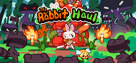
The Rabbit Haul capsule

The Rabbit Haul

Nurture your farm by day and defend your haul of crops from the thieving Trash Panda Posse at night. This farming and tower defense roguelite challenges you to grow powerful and symbiotic defenses to battle tough critters and rebuild your hometown one haul at a time!

WholesomeActionFamily Friendly
Caldera Interactive2026

The Rabbit Haul scores 73/100 — better than 40% of Wholesome capsules (n=397).

Released 2026 · By Caldera Interactive

Quick text summary

The Rabbit Haul scored 73/100 on Steam Analyzer — Good for a Wholesome capsule. Top priority fix: [contrast_color] Increase outline or lighting on dark purple enemy silhouettes to improve grayscale separation and readability at tiny size

Capsule scores by dimension

  • Genre Clarity: 7/10 — Clear casual strategy with farm setting. The central rabbit protagonist surrounded by crops, colorful vegetables, and defending against hostile creatures clearly signals a farming defense hybrid game. At tiny size, the bright orange carrots, green vegetables, and enemy silhouettes (trash pandas) still communicate the core mechanic of protecting a harvest, though the tower defense aspect is less explicit than the farming theme.
  • Title Readability: 8/10 — Bold logo reads well across sizes. The title 'The Rabbit Haul' uses a chunky white outline font with orange and green color blocking that maintains legibility from full size down to tiny thumbnails. The white outline stroke provides clean separation from the busy background, and the two-line layout with strategic spacing ensures the text doesn't collapse or blur into illegibility even at 120×45 resolution.
  • Contrast & Color: 8/10 — Vibrant palette pops clearly. The composition uses high-saturation oranges, greens, and purples against a darker teal/forest background with strong value separation throughout. The bright orange carrots and lime-green grass create clear visual hierarchy and silhouettes that remain distinct even when squinting, though some mid-tone purple enemy details could offer slightly more separation from darker backgrounds.
  • Uniqueness & Polish: 7/10 — Charming art style, competent execution. The hand-drawn aesthetic with expressive character design (cute rabbit, grinning enemies) and cohesive color palette feels intentional and distinctive compared to generic farming sims. The visual storytelling of 'cute farm under siege' reads clearly, though the overall composition leans toward a busy, colorful scene rather than a breakthrough premium visual hook that would elevate it into the 8+ range.
  • Brand Consistency: 7/10 — Consistent warm color identity. The warm orange-green palette and cartoon character design create a recognizable internal style with the cute rabbit as a potential brand mascot. The consistent rendering style and cohesive visual language suggest good art direction, though without reference to the 10 store screenshots, it is difficult to assess whether this capsule establishes a truly iconic identity that would carry across marketing materials.
  • Composition: 7/10 — Clear focal point, slightly busy. The central rabbit protagonist anchors the composition with title placement above, creating a clear primary focus that survives the tiny size reduction. Supporting elements (enemies, crops, trees) frame the scene effectively, though the density of colorful objects and the multiple enemy characters spread across the composition create some visual competition; at tiny size the individual details blur slightly but the overall composition still reads as cohesive.

What works

  • Title contrast and outline. White stroke around orange and green letters ensures the title remains readable at all sizes without relying on background clarity.
  • Color saturation and warmth. The vibrant orange, green, and purple palette creates strong visual appeal and pops distinctly against Steam's dark background color.
  • Character focal point. The centered rabbit protagonist with expressive design provides an immediate hook and clear subject for the eye to rest on.
  • Genre-appropriate aesthetic. The cute cartoon style with farming and creature elements aligns well with casual-strategy audience expectations and visual language.

What hurts the capsule

  • Composition density. Multiple enemy characters, creatures, and environmental details spread across the frame create visual noise that competes with the primary subject at small sizes.
  • Purple enemy silhouettes. Some dark purple enemy shapes lack sufficient value separation from the darker background elements, reducing edge clarity in grayscale contrast.
  • Tower defense messaging. While the farming theme is clear, the defensive/combat aspect is less visually prominent than the harvest concept, potentially underselling the hybrid strategy element.

Priority fixes

  1. [contrast_color] Increase outline or lighting on dark purple enemy silhouettes to improve grayscale separation and readability at tiny size
  2. [composition] Reduce secondary creature count or scale to minimize visual competition with the central rabbit protagonist while maintaining scene context
  3. [genre_clarity] Add a subtle tower or defensive structure element to more explicitly communicate the defense/strategy layer of the hybrid gameplay

Store copy priority fixes

  1. [feature_communication] Add one concrete example of a plant synergy or tower combination—e.g., 'plant ice towers to slow raccoons while your thorn towers deal damage' or similar—to make the core strategic layer tangible.
  2. [uniqueness] Rewrite the closing section to explicitly state what makes this game stand out: 'The only roguelite where farming synergies ARE your defense strategy' or similar bold differentiator.
  3. [feature_communication] Clarify the exploration mechanic: does the player explore on the farm, between runs, or during night waves? What does 'find treasure, quests, upgrades, weapons' mean mechanically?

Related guides

Steam app ID: 2514330 · Tags: Wholesome, Action, Family Friendly, Tower Defense, Roguelite