Scoring genre clarity...

GUARDS! capsule

GUARDS!

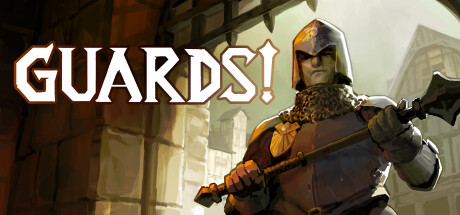
GUARDS! is an online co-op fantasy FPS that puts you in the underfunded and over-zealous steel boots of the City Watch. Kick down doors, bust criminals and cause excessive property damage as you fight to restore law and order to the corrupt city of New Alestead.

$4.99Mixed(416)
Online Co-OpCo-opFirst-Person
WYLDERZONE, Lowkey GameDevMar 1, 2024

GUARDS! scores 68/100 — better than 19% of Steam capsules we've analysed (n=22,658).

Mixed (416 reviews) · $4.99 · Released Mar 1, 2024 · By WYLDERZONE

Quick text summary

GUARDS! scored 68/100 on Steam Analyzer — Solid for a Steam capsule. Top priority fix: [uniqueness_polish] Introduce a distinctive visual hook such as comedic property damage, signature guard emblem, or City Watch branding that differentiates GUARDS! from generic fantasy warriors.

Capsule scores by dimension

  • Genre Clarity: 7/10 — Action fantasy FPS messaging clear. The armored guard in a medieval fantasy setting with a large axe-polearm weapon immediately signals action-fantasy gameplay. At TINY size, the silhouette of the heavily armored character with weapon is still recognizable as a fighter, though the specific 'City Watch' law-enforcement angle requires larger context. The yellow-orange armor and medieval architecture support an action game read, though co-op or FPS specifics are not visually apparent at scale.
  • Title Readability: 8/10 — Strong sans-serif title, excellent contrast. The bold white sans-serif 'GUARDS!' text is positioned in the upper left against a lighter background gradient, providing excellent contrast and legibility at all sizes including TINY. The exclamation mark adds personality and emphasis. At full size the text is crisp; at TINY it remains readable with clear letterforms, though some fine detail is lost. No secondary tagline competes, keeping focus clean.
  • Contrast & Color: 8/10 — Strong light-dark separation and warm palette. The warm yellow-orange armor, white title, and light beige-cream background create strong value separation against the dark Steam background #1b2838. The character silhouette reads clearly in grayscale due to high contrast between the lit armor and darker helmet/background elements. At TINY size, the warm tones and bright armor still pop distinctly, with the character outline remaining crisp and separated.
  • Uniqueness & Polish: 6/10 — Competent execution, generic fantasy warrior. The image shows clean professional rendering and a well-lit character, but the 'armored fantasy guard with axe' trope is extremely common across fantasy action games and lacks a distinctive hook or unique selling point. The City Watch concept and co-op FPS angle are not communicated visually—this could be any medieval fantasy action game. Compared to the benchmark titles which show distinctive art styles, mechanics, or character hooks, this reads as competent but generic.
  • Brand Consistency: 5/10 — Minimal identity cues, generic presentation. The capsule shows no distinctive logo, motif, or signature palette that would make GUARDS! recognizable on repeat viewing. The yellow-orange armor and medieval architecture are standard fantasy tropes rather than brand-specific identity markers. Without access to the 12 store screenshots, the capsule alone does not establish a memorable visual identity that differentiates it from dozens of other fantasy action titles on Steam.
  • Composition: 7/10 — Clear focal point, balanced layout structure. The armored guard is centered as the primary subject, with the architectural background providing supporting context without competing for attention. Title placement in the upper left uses safe margins and does not encroach on edges. The depth from building shadow to character creates layering. At SMALL and TINY sizes the character remains the clear focal point, though some background detail loses definition.

What works

  • Bold title legibility. White 'GUARDS!' text is large, high-contrast, and readable at TINY size with no secondary clutter competing for attention.
  • Strong color pop. Warm yellow-orange armor and light background values create excellent silhouette separation and visual pop against the dark Steam #1b2838 background.
  • Clear focal hierarchy. The centered armored character reads as the primary subject at all sizes, with supporting architecture not competing for focus.

What hurts the capsule

  • Generic fantasy trope. The armored guard with poleaxe is a extremely common archetype that does not communicate what makes GUARDS! unique or mechanically distinctive.
  • No brand identity markers. The capsule lacks iconic logos, signature colors, or memorable motifs that would make GUARDS! recognizable on repeat viewings compared to competitors.
  • Co-op FPS angle obscured. The game's core selling point as an online co-op FPS with property damage mechanics is not visually communicated; the capsule reads as a standard solo fantasy action game.

Priority fixes

  1. [uniqueness_polish] Introduce a distinctive visual hook such as comedic property damage, signature guard emblem, or City Watch branding that differentiates GUARDS! from generic fantasy warriors.
  2. [brand_consistency] Establish and apply a consistent logo, color palette, or character motif across the capsule that creates recognizable identity beyond the current generic medieval setting.
  3. [genre_clarity] Add subtle UI elements, cooperative visual cues, or comedic destruction indicators that hint at the co-op FPS and property damage mechanics without cluttering the composition.

Store copy priority fixes

  1. [feature_communication] Expand 'EVERYTHING IS A WEAPON' to clarify whether environmental destruction is physics-based or scripted, and provide 1-2 concrete examples of how this mechanic changes tactics in a stakeout scenario.
  2. [audience_targeting] Add a sentence explicitly stating difficulty level and accessibility (e.g., 'Designed for casual co-op fun with adjustable difficulty' or 'Hardcore tactical challenge requiring coordination') to help right players self-select.
  3. [genre_clarity] Clarify the relationship between stealth/stakeout phases and combat phases—are missions stealth-optional or mandatory? Does the 'NO PLAN SURVIVES FIRST CONTACT' section mean players must prepare tactically or reacts dynamically?
  4. [uniqueness] Add 1-2 sentences explaining what makes the gang faction system or kingpin progression loop feel fresh compared to standard mission-based co-op shooters.

Related guides

Steam app ID: 2514460