Scoring genre clarity...

Lost Eidolons: Veil of the Witch capsule

Lost Eidolons: Veil of the Witch

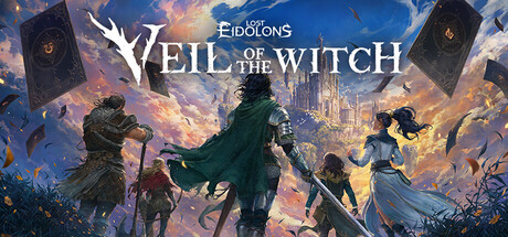
Veil of the Witch is a roguelite strategy RPG with turn-based combat and branching progression. Set in the world of “Lost Eidolons,” build a nimble squad of five, pick your skills as you level, and adapt to each unique run. May the gods favor the bold and the wise.

$16.24Very Positive(15)
Turn-Based TacticsRogueliteTurn-Based Strategy
Ocean Drive Studio, Inc.Oct 9, 2025

Lost Eidolons: Veil of the Witch scores 65/100 — better than 11% of Steam capsules we've analysed (n=22,658).

Very Positive (15 reviews) · $16.24 · Released Oct 9, 2025 · By Ocean Drive Studio, Inc.

Quick text summary

Lost Eidolons: Veil of the Witch scored 65/100 on Steam Analyzer — Solid for a Steam capsule. Top priority fix: [uniqueness_polish] Remove or significantly reduce the 'MAJOR UPDATE' banner to a small badge so the game identity capsule is not subordinated to promotional messaging for new viewers.

Capsule scores by dimension

  • Genre Clarity: 7/10 — Fantasy RPG strategy reads clearly. Three armored characters in heroic poses against a golden fantasy cityscape backdrop clearly signal fantasy RPG territory. The floating card-like objects on the left edge hint at the roguelite/deck-building strategy layer, which is a useful genre cue for informed viewers. At tiny size the characters collapse into silhouettes and the card hint disappears, leaving only a generic fantasy RPG read with no clear strategy signal.
  • Title Readability: 6/10 — Main title readable, sub-brand small. The large stylized 'Veil of the Witch' logotype is legible at full and small size thanks to strong gold-and-white lettering with dark outlines. The smaller 'Lost Eidolons' brand text above it is already borderline at small size and completely unreadable at tiny size. The 'MAJOR UPDATE' banner dominates the lower third and competes with the title hierarchy, reducing the game's core identity at a glance.
  • Contrast & Color: 7/10 — Warm gold pops against Steam dark bg. The warm golden sky and bright celestial city create strong value contrast against Steam's dark #1b2838 background, ensuring the capsule catches the eye during quick scroll. The center character in dark armor risks blending into the mid-tone sky at tiny size, though the bright background rim helps separation. In grayscale the title remains readable but the left and right characters lose definition against the light background.
  • Uniqueness & Polish: 6/10 — Competent but genre-typical presentation. The art quality is professional and the golden epic fantasy aesthetic is well-executed, but the three-heroes-against-a-skyline composition is a very common template across fantasy RPG capsules and doesn't immediately communicate the roguelite or strategy angle that differentiates this title. The 'MAJOR UPDATE' banner, while useful for returning players, detracts from the game's identity pitch for new browsers. Compared to benchmarks like Hades II or Metaphor: ReFantazio which use distinctive visual hooks, this feels familiar rather than memorable.
  • Brand Consistency: 7/10 — Cohesive fantasy palette and identity. The warm gold-and-teal palette, ornate serif logotype, and high-fantasy character designs all pull in the same direction and feel internally coherent. The 'Lost Eidolons' parent brand is present and legible at full size, providing franchise continuity for returning players. The floating card motifs on the left edge echo a roguelite mechanic identity cue, though they are too small to read as a consistent signature element at reduced sizes.
  • Composition: 6/10 — Busy lower third hurts hierarchy. The composition layers background city, midground characters, and foreground title banner in a reasonable depth stack, but the 'MAJOR UPDATE' golden banner occupies the lower third and creates a competing focal point against the title logo above it. At small and tiny sizes the banner reads louder than the game title, inverting the intended hierarchy. The three characters are well-spaced horizontally but the center figure lacks a decisive dominant focal pop that would anchor quick-scroll reads.

What works

  • Strong warm contrast on Steam dark background. The bright golden sky and glowing city backdrop create immediate value separation against #1b2838, helping the capsule stand out during quick scroll.
  • Core title logotype holds at small size. 'Veil of the Witch' in gold with dark outlines remains legible down to small capsule size due to generous letter scale and good stroke contrast.
  • Roguelite hint via card motifs. The floating card-like objects on the left edge provide a subtle but meaningful genre differentiator for attentive viewers.
  • Coherent high-fantasy art direction. Character designs, palette, and background all share a consistent epic-fantasy tone with no stylistic conflicts.

What hurts the capsule

  • MAJOR UPDATE banner dominates hierarchy. The large gold 'MAJOR UPDATE' ribbon commands as much visual weight as the game title and misleads first-time viewers by prioritizing update news over game identity.
  • 'Lost Eidolons' brand text unreadable at tiny size. The small parent franchise label above the main logo collapses to an illegible smudge at 120x45, losing franchise recognition for returning fans.
  • Genre strategy layer not visible at tiny size. The card motifs that hint at roguelite strategy disappear entirely at tiny thumbnail size, leaving only a generic fantasy RPG impression.
  • Center hero lacks dominant focal punch. All three characters receive roughly equal visual weight, diluting the focal point and slowing down the sub-second parse that small capsules require.

Priority fixes

  1. [uniqueness_polish] Remove or significantly reduce the 'MAJOR UPDATE' banner to a small badge so the game identity capsule is not subordinated to promotional messaging for new viewers.
  2. [title_readability] Increase the 'Lost Eidolons' brand text size or integrate it into the main logotype so it survives down to small capsule size.
  3. [composition] Amplify the center character as a clear primary focal point through stronger rim lighting or scale increase so the composition locks on one hero at tiny size.
  4. [genre_clarity] Scale up or redesign the card/roguelite motif element so it reads at small size, helping communicate the strategy-roguelite genre distinction.

Store copy priority fixes

  1. [uniqueness] Rewrite the short description to lead with what makes this tactical roguelite distinct—e.g., emphasize the witch patron mechanic, elemental terrain manipulation, or bond system as the primary differentiator, not generic squad building.
  2. [hook_strength] Replace the closing tagline with a more specific, active verb-forward statement that conveys stakes or reward—e.g., 'Every death unlocks new power; every victory brings you closer to the truth.'
  3. [feature_communication] Add a sentence in the detailed description or a sub-section stating estimated run length, number of unique encounters, or story branches to help players understand scope and replayability.
  4. [audience_targeting] Clarify difficulty progression and accessibility: note that Trials Mode is optional and that the core experience supports adaptive difficulty, so both casual and hardcore players know this is for them.

Related guides

Steam app ID: 2530490