Scoring genre clarity...

A Hat in Time capsule

A Hat in Time

A Hat in Time is a cute-as-heck 3D platformer featuring a little girl who stitches hats for wicked powers! Freely explore giant worlds and recover Time Pieces to travel to new heights!

$14.99Overwhelmingly Positive(110)
Cute3D PlatformerCollectathon
Gears for BreakfastOct 5, 2017

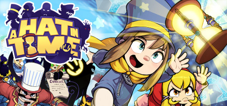
A Hat in Time scores 85/100 — better than 97% of Steam capsules we've analysed (n=22,659).

Overwhelmingly Positive (110 reviews) · $14.99 · Released Oct 5, 2017 · By Gears for Breakfast

Quick text summary

A Hat in Time scored 85/100 on Steam Analyzer — Excellent for a Steam capsule. Top priority fix: [composition] Increase safe margin on right edge to ensure supporting character remains fully visible and clear at all Steam framing sizes

Capsule scores by dimension

  • Genre Clarity: 9/10 — Vibrant 3D platformer charm. The capsule immediately signals a colorful 3D platformer with a whimsical protagonist. The central character's expressive anime-style face, the prominent hat, the playful poses of multiple characters, and the vibrant blue sky background all clearly communicate a lighthearted adventure game. At tiny size, the bold character silhouettes and warm yellow/blue color blocking still read as cheerful platformer gameplay.
  • Title Readability: 9/10 — Bold yellow title excellent legibility. The 'A HAT IN TIME' title uses a thick, bold sans-serif font in bright yellow with strong dark outline/shadow that creates excellent contrast against the light blue background. The letterforms remain fully readable even at tiny thumbnail size, and the strategic placement in the upper left avoids overlapping with busy character detail. The readability is maintained across all viewing scales without collapse.
  • Contrast & Color: 9/10 — High-saturation colors pop strongly. The capsule leverages a warm yellow-orange character palette against cool blue sky, creating strong value and hue separation that pops against Steam's dark background. The bright yellow title, glowing lantern elements, and vivid character clothing maintain clear silhouettes even in grayscale. The color scheme is saturated and intentional, with no muddy mid-tones that would blur the image at small size.
  • Uniqueness & Polish: 8/10 — Distinctive anime style and personality. The hand-drawn anime character art style with expressive faces, exaggerated proportions, and dynamic poses sets this apart from generic 3D platformers. The central girl's distinctive hat design, the varied character expressions showing joy and mischief, and the polished cel-shading suggest intentional visual storytelling that communicates the game's quirky personality. The craft is evident, though it follows a familiar anime aesthetic that may feel less unique than top-tier indie standouts.
  • Brand Consistency: 8/10 — Consistent character design identity. The protagonist's iconic hat and cheerful anime face are recognizable brand markers that would persist across marketing materials. The warm yellow and blue palette is cohesive and distinctive for the franchise. The playful, energetic composition style with multiple characters and dynamic poses reinforces a recognizable identity, though the internal rendering and effect quality is solid without reaching exceptional signature polish.
  • Composition: 8/10 — Clear focal point, good depth layering. The central character (girl in hat) occupies the primary visual hierarchy with supporting characters and objects arranged around her, creating clear depth: foreground character, midground props and smaller characters, background sky. The title integrates into the upper left without competing for attention. The composition remains readable at small size with minimal dead space, though the right edge shows some character cropping that is acceptable for the dynamic framing.

What works

  • Title stands out at all sizes. Bold yellow lettering with dark outline remains legible from full header to tiny thumbnail without any loss of readability or character collapse.
  • Strong color contrast against dark background. Warm yellow and orange tones of characters and props create immediate visual pop against both the light blue background and Steam's dark UI.
  • Clear genre communication. Expressive character expressions, dynamic poses, and vibrant 3D platformer aesthetic immediately signal the cheerful adventure tone without ambiguity.
  • Effective character-driven identity. The protagonist's distinctive hat and exaggerated anime proportions create a memorable visual signature that differentiates the game from competitors.

What hurts the capsule

  • Right edge character cropping. The smaller supporting character on the right edge sits dangerously close to the crop zone and may lose clarity or appeal depending on Steam's exact framing at different sizes.
  • Dense composition could overwhelm at tiny size. While readable, the multiple characters, props, and effects create some visual density that risks losing detail and hierarchy when scaled to small capsule dimensions.
  • Anime style follows familiar indie trope. Although well-executed, the hand-drawn anime aesthetic is a common visual language in indie platformers, reducing the uniqueness factor compared to top-tier standouts with more distinctive art directions.

Priority fixes

  1. [composition] Increase safe margin on right edge to ensure supporting character remains fully visible and clear at all Steam framing sizes
  2. [uniqueness_polish] Consider adding a subtle unique visual effect or signature element that distinguishes this capsule from other anime-styled indie platformers

Store copy priority fixes

  1. [feature_communication] Move or expand the hat crafting explanation to the second paragraph so the unique mechanic is explained before enemy introductions—this is the core differentiator.
  2. [audience_targeting] Add one explicit signal about difficulty or playstyle (e.g., 'perfect for platformer newcomers' or 'challenges veterans with optional collectibles') to help players self-select.
  3. [uniqueness] Include a comparative line in the short description such as 'combines Banjo-Kazooie exploration with dress-up customization' to explicitly differentiate from generic 3D platformers.
  4. [hook_strength] Strengthen the short description's second sentence by replacing 'recover Time Pieces' with a verb that hints at the core loop, like 'stitch magical hats and explore vibrant worlds to recover your stolen Time Pieces.'

Related guides

Steam app ID: 253230