Scoring genre clarity...

Bloodthief capsule

Bloodthief

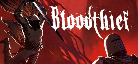
Bloodthief is an ultra-fast melee dungeon-runner where you use momentum to parkour through hazardous dungeons and brutally slash through enemies. Speed-run through haunted crypts and castles and learn what dark secrets lie beneath.

$12.99Overwhelmingly Positive(43)
Fast-PacedParkourHack and Slash
BlargisSep 22, 2025

Bloodthief scores 77/100 — better than 77% of Steam capsules we've analysed (n=22,658).

Overwhelmingly Positive (43 reviews) · $12.99 · Released Sep 22, 2025 · By Blargis

Quick text summary

Bloodthief scored 77/100 on Steam Analyzer — Good for a Steam capsule. Top priority fix: [uniqueness_polish] Add a distinctive visual element or signature color accent (e.g., a glowing blue or gold aura, unique armor trim, or motion-blur effect) that differentiates Bloodthief from other dark-action titles and creates a recognizable brand identity.

Capsule scores by dimension

  • Genre Clarity: 8/10 — Dark action melee combat clear. The silhouette of an armored warrior wielding a large blade against a blood-red backdrop immediately communicates action-combat gameplay. At tiny size, the weapon and dynamic pose remain legible and reinforce the melee-focused genre expectation. The gothic aesthetic and dual figures suggest dungeon exploration, though the parkour/momentum aspect is not visually apparent.
  • Title Readability: 8/10 — Strong metallic title, excellent contrast. The 'Bloodthief' logo uses a bold, distressed metal serif font with white fill and dark outline, positioned in the upper-right quadrant against the red gradient background. At small and tiny sizes, the letterforms remain distinct and the high contrast white-on-red holds legibility. The font choice reinforces the dark fantasy tone without sacrificing readability.
  • Contrast & Color: 9/10 — Striking red gradient with dark silhouettes. The deep red-to-crimson gradient background creates exceptional value separation from the dark armor and weapon silhouettes, producing a strong light-dark contrast that reads immediately at any size. White accents on the title and character highlights further enhance separation. In grayscale, the silhouettes maintain sharp edges and the composition does not collapse, demonstrating excellent tonal control.
  • Uniqueness & Polish: 7/10 — Polished but familiar dark action style. The execution is clean with professional lighting, character rendering, and atmospheric red-glow effects that feel cohesive and intentional. However, the composition—armored warrior with large weapon against dramatic red backdrop—follows a well-established formula in action-game capsules (similar to Lies of P, Black Myth: Wukong visual language). The uniqueness is moderate; it reads as premium but not distinctively memorable in genre context.
  • Brand Consistency: 6/10 — Competent but generic dark fantasy branding. The capsule establishes a consistent dark-fantasy aesthetic with gothic armor and blood-red atmosphere, but lacks distinctive identity markers that would make Bloodthief recognizable without the title. There is no iconic character design, signature color accent, or visual motif that signals this specific game versus other melee-combat titles. Internal rendering is cohesive, but external brand differentiation is weak.
  • Composition: 8/10 — Strong focal point, balanced layout. The primary armored figure on the left commands attention with clear silhouette and weapon positioning, while a secondary figure on the right provides depth and balance without competing for focus. The title anchors the upper right in a safe margin. At small and tiny sizes, the composition maintains clear hierarchy with the main character dominating the frame and supporting elements receding appropriately. Spatial usage is efficient with no dead zones.

What works

  • Excellent contrast and color pop. The crimson-red gradient provides outstanding visual separation from the dark character silhouettes and white title text, ensuring strong readability and visual impact even at tiny thumbnail size against Steam's dark background.
  • Clear focal point and depth layering. The primary warrior silhouette dominates the composition while the secondary figure adds visual depth, creating a layered read that guides attention without clutter or scattered emphasis.
  • Legible, stylistically appropriate typography. The distressed metal serif font for 'Bloodthief' reinforces the dark fantasy tone while maintaining strong contrast and readability across all size reductions from full header to tiny thumbnail.

What hurts the capsule

  • Generic visual execution within genre. The armored warrior-with-weapon-on-dark-background composition echoes many top-tier action titles, making it visually competent but not distinctively memorable or premium-feeling compared to benchmarks like Black Myth: Wukong or Lies of P.
  • No iconic brand identity markers. The capsule lacks a signature character design, unique color accent, or visual motif that would allow recognition of Bloodthief specifically—it reads as 'dark action game' rather than 'this particular dark action game.'
  • Parkour/momentum core mechanic not communicated visually. The static warrior pose and dungeon-exploration framing do not hint at the ultra-fast movement and parkour mechanics described as central to the game, potentially misfocusing player expectations toward traditional melee-combat gameplay.

Priority fixes

  1. [uniqueness_polish] Add a distinctive visual element or signature color accent (e.g., a glowing blue or gold aura, unique armor trim, or motion-blur effect) that differentiates Bloodthief from other dark-action titles and creates a recognizable brand identity.
  2. [genre_clarity] Incorporate a subtle motion cue or dynamic element (e.g., speed lines, momentum trails, or parkour silhouette) to visually communicate the core ultra-fast melee dungeon-runner mechanic and set genre expectations accurately.
  3. [brand_consistency] Establish and reinforce an iconic secondary visual motif (symbol, character detail, or color complement) that appears consistently across store screenshots and marketing materials for recognizable brand cohesion.

Store copy priority fixes

  1. [feature_communication] Replace the repeated 'Acquire Hidden Powers' section with a concrete explanation of 2–3 core abilities (e.g., 'Unleash time-slow bursts to navigate spike traps' or 'Drain multiple enemies at once to fuel a speed boost'), making ability progression tangible and mechanically clear.
  2. [uniqueness] Add a sentence comparing Bloodthief's vampire-blood-speed mechanic to traditional dungeon runners (e.g., 'Unlike typical runners, your combat kills directly fuel movement speed, creating a risk-reward loop where aggression is survival') to articulate mechanical innovation.
  3. [feature_communication] Expand the weapon line from '20 collectable weapons with unique perks' to clarify one or two weapon archetypes and their tactical uses (e.g., 'Heavy weapons slow you but shatter obstacles; light daggers keep momentum high') so players understand how loadout choice impacts playstyle.
  4. [hook_strength] Rewrite the detailed description opening to provide new information or tonal escalation instead of repeating the short description verbatim; consider leading with the vampire blood mechanic or a specific level design principle.

Related guides

Steam app ID: 2533600