Scoring genre clarity...

Stellaris: Astral Planes capsule

Stellaris: Astral Planes

NEW CORE SYSTEMS AND TECHNOLOGIES. NEW PLANES TO EXPLORE. NEW BRANCHING NARRATIVES.

$9.99Mostly Negative(1,073)
SpaceStrategyGrand Strategy
Paradox Development Studio, Abrakam Entertainment SANov 16, 2023

Stellaris: Astral Planes scores 80/100 — better than 90% of Steam capsules we've analysed (n=22,658).

Mostly Negative (1,073 reviews) · $9.99 · Released Nov 16, 2023 · By Paradox Development Studio

Quick text summary

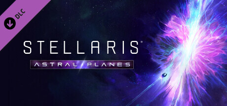
Stellaris: Astral Planes scored 80/100 on Steam Analyzer — Good for a Steam capsule. Top priority fix: [title_readability] Increase the ASTRAL PLANES subtitle font size and weight, or simplify the banner to ensure the DLC name remains legible at 120x45 thumbnail size.

Capsule scores by dimension

  • Genre Clarity: 7/10 — Space strategy implied clearly. The cosmic nebula explosion and tiny spacecraft silhouette in the lower center strongly suggest a space-themed strategy or sci-fi game. At tiny size, the cosmic energy burst and deep space backdrop communicate sci-fi genre reliably, though the specific strategy/4X subgenre is less immediately apparent without the title context. The visual language aligns well with Stellaris brand expectations for returning players.
  • Title Readability: 8/10 — Strong title, subtitle fades small. STELLARIS is rendered in clean, spaced sans-serif capitals on the left with good contrast against the darker left region of the image, reading well at full and small sizes. The ASTRAL PLANES subtitle sits in a purple-tinted banner below and is legible at small size but collapses to near-unreadable at tiny size. The two-tier hierarchy is smart but the subtitle's smaller weight and decorative banner frame hurt it under thumbnail compression.
  • Contrast & Color: 8/10 — Strong cosmic burst pops well. The central energy explosion in vivid magenta, violet, and white creates a high-saturation focal point that pops strongly against Steam's dark #1b2838 background, especially on the right side. The left portion where the title sits is relatively dark and desaturated, providing clean contrast for white letterforms. In grayscale, the bright burst still separates clearly from the surrounding dark space, though the ship silhouette in the lower center is very small and loses definition at tiny size.
  • Uniqueness & Polish: 8/10 — Premium DLC feel, familiar formula. The production quality is high with a carefully rendered cosmic anomaly explosion and professional typographic treatment that feels premium and publisher-grade. The ASTRAL PLANES subtitle banner adds a nice DLC identity touch. However, the core visual concept of a glowing space explosion is a well-worn Stellaris DLC formula, so it feels polished but not surprising or genre-defining compared to more conceptually inventive capsules.
  • Brand Consistency: 9/10 — Cohesive Stellaris DLC identity. The capsule maintains strong internal cohesion with the established Stellaris visual language: spaced uppercase title treatment, deep space backdrop with nebula colors, signature magenta-violet palette, and the characteristic energy phenomena focal point seen across other DLC covers. The subtitle banner with a translucent purple strip is a recognizable Stellaris DLC convention. Any existing Stellaris fan would immediately recognize this as part of the series without needing to read the title.
  • Composition: 8/10 — Clear split with strong focal anchor. The composition smartly divides left third for typography and right two-thirds for the dramatic energy burst, creating a clean hierarchy that avoids text competing with the hero visual. The tiny spacecraft near the base of the explosion provides a sense of scale and a secondary focal point. At small size the burst dominates effectively, but the ship detail is essentially invisible at tiny size. Safe margins are respected on all sides and the design crops well under Steam's aspect ratio.

What works

  • Strong brand recognition. Established Stellaris visual conventions including spaced title, nebula palette, and DLC banner subtitle make this instantly recognizable to the existing audience.
  • High contrast focal point. The magenta-violet energy explosion creates a vivid, high-saturation centerpiece that pops immediately against Steam's dark background in quick scroll.
  • Clean typographic hierarchy. STELLARIS in large spaced caps over the darker left region ensures the brand name reads clearly at full and small sizes without interference from background detail.
  • Effective left-right composition split. Separating title space from hero visual prevents clutter and gives each element room to read, which holds well down to small capsule size.

What hurts the capsule

  • Subtitle collapses at tiny size. ASTRAL PLANES in the decorative banner becomes unreadable at 120x45, meaning the DLC name is lost in the smallest thumbnail context.
  • Ship silhouette too small to read. The spacecraft near the energy burst is a compelling scale detail at full size but disappears entirely at small and tiny sizes, losing the only human-scale element.
  • Genre ambiguity for new players. Without prior Stellaris knowledge, the cosmic explosion visual could suggest an action shooter or space exploration game rather than a 4X grand strategy title.
  • Formula fatigue risk. The glowing space explosion composition closely mirrors multiple other Stellaris DLC capsules, reducing distinctiveness within the franchise's own store page context.

Priority fixes

  1. [title_readability] Increase the ASTRAL PLANES subtitle font size and weight, or simplify the banner to ensure the DLC name remains legible at 120x45 thumbnail size.
  2. [genre_clarity] Introduce a subtle strategic UI element or iconographic cue such as a star map overlay or hex grid ghost to signal the 4X strategy genre to new viewers.
  3. [uniqueness_polish] Differentiate this DLC capsule more distinctly from other Stellaris entries by adding a unique visual motif tied to Astral Planes gameplay, such as dimensional rift geometry or planar tear framing.
  4. [contrast_color] Slightly increase the size or brightness of the spacecraft silhouette so it retains a readable presence at small capsule size and reinforces the sense of scale.

Store copy priority fixes

  1. [hook_strength] Replace the opening short description with a strong value proposition that leads with the core new mechanic or experience—e.g., 'Tear rifts through space-time to explore alternate realities and reshape your empire with reality-bending technologies' instead of listing features without context.
  2. [feature_communication] Add concrete, mechanical descriptions: specify what 'new Actions' and 'Relics' actually do in gameplay, how 'Rifts' function as a navigation system, and what player choices in branching narratives unlock or change (e.g., 'Your decisions alter empire traits, unlock exclusive techs, or unlock new Riftworld origins').
  3. [uniqueness] Articulate what makes Astral Planes mechanically different from base Stellaris or other expansions—e.g., if Rifts are a new layer of map/exploration, or if Riftworld origins offer a fundamentally new playstyle, lead with that distinction early.
  4. [audience_targeting] Add a sentence clarifying who this DLC is for—e.g., 'Ideal for explorers and roleplay-focused empires' or 'Expands deep strategy systems for veteran players'—to help the right player self-identify.

Related guides

Steam app ID: 2534090