Scoring genre clarity...

Roach Royale capsule

Roach Royale

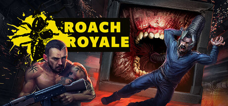
Roach Royale is a cooperative first-person horror shooter for 2 to 44 players, featuring asymmetrical gameplay that fuses horror, strategy, and battle royale elements. Band together to survive - or embrace the terror and become the nightmare that others must escape.

$3.993 user reviews
ActionBattle RoyaleArena Shooter
MOLOTApr 7, 2026

Roach Royale scores 70/100 — better than 30% of Steam capsules we've analysed (n=22,658).

3 user reviews · $3.99 · Released Apr 7, 2026 · By MOLOT

Quick text summary

Roach Royale scored 70/100 on Steam Analyzer — Good for a Steam capsule. Top priority fix: [composition] Remove or reduce the red texture noise in the background behind the characters to improve silhouette clarity and contrast at small and tiny sizes.

Capsule scores by dimension

  • Genre Clarity: 7/10 — Horror shooter multiplayer clear. The capsule communicates action-horror through the aggressive zombie creature on the right, the armed male character aiming a weapon on the left, and the red-hot hellish environment with fire. At tiny size, the silhouette of the creature and the weapon are recognizable enough to signal shooter-horror, though the specific multiplayer or battle royale angle is less explicit without reading the title.
  • Title Readability: 8/10 — Bold yellow logo stands firm. The 'ROACH ROYALE' title uses a thick, bright yellow sans-serif font with a black outline positioned in the upper-left quadrant against a dark background, making it highly legible at all sizes including tiny. The yellow splatter graphic behind reinforces the branding and ensures the text does not collapse under reduction, though the tagline below the title is too small to read at tiny size.
  • Contrast & Color: 8/10 — Strong value separation, readable. The yellow title logo creates excellent contrast against the dark background, and the red-orange glow of the hellish environment contrasts sharply with the cool blue-grey tones of the creature and the character's skin. In grayscale, the light yellow logo and bright fire elements separate cleanly from the dark surroundings, ensuring silhouette clarity even at tiny sizes where detail is lost.
  • Uniqueness & Polish: 6/10 — Competent horror atmosphere generic. The composition features a symmetrical two-character standoff with professional rendering and believable lighting, but the zombie creature and armed human pose are common tropes in horror-shooter marketing without a distinctive hook or unique selling point. The hellish red environment and splatter logo add personality, but the overall presentation reads as polished but not distinctive compared to Resident Evil 4 or Warhammer 40K: Space Marine 2.
  • Brand Consistency: 6/10 — Yellow splatter logo recognizable. The yellow splatter logo and consistent red-hot color palette create an internal identity signal, but without reference to the seven store screenshots, the capsule lacks deeper visual motifs or signature design elements that would be instantly memorable across touchpoints. The logo could serve as a brand anchor if used consistently across all marketing materials.
  • Composition: 7/10 — Balanced focal points, minor clutter. The capsule uses a clear left-right composition with the armed character on the left and the creature on the right, creating visual balance and a natural reading flow. The title occupies the upper-left safely without edge-crop risk, and the two characters form a clear hierarchy; however, the dense red background texture creates slight visual noise that competes with the subjects at small sizes, and the title placement slightly favors the left edge which could improve centering.

What works

  • Strong title legibility. Yellow bold sans-serif with black outline remains readable at tiny size and pops against dark backgrounds with minimal effort.
  • Clear horror-action messaging. The zombie creature and armed character silhouettes immediately signal a horror-shooter genre without ambiguity, supporting the multiplayer action context.
  • Balanced symmetric composition. Two-character standoff creates natural left-right balance and keeps the focal point away from dead center, avoiding weak framing.
  • Professional rendering quality. Character models, lighting, and fire effects are polished and avoid the cheap asset trap common in lower-tier indie horror games.

What hurts the capsule

  • Generic creature and pose. The zombie design and two-character confrontation trope are common across horror-shooter marketing and do not signal a unique identity or core mechanic like cooperative/asymmetrical play.
  • Red background texture noise. The busy hellish texture behind the characters creates visual clutter that reduces contrast and silhouette clarity at small and tiny sizes where detail collapses.
  • No cooperative or multiplayer visual cue. The capsule shows a single player versus a single creature, missing an opportunity to visually communicate the 2-44 player cooperative angle that differentiates Roach Royale from standard shooters.
  • Unreadable tagline. Small text below the title becomes illegible at tiny size, adding no value and wasting prime real estate in the upper region.

Priority fixes

  1. [composition] Remove or reduce the red texture noise in the background behind the characters to improve silhouette clarity and contrast at small and tiny sizes.
  2. [genre_clarity] Add a secondary character or team visual element (second player model, group silhouette, or cooperative UI hint) to communicate the 2-44 player cooperative multiplayer angle and differentiate from single-player horror games.
  3. [title_readability] Delete the unreadable tagline below the title to reduce clutter and simplify the upper hierarchy.
  4. [uniqueness_polish] Consider adding a visual motif or environmental detail (e.g., swarm of roaches, asymmetrical player indicator, or strategic element) that hints at the unique asymmetrical gameplay loop rather than a generic creature confrontation.

Store copy priority fixes

  1. [feature_communication] Specify core combat mechanics: 'Use firearms and equipment to fight creatures and other players, or unleash monster abilities when resurrected to hunt the living.' This directly answers 'what will I actually do?'
  2. [genre_clarity] Move the 'Become Your Own Nightmare' mechanic into the short description or first paragraph of detailed description, as it is the primary asymmetrical hook that differentiates the game.
  3. [feature_communication] Replace 'brutal grinding traps' with concrete examples: 'Navigate laser grids, pressure chambers, and timed door sequences designed to separate teams and force difficult choices.'
  4. [audience_targeting] Add one sentence explicitly targeting the intended player type: 'Perfect for horror fans seeking intense PvP betrayal dynamics and co-op survival challenges' or similar to reduce ambiguity about tone fit.

Related guides

Steam app ID: 2548770