Scoring genre clarity...

Hyper Sentinel Fusion capsule

Hyper Sentinel Fusion

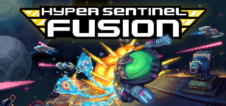
Pilot an agile star fighter to tear down alien megastructures under fire, then pull off a high-stakes heist from within before everything explodes. When you die time rewinds, sending you back to Moonbase Alpha—your hub for reinvention. Spend your bounty on explosive upgrades, ready for the next run.

Action RoguelikeShoot 'Em UpTop-Down Shooter
Four5Six Pixel, Huey GamesComing soon

Hyper Sentinel Fusion scores 70/100 — better than 30% of Steam capsules we've analysed (n=22,658).

Released Coming soon · By Four5Six Pixel

Quick text summary

Hyper Sentinel Fusion scored 70/100 on Steam Analyzer — Good for a Steam capsule. Top priority fix: [uniqueness_polish] Add a visual cue that communicates the roguelite or time-rewind mechanic, such as a ghosted rewind trail or heist-themed element, to differentiate from generic arcade shooters.

Capsule scores by dimension

  • Genre Clarity: 8/10 — Clear arcade space shooter vibes. The large green-domed saucer-style ship with laser trails and a neon purple speed corridor immediately communicate an arcade-style space shooter. At tiny size the ship silhouette and colorful energy beams still read as a fast-paced shoot-em-up or shmup genre. The retro-futuristic aesthetic reinforces action-arcade expectations without mixed genre messaging.
  • Title Readability: 7/10 — Bold logo readable at small size. The 'HYPER SENTINEL FUSION' logo uses a bold, chunky retro font with yellow chevron accents and a dark drop shadow that creates good separation from the background. At full size the title is crisp and clearly legible. At tiny size 'FUSION' in large white letters remains readable but 'HYPER SENTINEL' above it becomes harder to parse due to smaller sizing, though the overall logo block still communicates a title is present.
  • Contrast & Color: 7/10 — Vibrant neon pops on dark Steam background. The neon purple speed tunnel, bright green ship dome, and yellow-white laser trails create strong saturation contrast against Steam's dark #1b2838 background. In grayscale the ship has decent value separation from the background but the mid-toned grey hull of the ship blends slightly with the purple gradient behind it. At small size the central ship silhouette still reads clearly due to the luminous glow effects surrounding it.
  • Uniqueness & Polish: 6/10 — Competent retro arcade style, somewhat generic. The neon speed tunnel and retro ship design are competent and thematically appropriate, but the overall composition feels like a familiar indie arcade shooter template without a distinctive visual hook that sets it apart. The chevron logo elements and color scheme are cohesive but don't communicate the unique roguelite heist mechanic described. Craft is solid but not premium enough to stand out against top-tier indie capsules.
  • Brand Consistency: 7/10 — Cohesive retro arcade identity. The yellow chevron motifs on the logo, the neon purple-and-green palette, and the retro vector-style ship design create a recognizable internal identity. The glowing speed lines and bold typography are consistent with an arcade action brand. The 'Hyper Sentinel' franchise branding with the logo mark inside the 'O' of FUSION suggests an established series identity that carries across the capsule coherently.
  • Composition: 7/10 — Ship centered, logo well-anchored below. The large ship occupies the upper-center of the frame as a clear focal point with smaller pursuing ships creating depth and scale behind it. The title logo sits in the lower third with controlled negative space beneath it, giving the composition a top-subject bottom-title structure that reads well at small sizes. At tiny size the logo and ship compete slightly as equal weight elements, and the right-side planet and hex-grid detail become too small to contribute meaning.

What works

  • Instant genre signal. The large neon ship with laser trails and speed tunnel communicates arcade space shooter instantly even at tiny thumbnail size.
  • Strong logo contrast. The bold chunky font with dark drop shadow and yellow chevron accents ensures the title remains legible against the energetic background at small sizes.
  • Vibrant neon palette. The purple, green, and yellow-white color scheme creates strong saturation contrast against Steam's dark UI background during quick scroll.
  • Clear focal hierarchy. The dominant central ship with supporting smaller ships behind it creates a natural depth read without cluttering the composition.

What hurts the capsule

  • Generic roguelite mechanic not communicated. The heist and time-rewind loop mechanics, which are the game's unique selling points, are completely absent from the visual storytelling.
  • Right-side detail wasted at small size. The planet and hex-grid UI panel on the right edge become unreadable noise at tiny size and add no genre or brand value.
  • Ship hull blends into purple background. In grayscale the grey mid-tones of the ship body merge with the purple speed tunnel gradient, reducing silhouette clarity.
  • HYPER SENTINEL text strains at tiny size. The smaller text line above FUSION becomes difficult to read at tiny thumbnail dimensions, weakening the full title readability.

Priority fixes

  1. [uniqueness_polish] Add a visual cue that communicates the roguelite or time-rewind mechanic, such as a ghosted rewind trail or heist-themed element, to differentiate from generic arcade shooters.
  2. [title_readability] Increase the size or weight of the 'HYPER SENTINEL' text relative to 'FUSION' so the full title reads as a unified block at tiny size.
  3. [contrast_color] Add a brighter rim light or outline to the ship hull to improve silhouette separation from the purple background, especially in grayscale.
  4. [composition] Remove or simplify the right-side planet and hex-grid panel, redirecting that visual space to reinforce the central focal point or logo area.

Store copy priority fixes

  1. [feature_communication] Add 1–2 concrete upgrade examples in the UPGRADE & EXPLORE section (e.g., 'unlock weapon mods, shield enhancements, or dash abilities') to make progression tangible.
  2. [uniqueness] Expand the enemy form-stealing mechanic description to clarify frequency and strategic importance—e.g., 'harvest enemy weapons and abilities to dynamically adapt your loadout mid-run.'
  3. [audience_targeting] Add a sentence signaling difficulty/accessibility, such as 'Brutal permadeath for arcade veterans, or soften the challenge with persistent upgrades for newer players' to clarify who will enjoy this most.

Related guides

Steam app ID: 2563010