Scoring genre clarity...

I Hate This Place capsule

I Hate This Place

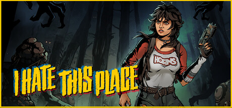
A craft-based, isometric survival horror game with twisted monsters and warped reality. Scavenge and build to survive terrifying days and nights while using stealth and noise to fight enemies that stalk by sound. All styled with bold comic art and an '80s horror vibe.

$29.99Mixed(58)
Survival HorrorComic BookIsometric
Rock Square ThunderJan 29, 2026

I Hate This Place scores 83/100 — better than 98% of Survival Horror capsules (n=1,175).

Mixed (58 reviews) · $29.99 · Released Jan 29, 2026 · By Rock Square Thunder

Quick text summary

I Hate This Place scored 83/100 on Steam Analyzer — Good for a Survival Horror capsule. Top priority fix: [composition] Strengthen the background monster's silhouette with a subtle rim-light or highlight so it reads as a distinct threat element at tiny sizes without increasing visual noise.

Capsule scores by dimension

  • Genre Clarity: 8/10 — Survival horror with comic style. The capsule clearly communicates survival horror through the armed protagonist, dark industrial setting, and lurking monster silhouette on the left. Comic art style with bold lines and exaggerated proportions immediately signals indie horror with personality. At tiny size, the character pose and monster outline remain readable enough to suggest action-horror gameplay, though finer details blur.
  • Title Readability: 9/10 — Bold yellow title extremely legible. The all-caps yellow title 'I HATE THIS PLACE' uses a heavy sans-serif font with thick letterforms and extreme value contrast against the dark background. The title placement in the left-center avoids the character and background clutter, making it pop at all sizes including tiny 120x45. At full size and when squinting, the title remains crystal clear and scannable in under one second.
  • Contrast & Color: 9/10 — Strong value separation with warm accents. The character's red armor and white tank top create excellent silhouette separation against the dark teal-gray background, while the bright yellow title provides maximum pop on dark. The warm red-orange tones in the character and weapon contrast with cool background greens and grays, creating visual depth. In grayscale test, the character maintains clear edges and the title remains the dominant bright element; this design does not collapse when squinting.
  • Uniqueness & Polish: 8/10 — Distinctive comic art with '80s attitude. The bold comic book illustration style with exaggerated proportions and thick inking sets this apart from photorealistic survival horror competitors. The protagonist's confident pose, punk-inspired appearance, and weapon-ready stance communicate character personality and thematic bite that elevates it beyond generic survival game presentation. The execution is clean and intentional, not template-based, though the core scene composition follows familiar survival-hero patterns.
  • Brand Consistency: 8/10 — Cohesive comic art direction throughout. The capsule uses consistent cell-shaded comic rendering, limited warm-cool color palette (reds, yellows, teals, grays), and a signature bold outline style that should anchor the brand identity across other store assets. The protagonist's visual design and the '80s grunge aesthetic create recognizable identity cues that differentiate from other indie horror titles. Without access to additional screenshots, internal cohesion within this capsule is strong and the art direction feels deliberate and sustained.
  • Composition: 8/10 — Clear focal point with effective depth. The armed protagonist dominates the right half as the primary focal point, with the lurking monster on the left providing secondary interest and establishing horror theme without competing for attention. Foreground character, mid-ground industrial architecture, and background monster create clear layering that reads at small size. Title placement in the left-center follows safe margins and does not collide with the focal character; composition remains effective at small and tiny sizes without critical information at dangerous edges.

What works

  • Exceptional title contrast and legibility. Bright yellow sans-serif on dark background reads perfectly at all sizes and survives any squint test or grayscale conversion.
  • Strong genre and tone communication. Comic art style, weapon, armor, and monster silhouette instantly signal indie survival horror with personality and attitude.
  • Confident character design and silhouette. Protagonist pose and distinctive red-white outfit create memorable visual identity that differentiates from generic survival game heroes.
  • Coherent color palette and depth layering. Warm character tones against cool background with clear foreground-midground-background separation maintains readability at tiny size.

What hurts the capsule

  • Background monster detail loss at tiny size. The lurking creature on the left, while effective at full size, becomes an ambiguous dark shape at 120x45 and may not register as intentional secondary element in quick scroll.
  • Industrial setting lacks distinctive visual hook. While competent, the warehouse/factory environment is a familiar survival game backdrop that does not communicate unique mechanics or story angle beyond the character and title.

Priority fixes

  1. [composition] Strengthen the background monster's silhouette with a subtle rim-light or highlight so it reads as a distinct threat element at tiny sizes without increasing visual noise.
  2. [uniqueness_polish] Consider adding a subtle gameplay-hint element (crafting materials, scavenged items, or a noise/sound wave motif) to the composition to communicate the craft and audio-stealth mechanics and differentiate from standard survival-action covers.
  3. [genre_clarity] Verify that the industrial setting elements (pipes, metal, decay) are visible and readable at small size; if they blur into background, simplify background silhouette for faster genre recognition.

Store copy priority fixes

  1. [feature_communication] Add one specific crafting example in the detailed description, such as 'craft spike traps to funnel sound-hunting creatures into deadly ambushes' to make the crafting loop tangible.
  2. [audience_targeting] Add a sentence clarifying campaign length, difficulty options, or whether permadeath exists, helping players gauge commitment level and complexity.
  3. [hook_strength] Strengthen the opening line by leading with the sound-hunting mechanic: 'Survive creatures that hunt by sound in an isometric survival horror game where stealth, traps, and clever noise are your only defense' to front-load the unique selling point.

Related guides

Steam app ID: 2604490 · Tags: Survival Horror, Comic Book, Isometric, Crafting, Survival