Scoring genre clarity...

From Glory To Goo capsule

From Glory To Goo

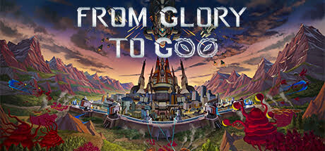
From Glory To Goo is a Sci-Fi survival RTS set on an alien world. Serve as humanity's bulwark by establishing a colony and supporting your colonists still in orbit. But beware, for The Goo, a relentless and shape-shifting force approaches from all sides, even above and below.

$8.39Overwhelmingly Positive(49)
Base BuildingTower DefenseRTS
Stratagem BlueApr 2, 2024

From Glory To Goo scores 65/100 — better than 11% of Steam capsules we've analysed (n=22,658).

Overwhelmingly Positive (49 reviews) · $8.39 · Released Apr 2, 2024 · By Stratagem Blue

Quick text summary

From Glory To Goo scored 65/100 on Steam Analyzer — Solid for a Steam capsule. Top priority fix: [title_readability] Reduce title to two lines ('FROM GLORY' / 'TO GOO') and increase letter spacing to maintain legibility at tiny size, or relocate to top/bottom edge with darker background bar.

Capsule scores by dimension

  • Genre Clarity: 7/10 — Sci-fi RTS with alien threat. The central fortress structure, mountainous alien landscape, and ominous sky clearly signal strategy and sci-fi setting. The ornate mechanical base conveys RTS/colony management, though at tiny size the specific threat from 'The Goo' becomes less apparent—the visuals read more as generic sci-fi fortress than survival horror. The composition supports strategy game recognition through overhead perspective and industrial architecture.
  • Title Readability: 6/10 — Readable at full, struggles tiny. At full header size, 'FROM GLORY TO GOO' displays clearly with strong white lettering and strategic spacing across the composition. At tiny thumbnail size (120x45), the three-line layout becomes cramped and the middle 'TO GOO' line loses legibility due to font weight variation and outline thickness inconsistency. The title placement directly over landscape texture rather than a controlled background region compounds this weakness.
  • Contrast & Color: 7/10 — Strong sky contrast, muddy mid-tones. The white title text pops well against the darker upper sky region, and the fortress silhouette reads clearly against the landscape. However, the alien terrain uses warm oranges and purples that blend together in value at mid-ground, creating muddy separation between the red flowers and darker mountain faces. In grayscale, the contrast holds but loses the color pop that makes the landscape visually distinctive at small sizes.
  • Uniqueness & Polish: 6/10 — Competent execution, familiar aesthetic. The central fortress and alien landscape are well-rendered with deliberate color grading (warm sunset palette) and layered depth. However, the overall composition follows typical sci-fi RTS convention—mountain vista, central structure, ominous sky—without a distinctive hook that communicates 'The Goo' threat or unique survival mechanic. The presentation is polished but generic compared to top-tier strategy game capsules that lead with a memorable core visual or character.
  • Brand Consistency: 6/10 — Coherent but generic sci-fi identity. The fortress design, color palette (warm/cool balance), and landscape style are internally consistent and suggest a recognizable game world. However, without knowledge of the 12 store screenshots, the capsule does not present a distinctive brand icon, motif, or color signature that would stand out as uniquely 'From Glory To Goo' versus other sci-fi RTSs. The visual identity feels solidly crafted but lacks a memorable anchor.
  • Composition: 7/10 — Clear focal point, title intrudes. The fortress anchors the center and commands attention with surrounding landscape layers creating depth (foreground flowers, midground terrain, background sky). The three-line title overlays the composition strategically but encroaches on the main subject, dividing attention rather than leading to it. At small size the composition reads well, but the title placement leaves little breathing room and risks edge cropping on Steam's narrower capsule view.

What works

  • Clear focal point architecture. The ornate central fortress is visually dominant and immediately identifies this as a strategy game with infrastructure focus.
  • Layered depth and atmosphere. Foreground flowers, midground terrain, and dramatic sky create visual separation and draw the eye through the scene effectively.
  • Strong title contrast at full size. White letterforms read cleanly against the darker sky region, ensuring legibility at header viewing size.

What hurts the capsule

  • Title readability fails at tiny size. The three-line layout and inconsistent outline weight cause 'TO GOO' to blur and collapse into illegibility at 120x45 thumbnail viewing.
  • Generic sci-fi threat communication. The landscape and fortress convey strategy but do not visually distinguish 'The Goo' or the survival element that defines the game's unique pitch.
  • Muddy mid-tone value separation. Warm orange terrain and purple mountains blend together in value, weakening silhouette clarity in grayscale and reducing contrast impact at small sizes.
  • Title placement competes with subject. Three lines of text overlay the central fortress, creating visual conflict rather than leading the eye to the game's primary focal point.

Priority fixes

  1. [title_readability] Reduce title to two lines ('FROM GLORY' / 'TO GOO') and increase letter spacing to maintain legibility at tiny size, or relocate to top/bottom edge with darker background bar.
  2. [genre_clarity] Add a subtle visual indicator of 'The Goo' threat (e.g., creeping tendrils, particle effect, or alien silhouette) in one corner to communicate the survival horror element and differentiate from generic RTS.
  3. [contrast_color] Increase value separation between foreground flowers and midground terrain by darkening one or brightening the other, improving silhouette clarity at small sizes.
  4. [composition] Move title elements away from the fortress center to prevent visual overlap; consider positioning at top with a subtle semi-transparent background to maintain readability without competing with focal point.

Store copy priority fixes

  1. [feature_communication] Add a sentence explicitly describing tower defense mechanics: 'Build defensive structures and manage unit placement to repel waves of The Goo before they breach your perimeter' to strengthen tower defense positioning.
  2. [uniqueness] Insert a sentence highlighting the captain progression differentiation: 'Each captain unlocks unique weapons and abilities, making captain choice a core strategic pillar' to communicate why this RTS stands apart.
  3. [feature_communication] Clarify the orbital support system: 'Manage both your ground colony and upgrades to your orbiting ship, sending resources up and receiving reinforcements down' to resolve the introduced-but-unexplained mechanic.

Related guides

Steam app ID: 2607060