Scoring genre clarity...

Blockstorm capsule

Blockstorm

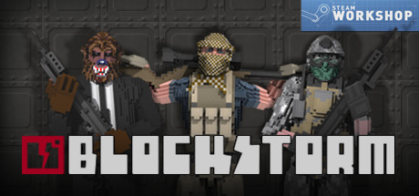
Blockstorm is a FPS game set in a world made of destructible blocks. All maps and characters included in the game are made with the same tools that are available to the public. You can build everything in Blockstorm, and you can destroy it.

Free to PlayMostly Positive(2,678)
ActionFPSMultiplayer
GhostSharkMay 21, 2015

Blockstorm scores 72/100 — better than 45% of Action capsules (n=8,734).

Mostly Positive (2,678 reviews) · Free to Play · Released May 21, 2015 · By GhostShark

Quick text summary

Blockstorm scored 72/100 on Steam Analyzer — Good for a Action capsule. Top priority fix: [genre_clarity] Integrate a visually distinctive block-destruction element into the composition—such as a character mid-construction or surrounded by fragmented building blocks—to communicate the unique building mechanic that differentiates Blockstorm from standard FPS games.

Capsule scores by dimension

  • Genre Clarity: 7/10 — FPS action clearly signaled. Pixelated characters holding visible firearms and explosives immediately communicate action-shooter gameplay. The block-based aesthetic and destructible environment hint at the unique building/destruction mechanic, though at TINY size the voxel art style reads as retro shooter first. Genre identity is strong but the destructible block uniqueness becomes secondary to standard FPS iconography.
  • Title Readability: 8/10 — Bold geometric logo reads well. BLOCKSTORM title uses thick white sans-serif lettering with a distinctive red square block icon on the left, creating strong contrast against the dark background. The logo maintains clarity at SMALL and TINY sizes due to geometric simplicity and high-contrast white-on-black positioning. The tag line 'NOW WITH WORKSHOP' is present but becomes illegible at TINY size, a minor issue.
  • Contrast & Color: 8/10 — Strong value separation throughout. White title text pops decisively against dark gray concrete background, and pixelated character silhouettes have distinct color blocking in tan, gray, red, and gold that separates cleanly from the dim background. Even at TINY size the light values and saturated character colors maintain edge definition. Dark background texture doesn't muddy the focal characters or logo.
  • Uniqueness & Polish: 6/10 — Competent but generic FPS presentation. The voxel-art character lineup with weapons is well-executed and cohesive, but reads as a standard 'team of soldiers' trope common in action games rather than communicating Blockstorm's core hook of destructible building and creative destruction. The capsule shows polish in craft but misses the opportunity to visually differentiate itself from conventional FPS marketing by emphasizing the block-building mechanic.
  • Brand Consistency: 7/10 — Consistent voxel style, recognizable identity. The pixelated aesthetic is uniform across characters, environment, and the red block icon logo, creating a cohesive blocky art direction that aligns with the game's destructible voxel world. The red square logo is a memorable brand marker that could be recognized in other contexts. However, the presentation doesn't communicate anything distinctly memorable about Blockstorm's unique gameplay versus other block or FPS games.
  • Composition: 7/10 — Balanced group layout with clear hierarchy. Three pixelated characters are centered and evenly spaced, creating a stable focal point that reads at all sizes. The logo anchors the top in the strongest real estate. Character positioning from left to right creates visual flow, and depth layering with background texture supports the subjects without competing. At TINY size, the group silhouette reads as a unified subject; however, the equal visual weight given to all three characters dilutes focus rather than emphasizing one protagonist.

What works

  • Bold title logo with red icon anchor. The BLOCKSTORM text with red square block creates a memorable, high-contrast identifier that remains legible across all sizes and establishes brand recognition.
  • Voxel art consistency and cohesion. Uniform pixelated style across characters, weapons, and environment creates a polished, intentional look that reflects the game's actual aesthetic.
  • Strong silhouette contrast at small sizes. Character lineup reads clearly even at TINY size due to saturated color blocking and distinct value separation from the dark background.

What hurts the capsule

  • Generic FPS squad template feel. The presentation doesn't visually communicate Blockstorm's unique selling point of destructible block-building gameplay, instead relying on familiar 'armed soldiers' trope.
  • Equal visual weight on three characters. All three pixelated figures compete for attention with similar sizing and saturation, weakening focal hierarchy and failing to establish a clear protagonist or visual anchor.
  • Workshop tagline becomes illegible at small size. The 'NOW WITH WORKSHOP' text is too small to read at SMALL and TINY sizes, adding clutter without communicating value.

Priority fixes

  1. [genre_clarity] Integrate a visually distinctive block-destruction element into the composition—such as a character mid-construction or surrounded by fragmented building blocks—to communicate the unique building mechanic that differentiates Blockstorm from standard FPS games.
  2. [composition] Establish clearer focal hierarchy by enlarging or repositioning the center character with cooler tones or lighting, while reducing the visual weight of side characters, to guide eye flow and create a stronger primary subject.
  3. [title_readability] Remove or redesign the 'NOW WITH WORKSHOP' tagline to be readable at SMALL size, or relocate it to avoid cramping the logo zone and maintain clean title presentation.

Store copy priority fixes

  1. [hook_strength] Rewrite the opening to lead with a gameplay hook: 'Blast through voxel fortresses, reshape maps on the fly, and battle in a world where every wall can crumble and every structure can be rebuilt.' This conveys action and emergent gameplay rather than just listing features.
  2. [feature_communication] Add 1–2 sentences after the mode list explaining why destruction and building matter tactically: 'Destroy enemy cover to expose them. Build fortifications to defend your flag. Master the environment, not just the weapons.' This turns mechanics into meaningful gameplay.
  3. [tone_match] Replace procedural phrases with active, engaged language: change 'The voxel nature of characters and maps and the in-game editor allows you to fully customize' to 'Create custom characters and maps with the same powerful editor we use. Then share them instantly with the community.' This feels more like a game, less like documentation.
  4. [uniqueness] Add a differentiating statement: 'Unlike games where destruction is cosmetic, every block you destroy or build changes the balance of power—there's no permanent map. Every match is tactically different.' This explains why the voxel destruction system matters more than in competitors.

Related guides

Steam app ID: 263060 · Tags: Action, FPS, Multiplayer, Shooter, Indie