Scoring genre clarity...
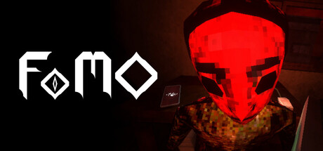
FoMO capsule

FoMO

FoMO is an experimental first-person horror with unpredictable mazes, a suffocating atmosphere, and a decaying retro look. No weapons, only escape, paranoia, and choices that accelerate the horror.

$9.495 user reviews
Psychological HorrorRetroPixel Graphics
Quantic Monkey StudioJul 21, 2025

FoMO scores 75/100 — better than 79% of Psychological Horror capsules (n=2,166).

5 user reviews · $9.49 · Released Jul 21, 2025 · By Quantic Monkey Studio

Quick text summary

FoMO scored 75/100 on Steam Analyzer — Good for a Psychological Horror capsule. Top priority fix: [genre_clarity] Incorporate a maze-like environmental detail or first-person perspective hint (e.g., jagged corridor edges, warped perspective lines) to differentiate from generic horror and clarify the experimental gameplay loop.

Capsule scores by dimension

  • Genre Clarity: 7/10 — Horror atmosphere clearly signaled. The glowing red skull mask and dark, ominous environment immediately communicate first-person horror vibes. At tiny size, the red skull reads as a strong horror icon, though the maze/escape gameplay isn't visually explicit—the retro decay and claustrophobic framing help reinforce the paranoia aspect, but genre specificity relies heavily on the threatening skull imagery rather than unique mechanical signifiers.
  • Title Readability: 8/10 — Strong geometric logo, readable at all sizes. The FoMO logo uses clean, geometric sans-serif letterforms with internal diamond and square motifs that remain legible even at tiny thumbnail size. The white-on-dark placement on the left side avoids competition with the busy skull on the right. At small size, the angular logo holds its shape well, though the internal geometric details begin to blur slightly at the smallest viewport—the overall word form stays intact and recognizable.
  • Contrast & Color: 8/10 — Excellent value separation and silhouette. The bright red skull and white logo create strong luminosity contrast against the dark burnt orange and black background. In grayscale simulation, the skull remains a clear light form and the logo stands out with high contrast. The warm dark background does not muddy the red—it actually enhances separation—and at tiny size the silhouette of the skull and white text both read crisply without blending into the Steam background color #1b2838.
  • Uniqueness & Polish: 7/10 — Distinctive retro horror aesthetic. The capsule commits to a cohesive retro-degraded aesthetic with the weathered skull texture and warm, desaturated color palette that feels intentional rather than generic. The geometric logo design is memorable and feels custom rather than templated. However, glowing red skulls are a familiar horror trope, and the composition doesn't clearly communicate the maze escape or paranoia mechanics—it reads as 'scary mask' without differentiating this from dozens of other indie horror titles that use similar imagery.
  • Brand Consistency: 7/10 — Cohesive retro palette and symbol. The capsule establishes a recognizable identity through the geometric FoMO logo, the red skull icon, and the warm desaturated brown-orange color grading. These elements feel intentional and would likely carry across marketing materials and in-game UI. Without access to the 13 store screenshots for direct reference, the internal logic of the capsule suggests a consistent visual language built around decay, geometry, and retro horror—though the skull alone is not uniquely branded compared to other horror games.
  • Composition: 8/10 — Clear dual focal points, balanced hierarchy. The logo anchors the left third, the skull dominates the right side, with the dark background creating visual separation between them rather than clutter. At small size, both elements read clearly without competing—the eye scans left to right naturally. The composition maintains safe margins and the skull, though positioned right of center, doesn't risk edge cropping on Steam's standard aspect ratio. Depth is implied by foreground skull and recessed background, creating a layered feel that reads well even at tiny size.

What works

  • High contrast white logo and red skull. Both key elements pop decisively against the dark warm background and hold legibility at tiny thumbnail size without any blending or loss of silhouette clarity.
  • Cohesive retro-horror visual identity. The geometric logo design, color palette, and degraded texture work together to establish a distinctive and intentional aesthetic that feels premium rather than generic.
  • Balanced composition with clear focal points. The left-anchored logo and right-positioned skull create a natural visual flow that doesn't overcrowd the frame and maintains readability across all viewing sizes.

What hurts the capsule

  • Generic horror skull imagery. The red glowing skull is a familiar horror cliché that doesn't clearly differentiate FoMO from other indie horror titles or communicate its unique maze-escape-paranoia gameplay.
  • Gameplay mechanics not visually apparent. Nothing in the composition hints at the experimental maze design, unpredictable choices, or first-person perspective—the capsule reads as atmosphere without conveying what makes this game mechanically distinct.
  • Limited narrative or thematic communication. The skull and decay suggest generic horror rather than the specific paranoia-driven, choice-heavy narrative experience described in the game's concept.

Priority fixes

  1. [genre_clarity] Incorporate a maze-like environmental detail or first-person perspective hint (e.g., jagged corridor edges, warped perspective lines) to differentiate from generic horror and clarify the experimental gameplay loop.
  2. [uniqueness_polish] Introduce a subtle visual motif or secondary element that hints at the paranoia or choice mechanic (e.g., branching paths, distorted logic symbols, corrupted UI elements) to elevate from 'scary skull' to 'psychological horror game'.
  3. [brand_consistency] Ensure the retro degradation effect and warm color palette remain consistent if secondary marketing materials use brighter or cleaner versions—lock the visual language to maintain identity.

Store copy priority fixes

  1. [uniqueness] Add a comparative statement such as 'Unlike traditional escape horror, every maze layout is randomized—no two playthroughs follow the same path' to explicitly differentiate from genre peers.
  2. [feature_communication] Expand the 'Focus on pursuit, evasion and hiding' line with one sentence explaining a specific hiding or evasion mechanic (e.g., 'use shadows or confined spaces to evade what's chasing you') to sharpen mechanical clarity.
  3. [hook_strength] Strengthen the short description by replacing 'decaying retro look' with a more specific sensory phrase like 'nauseating pixel-art distortion' to reinforce the atmosphere anchor mentioned in the detailed copy.

Related guides

Steam app ID: 2632690 · Tags: Psychological Horror, Retro, Pixel Graphics, Adventure, Dark