Scoring genre clarity...

Sancticide capsule

Sancticide

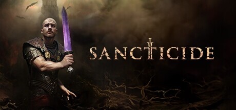
Sancticide is an Indie melee-focused TPP action RPG game set in the world of the biblical Apocalypse. Become Ezechiel, sin collector in the service of Them at The Top, as he ventures through what is left of our world during the End Times.

$11.99Mixed(55)
Action RPGActionRPG
Red Square Games, Sylen StudioMar 11, 2026

Sancticide scores 70/100 — better than 30% of Steam capsules we've analysed (n=22,658).

Mixed (55 reviews) · $11.99 · Released Mar 11, 2026 · By Red Square Games

Quick text summary

Sancticide scored 70/100 on Steam Analyzer — Good for a Steam capsule. Top priority fix: [uniqueness_polish] Introduce a distinctive environmental or symbolic element from the biblical apocalypse setting behind the warrior to differentiate from generic dark fantasy capsules.

Capsule scores by dimension

  • Genre Clarity: 8/10 — Dark melee action RPG clear. The central warrior figure in dark leather armor gripping a sword, combined with the smoky hellish background and bat silhouettes, immediately communicates dark fantasy melee combat. The biblical apocalypse theme is subtly reinforced by the cross motif embedded in the title lettering. At tiny size the armored sword-wielding figure still reads as an action RPG archetype, though the specific biblical setting is lost.
  • Title Readability: 7/10 — Legible at full, marginal at tiny. The title SANCTICIDE uses a clean serif display font with good letter spacing and sits on a darker region of the background, giving it reasonable contrast at full size. The cross integrated into the letter T is a clever identity detail visible at medium size. At tiny size the letterforms compress but the word remains broadly readable due to the high contrast light text against the dark background, though the T cross detail disappears entirely.
  • Contrast & Color: 7/10 — Strong value separation, muted palette. The warrior is lit from the left with a warm rim light that separates him clearly from the murky dark brown and grey background. In grayscale the figure holds a decent silhouette, particularly the sword and upper body profile against the lighter smoky haze on the right side. The overall palette is desaturated and dark which sits well on Steam's dark background, but the image has limited color pop and could blend slightly with dark capsule grids on quick scroll.
  • Uniqueness & Polish: 6/10 — Competent but genre-familiar execution. The photorealistic warrior with sword in a smoky hellscape is a well-worn formula seen across many dark fantasy action titles, and nothing in the composition gives a distinctive visual hook that separates it from similar entries. The craft is solid with convincing character rendering and moody atmosphere, but the cross T motif in the title is the only truly unique identity element. Compared to genre benchmarks like Lies of P or Hellblade II which have strong distinct visual concepts, this reads as competent but generic.
  • Brand Consistency: 7/10 — Cohesive dark tone, clear identity seed. The color palette, character rendering style, and dark apocalyptic atmosphere are internally consistent and suggest a unified art direction. The cross motif in the title and the warrior design together form a recognizable identity seed for the biblical apocalypse setting. The rendering style feels coherent with what one would expect from the game's described tone, though without seeing the character Ezechiel used consistently across marketing materials the identity anchor is not yet iconic.
  • Composition: 7/10 — Classic split layout, solid hierarchy. The composition uses a classic left character, right title split that is well-proven for capsule readability, with the warrior occupying the left half and the title text given clear breathing room on the right. The figure is well-cropped with the sword pointing inward toward the title, creating a natural eye path. At small size the hierarchy holds, though the dark lower third of the image adds some dead weight and the title could sit slightly higher to improve crop resilience at various Steam display sizes.

What works

  • Strong figure silhouette. The armored warrior with raised sword creates a clear readable silhouette that survives small and tiny scaling.
  • Cross motif in title. The cross integrated into the T of SANCTICIDE is a clever, on-brand detail that communicates the biblical theme at medium viewing sizes.
  • Effective light-dark separation. Warm rim lighting on the character against the cold dark background provides clean value contrast that holds in grayscale.
  • Clean title placement. The title sits on a controlled dark region with good letter spacing, avoiding the noisy texture problem common in the genre.

What hurts the capsule

  • Generic dark warrior formula. The photorealistic sword-wielding warrior in smoky darkness is visually indistinguishable from dozens of similar dark fantasy action capsules at a glance.
  • Limited color differentiation. The near-monochrome brown and grey palette gives the capsule low visual pop in a colorful Steam grid, risking it being scrolled past quickly.
  • Dead lower third. The bottom portion of the image is very dark with little compositional content, wasting prime real estate and adding visual weight without payoff.
  • No secondary genre or mechanic hook. Nothing in the image communicates the RPG depth or the biblical apocalypse setting uniquely enough to distinguish it from a pure hack-and-slash title.

Priority fixes

  1. [uniqueness_polish] Introduce a distinctive environmental or symbolic element from the biblical apocalypse setting behind the warrior to differentiate from generic dark fantasy capsules.
  2. [contrast_color] Add a subtle accent color such as a warm golden or deep red glow to the composition to increase visual pop against Steam's dark grid background.
  3. [composition] Raise the title text slightly higher and reduce the dark dead zone in the lower third by extending background detail or a subtle atmospheric element downward.
  4. [title_readability] Increase the weight or outline of the title lettering slightly so it holds contrast and legibility when compressed to tiny thumbnail size.

Store copy priority fixes

  1. [hook_strength] Rewrite the opening sentence to lead with a specific gameplay action or emotional hook—e.g., 'Wield sacred weapons and divine powers to judge sinners in a brutal apocalypse where death teaches and evolves your strategy' instead of defining it by genre labels.
  2. [feature_communication] Add a structured 3–4 bullet point list after the first paragraph that clearly explains: (1) Combat loop with weapons and Purple Powers, (2) Enemy types and boss encounters, (3) Progression and customization, (4) Permadeath learning mechanic and difficulty expectation.
  3. [uniqueness] Explicitly differentiate Sancticide's combat or progression from similar action RPGs—e.g., 'Unlike X, Sancticide's Purple Powers system allows you to [specific mechanic]' or 'Each run teaches you new enemy weaknesses, rewarding pattern recognition over reflexes.'
  4. [audience_targeting] Add a short sentence clarifying who should play this: e.g., 'Built for action RPG veterans and roguelike fans who thrive on mastering brutal combat through repeated runs' to filter expectations and attract the right audience.

Related guides

Steam app ID: 2635050