Scoring genre clarity...
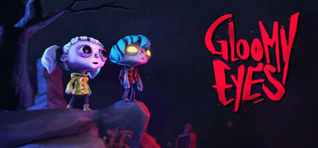
A cozy horror, “self-coop”, adventure about two unlikely souls who forge a forbidden bond and journey together to find the sun. Explore eerie yet charming Tim Burton-esque levels, switch between two unique characters, and solve brain-teasing puzzles.
$24.99Very Positive(149)
AdventurePuzzleMystery
Atlas V, Be Revolution Gaming, 3Dar, Fishing Cactus, ARTE FranceSep 12, 2025