Scoring genre clarity...

KILL KNIGHT capsule

KILL KNIGHT

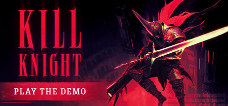
KILL KNIGHT is an ultra-responsive arcade-inspired isometric action shooter. Condemned to eternal sufferance, deep within the voids of an eldritch arena, you must wield an arsenal of devastating weaponry to obliterate swarms of otherworldly horrors - and MASTER THE DEMON WITHIN.

$7.49Very Positive(18)
StylizedBullet HellTop-Down Shooter
PlaySideOct 2, 2024

KILL KNIGHT scores 83/100 — better than 95% of Stylized capsules (n=3,516).

Very Positive (18 reviews) · $7.49 · Released Oct 2, 2024 · By PlaySide

Quick text summary

KILL KNIGHT scored 83/100 on Steam Analyzer — Good for a Stylized capsule. Top priority fix: [uniqueness_polish] Emphasize the isometric arcade-shooter mechanic more distinctly through UI hints or weapon detail that differentiates from standard action games

Capsule scores by dimension

  • Genre Clarity: 8/10 — Action shooter clearly telegraphed. The demonic armored character wielding a large glowing weapon on an isometric angle immediately signals action combat. Red neon lighting, aggressive pose, and otherworldly enemy design reinforce the arcade shooter identity. At tiny size, the silhouette and weapon remain distinct enough to read as action-focused, though specific subgenre nuance is lost.
  • Title Readability: 9/10 — Bold, legible title dominates. KILL KNIGHT uses a strong sans-serif uppercase typeface in bright red with tight letter spacing, positioned in the upper left with no competing background noise. The title maintains full readability at small and tiny sizes with excellent contrast against the dark background. The secondary CTA 'PLAY THE DEMO' in white is clearly readable but appropriately subordinate.
  • Contrast & Color: 9/10 — Vivid red-gold palette pops cleanly. The hot red and gold accent colors create strong value separation from the near-black background, with the glowing weapon and character silhouette cutting cleanly against darkness. At tiny size, the red title and bright weapon glow remain instantly visible and distinct. The warm-to-cool lighting creates clear silhouette separation without muddiness.
  • Uniqueness & Polish: 8/10 — Premium demonic action aesthetic. The isometric perspective, detailed demonic armor, and neon lighting treatment convey a polished, intentional art direction rather than generic action fare. The character design and weapon glow suggest high production quality and a distinct visual hook. However, the composition leans into familiar dark-action-with-red-lighting tropes seen in many contemporary action games, limiting novelty.
  • Brand Consistency: 8/10 — Cohesive demonic warrior identity. The capsule establishes a recognizable brand through the demonic protagonist in distinctive armor, the signature red-neon color palette, and the isometric combat framing. These elements are reinforced by game screenshots and promotional material, creating a memorable visual identity. The consistent use of eldritch horror themes and aggressive typography supports brand recognition across touchpoints.
  • Composition: 8/10 — Strong focal hierarchy with clear balance. The demonic character occupies center-right focus with the weapon creating a diagonal line that guides the eye, while the title anchors the left in a balanced asymmetrical layout. The 'PLAY THE DEMO' bar adds hierarchy without clutter. At small and tiny sizes, the character and title remain the clear focal points with appropriate negative space; no critical elements creep into crop margins.

What works

  • Excellent title contrast and permanence. Bright red uppercase sans-serif holds perfect readability from full size down to tiny thumbnail.
  • Cohesive color palette with strong identity. Red-gold-black combination creates premium feel and supports immediate brand recognition across the capsule.
  • Clear action genre signaling. Demonic armored figure with glowing weapon and aggressive isometric pose instantly communicates combat focus.
  • Balanced composition without clutter. Asymmetrical layout with title left, character center-right, and CTA bar avoids visual confusion at all viewing sizes.

What hurts the capsule

  • Limited visual novelty within genre. Dark-action-with-red-lighting aesthetic echoes common patterns in HELLDIVERS 2, Armored Core, and similar contemporary titles.
  • Secondary text legibility at tiny size. The small copyright/watermark text at bottom right becomes unreadable at thumbnail size, though this is a minor detail element.

Priority fixes

  1. [uniqueness_polish] Emphasize the isometric arcade-shooter mechanic more distinctly through UI hints or weapon detail that differentiates from standard action games
  2. [composition] Ensure weapon glow and character silhouette remain maximally distinct at 120x45px by testing saturation and edge definition at tiny scale

Store copy priority fixes

  1. [feature_communication] Add 1-2 specific weapon or ability examples in the detailed description (e.g., 'wield a plasma revolver that resets cooldowns on critical hits, or heavy rocket launcher that slows you but clears screens') to make resource-swapping tactically concrete.
  2. [uniqueness] Insert a sentence explicitly comparing or contrasting this game's mechanic to recognizable genre peers (e.g., 'Unlike traditional bullet hells, KILL KNIGHT rewards aggressive forward movement and executes over passive evasion') to sharpen differentiation.
  3. [hook_strength] Consider leading the short description with the immediate action verb and tone (e.g., 'Push into the Abyss as a reanimated knight, wielding a twisted arsenal to obliterate eldritch horrors—but beware the demon within') to front-load gameplay excitement before narrative flavor.
  4. [feature_communication] Clarify the Kill Power mechanic with a concrete example in the bullet list (e.g., 'Raise your Kill Power to progressively unlock attack speed and damage multipliers, resetting each run') rather than the current vague 'increasing speed and damage.'

Related guides

Steam app ID: 2694420 · Tags: Stylized, Bullet Hell, Top-Down Shooter, Arcade, Hack and Slash