Scoring genre clarity...

The Rogue Prince of Persia capsule

The Rogue Prince of Persia

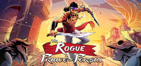
In this challenging, fast-paced roguelite, every death is a unique chance to rewrite fate, save Persia or die trying. Master fluid, acrobatic combat and parkour as you explore your kingdom to right your wrongs!

$8.99Very Positive(35)
RogueliteAction RoguelikeAction
Evil EmpireAug 20, 2025

The Rogue Prince of Persia scores 75/100 — better than 68% of Steam capsules we've analysed (n=22,658).

Very Positive (35 reviews) · $8.99 · Released Aug 20, 2025 · By Evil Empire

Quick text summary

The Rogue Prince of Persia scored 75/100 on Steam Analyzer — Good for a Steam capsule. Top priority fix: [title_readability] Switch to a bold sans-serif or slightly thicker outline on the serif font to improve legibility at TINY thumbnail size while maintaining the ornate aesthetic.

Capsule scores by dimension

  • Genre Clarity: 8/10 — Action roguelite with parkour combat. The dynamic pose of the protagonist mid-leap with weapon drawn immediately signals acrobatic action gameplay. The ornate Persian architecture and warm golden lighting establish the fantastical action-adventure setting. At TINY size, the character silhouette and weapon remain readable, clearly communicating fast-paced combat over puzzle or strategy mechanics.
  • Title Readability: 7/10 — Title readable at full, minor issues tiny. The 'Rogue Prince of Persia' text uses a bold red banner shape with white serif lettering that contrasts well against the warm background at full size. At TINY size, the overall title shape remains recognizable but individual letters become less crisp, and the subtitle 'Rogue Prince' loses clarity due to the serif font weight reduction at scale.
  • Contrast & Color: 8/10 — Strong warm-to-dark value separation. The golden-yellow lighting on the protagonist and surrounding architecture creates excellent contrast against the dark blue-purple sky and darker building silhouettes. The warm orange-gold gradient in the upper portion pops distinctly against the Steam dark background, and the character's red garments reinforce the focal point through saturated warm tones.
  • Uniqueness & Polish: 7/10 — Polished illustrated style, solid execution. The capsule demonstrates clean digital illustration work with intentional lighting, fluid character anatomy in mid-action, and cohesive color grading that feels premium and intentional. The acrobatic mid-jump pose communicates the parkour mechanic clearly without feeling like a generic fantasy warrior scene, though the overall composition follows familiar action game conventions seen in comparable titles.
  • Brand Consistency: 7/10 — Consistent art style, recognizable IP. The capsule maintains the ornate Persian visual identity with architectural details, warm golden color palette, and the distinctive character design that aligns with Prince of Persia franchise expectations. The red banner treatment and serif typography create recognizable branding elements, though without unique iconic motifs beyond the established IP, the internal identity signals are solid but not uniquely memorable.
  • Composition: 8/10 — Strong focal hierarchy, balanced layout. The protagonist leaping toward the upper-center creates a clear primary focus, while flanking enemy silhouettes and architectural elements provide secondary support without competing for attention. The title banner sits strategically in the mid-lower region without obscuring the character, and the composition maintains visual balance across the full header—the layout remains coherent at SMALL size with only minor element softening.

What works

  • Dynamic action pose communicates parkour gameplay. The mid-leap acrobatic silhouette immediately signals fluid movement and combat action, differentiating the roguelite mechanic visually from static or turn-based competitors.
  • Warm golden lighting creates premium visual polish. The intentional backlighting and golden color grading give the capsule a cohesive, high-production-value appearance that stands out in the action genre.
  • Title placement avoids cluttering focal point. The red banner title sits in the lower portion without obscuring the protagonist, maintaining clear visual hierarchy and allowing the character to dominate the composition.
  • Strong contrast against Steam dark background. The warm orange-gold tones and saturated reds create excellent value separation from the #1b2838 background, ensuring visual pop in quick-scroll discovery.

What hurts the capsule

  • Serif font loses legibility at TINY size. The decorative serif typeface in the title becomes fuzzy and harder to parse when the capsule scales down to thumbnail dimensions, reducing text clarity at the most critical discovery moment.
  • Generic action composition follows expected pattern. While well-executed, the centered hero-leap pose with flanking enemies follows a familiar template seen across many action game capsules, limiting distinctive visual identity.
  • Subtitle tagline barely readable at small scale. The 'Rogue Prince of Persia' secondary text loses definition at SMALL size, and context about the roguelite mechanic is not visually reinforced beyond the title treatment.

Priority fixes

  1. [title_readability] Switch to a bold sans-serif or slightly thicker outline on the serif font to improve legibility at TINY thumbnail size while maintaining the ornate aesthetic.
  2. [uniqueness_polish] Add a subtle iconic visual element or distinctive color accent (such as a roguelite mechanic symbol or Persia-specific motif) to increase memorability beyond standard action game tropes.
  3. [composition] Ensure the red banner title maintains minimum safe margins from the left and right edges to account for Steam cropping on narrower display ratios.

Store copy priority fixes

  1. [uniqueness] Add a sentence explaining what makes this game's parkour-combat fusion or acrobatic system mechanically distinct from other action roguelikes (e.g., 'chain wall-runs into combo finishers for reward multipliers').
  2. [feature_communication] Expand the exploration section to clarify what players discover and how it impacts builds or story (e.g., 'unlock new weapon types,' 'unlock story branching paths,' or 'gain passive perks').
  3. [audience_targeting] Add a sentence signaling difficulty positioning and intended audience, such as 'designed for players seeking skill-based replayability' or note accessibility/difficulty modifiers upfront.
  4. [feature_communication] Explain the metaprogression system explicitly: what unlocks persist between runs, and how it encourages long-term engagement beyond cosmetics.

Related guides

Steam app ID: 2717880