Scoring genre clarity...

Star Birds capsule

Star Birds

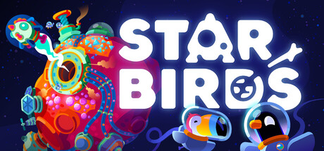
Star Birds is a chill factory building and resource management game. Mine asteroids and create brain-twisting production networks. Level by level, you guide your feathered crew to new interstellar horizons!

$15.99Very Positive(186)
Early AccessResource ManagementBase Building
Toukana InteractiveSep 10, 2025

Star Birds scores 68/100 — better than 19% of Steam capsules we've analysed (n=22,658).

Very Positive (186 reviews) · $15.99 · Released Sep 10, 2025 · By Toukana Interactive

Quick text summary

Star Birds scored 68/100 on Steam Analyzer — Solid for a Steam capsule. Top priority fix: [genre_clarity] Incorporate a subtle visual hint of factory or production mechanics — such as conveyor belts, resource nodes, or a network of pipes — integrated into the alien structure to communicate the simulation/strategy genre at a glance.

Capsule scores by dimension

  • Genre Clarity: 5/10 — Cute space theme, genre ambiguous. The colorful alien structure on the left hints at building or construction mechanics, and the bird characters in space suits suggest a sci-fi casual game. However, at tiny size the factory/resource management genre is not communicated clearly — it reads more like a casual platformer or adventure game. The production network angle is entirely absent from the visual.
  • Title Readability: 8/10 — Bold white title reads well. The large white rounded lettering for STAR BIRDS sits on a clean dark space background with good contrast, making it readable at small and even tiny sizes. The playful logo integration of a bird silhouette inside the 'O' of STAR and a star replacing a letter adds charm without hurting legibility. At tiny size the two-line stacked layout keeps the words recognizable even if fine decorative details are lost.
  • Contrast & Color: 7/10 — Warm pops against dark space bg. The bright orange and multicolor alien structure on the left contrasts well against the dark navy-purple space background, creating good separation. The white title text pops strongly. At tiny size the two small bird characters on the right side lose definition and merge somewhat into the background due to their smaller scale and cooler tones blending with the dark bg.
  • Uniqueness & Polish: 7/10 — Charming art style, somewhat generic. The colorful, cartoony bird characters and the vibrant alien asteroid structure have genuine personality and a cohesive illustration style that feels handcrafted. However, the overall composition of 'cute characters in space' is a well-trodden visual territory and doesn't strongly communicate the factory-building hook that sets this game apart. The craft is solid but the unique selling point is not visually surfaced.
  • Brand Consistency: 7/10 — Cohesive palette and character style. The warm saturated palette, rounded character designs, and playful hand-drawn aesthetic feel internally consistent and suggest a lighthearted tone that aligns with the chill casual genre. The bird mascots are distinctive enough to serve as recurring brand icons. The color language of warm orange structures against cool space backgrounds feels like a deliberate and repeatable identity choice.
  • Composition: 7/10 — Good balance, weak focal hierarchy. The layout divides naturally into the alien structure on the left, the large title in the center-right, and two small bird characters in the lower right, creating a reasonable left-to-right flow. However there is no single dominant focal point — the large title and the colorful structure compete for attention. At small and tiny sizes the two small birds in the lower right corner become nearly invisible and add visual noise without contributing meaningfully.

What works

  • Strong title legibility. The large white stacked STAR BIRDS lettering reads clearly even at tiny thumbnail sizes due to high contrast against the dark space background.
  • Distinctive character design. The bird astronaut mascots and vibrant alien structure give the capsule a memorable and charming personality that stands out from generic space-themed games.
  • Warm-cool color contrast. The hot orange and pink tones of the alien asteroid structure pop vibrantly against the dark navy space background, ensuring the image doesn't feel flat.
  • Cohesive playful tone. The rounded fonts, saturated palette, and cartoon illustration style all reinforce a consistent chill and casual brand identity.

What hurts the capsule

  • Genre completely hidden. Nothing in the visual communicates factory building, resource management, or production networks — the core gameplay hook is entirely absent at any viewing size.
  • Small birds disappear at tiny size. The two bird characters in the lower right are too small and too low-contrast to read at tiny thumbnail size, wasting compositional real estate.
  • No dominant focal point. The large colorful structure and the large title text compete equally for attention without a clear visual hierarchy guiding the eye.
  • Generic cute-space aesthetic. Despite solid craft, the overall visual language of cute characters in a colorful space setting is well-worn and doesn't surface a unique selling point.

Priority fixes

  1. [genre_clarity] Incorporate a subtle visual hint of factory or production mechanics — such as conveyor belts, resource nodes, or a network of pipes — integrated into the alien structure to communicate the simulation/strategy genre at a glance.
  2. [composition] Increase the size of at least one bird character to make it a clear secondary focal point that competes less with the structure and more with the title, improving hierarchy at small sizes.
  3. [uniqueness_polish] Emphasize the factory-building angle in the visual storytelling by showing birds actively working on or inside a more machine-like structure, differentiating it from generic casual space games.
  4. [contrast_color] Boost the contrast and saturation of the right-side bird characters so they remain visible and contribute positively to the composition at tiny thumbnail size.

Store copy priority fixes

  1. [hook_strength] Rewrite the short description opening to lead with a unique selling point or emotional hook beyond 'chill factory building'—e.g., 'Mine asteroids in a living kurzgesagt universe' or emphasize the story mystery element to create curiosity.
  2. [uniqueness] Add one sentence in the detailed description that explicitly differentiates Star Birds from other factory builders (e.g., 'Unlike traditional factory sims, every asteroid is a self-contained puzzle with its own shape and environmental hazards').
  3. [feature_communication] Replace or follow the 'Early Access Roadmap' header with actual upcoming content, or remove it entirely if no roadmap exists, to avoid confusion about the game's development phase.

Related guides

Steam app ID: 2719750