Scoring genre clarity...

Tralalero Tralala : Survive the night capsule

Tralalero Tralala : Survive the night

An asymmetric horror game where four survivors try to escape an Italian monster-maniac by solving puzzles and completing tasks. Repair the Bombardiro Crocodilo and run!

$7.99Mostly Negative(10)
HorrorRealisticAction
Axel`sGunsJul 1, 2025

Tralalero Tralala : Survive the night scores 60/100 — better than 0% of Horror capsules (n=3,118).

Mostly Negative (10 reviews) · $7.99 · Released Jul 1, 2025 · By Axel`sGuns

Quick text summary

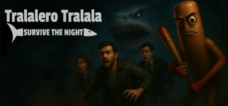
Tralalero Tralala : Survive the night scored 60/100 on Steam Analyzer — Solid for a Horror capsule. Top priority fix: [title_readability] Enlarge or reposition the 'SURVIVE THE NIGHT' tagline to ensure legibility at small capsule size, or replace with a more compact secondary text.

Capsule scores by dimension

  • Genre Clarity: 7/10 — Horror survival asymmetric gameplay clear. The image communicates horror and survival through dark atmosphere, menacing character poses, and the antagonist figure with a weapon on the right. At tiny size, the group of cowering figures contrasted against the aggressive right-side character reads as survival horror, though the specific asymmetric multiplayer mechanic is not visually obvious. The tagline 'SURVIVE THE NIGHT' reinforces the genre intent effectively.
  • Title Readability: 6/10 — Title readable full size, tagline compressed. The main title 'Tralalero Tralala' is clearly legible at full header size in white sans-serif with good contrast. However, the tagline 'SURVIVE THE NIGHT' is considerably smaller and placed below in a secondary position; at tiny thumbnail size (120x45), both text elements compress and the tagline becomes difficult to parse. The distinctive game title remains the strongest text anchor.
  • Contrast & Color: 7/10 — Strong dark separation with warm accents. The image leverages a dark teal-black background that provides excellent separation from the warm orange-brown tones of the antagonist character on the right and the cooler skin tones of the survivors. The silhouettes of the four figures read clearly against the background even at small size, though the mid-tone clothing on the survivors blends slightly into the shadow. The antagonist's warm color palette pops distinctly.
  • Uniqueness & Polish: 5/10 — Competent execution, generic horror tropes. The image presents a well-lit, professionally rendered scene with convincing character models and atmospheric lighting. However, the composition—cowering survivors facing off against a larger antagonist—is a familiar horror game trope without a distinctive visual hook or narrative moment that sets it apart. The rendering is solid but the visual storytelling feels derivative of established survival horror conventions.
  • Brand Consistency: 5/10 — No memorable identity or signature motif. The capsule shows realistic character rendering with standard horror styling but lacks any distinctive brand cues, iconic character design, or recognizable visual language that could serve as brand identity. The title 'Tralalero Tralala' suggests a unique cultural or comedic angle, but the grim horror aesthetic does not visually reinforce this personality or create a memorable identity signature. Without additional context from other promotional assets, the game feels generically horror-coded.
  • Composition: 6/10 — Clear focal point, unbalanced visual weight. The composition features a clear primary focal point: the antagonist with weapon dominating the right side creates strong visual hierarchy and guides the eye. The four survivors clustered on the left provide context but read as secondary elements. However, the layout creates an imbalanced composition with heavy weight on the right and relative emptiness on the left; the title placement in the upper left competes for attention. At tiny size the grouping still reads clearly but the asymmetry becomes more apparent.

What works

  • Strong atmospheric lighting and silhouettes. The dark background combined with warm-toned antagonist and cool-toned survivors creates clear visual separation that remains readable even at small thumbnail size.
  • Clear main title legibility at full size. The distinctive 'Tralalero Tralala' title in white sans-serif maintains excellent contrast and readability at the header image scale with clean letterforms.
  • Unambiguous threat-versus-survival framing. The visual composition of cowering figures opposite an aggressive antagonist immediately communicates the core survival horror premise without text dependency.

What hurts the capsule

  • Tagline illegible at tiny thumbnail size. The 'SURVIVE THE NIGHT' text becomes unreadable at 120x45 pixel scale, losing secondary communication that clarifies the night survival mechanic.
  • Generic horror aesthetic without unique identity. The realistic dark horror styling and cowering-survivors pose follow standard genre conventions with no distinctive visual elements that suggest the game's comedic Italian monster or puzzle-solving mechanics.
  • Unbalanced composition with empty left space. The majority of visual weight concentrates on the right-side antagonist, leaving the left third of the composition relatively sparse and creating asymmetrical visual tension that feels unintentional rather than dynamic.
  • No visible brand identity or iconic motif. The capsule lacks distinctive character design, color palette signature, or visual symbols that could function as recognizable brand markers across multiple promotional materials.

Priority fixes

  1. [title_readability] Enlarge or reposition the 'SURVIVE THE NIGHT' tagline to ensure legibility at small capsule size, or replace with a more compact secondary text.
  2. [uniqueness_polish] Incorporate a distinctive visual element that hints at the game's unique mechanics (puzzle-solving, Italian monster character, or Bombardiro Crocodilo repair objective) rather than relying on generic survival horror tropes.
  3. [composition] Rebalance the left side of the image to create more intentional depth layering or add environmental detail that fills the empty space and creates visual coherence, reducing the one-sided weight distribution.
  4. [brand_consistency] Develop a signature color accent, character design quirk, or repeating visual motif that establishes immediate brand recognition and differentiates from standard horror game aesthetics.

Store copy priority fixes

  1. [hook_strength] Rewrite the short description to lead with emotional stakes: 'Four friends must solve nightmarish puzzles and escape a relentless Italian monster-maniac hunting them in the dark—or become its next victim.' This adds dread and stakes.
  2. [feature_communication] Add a 1-2 sentence explanation of core quest types: 'Survivors repair generators, unlock safe rooms, and collect keys scattered across maps while the maniac closes in—every action risks exposure.' This clarifies the actual gameplay loop.
  3. [tone_match] Decide if the game leans whimsical-darkly-comic or genuinely terrifying, then either amplify the Italian folklore horror atmosphere or downplay Psychological Horror from tags to match the playful creature names.
  4. [audience_targeting] Specify whether this is competitive-focused multiplayer-only, if it supports casual/new players, and whether team communication is required—this signals who should buy.

Related guides

Steam app ID: 2733710 · Tags: Horror, Realistic, Action, Immersive Sim, Zombies