Scoring genre clarity...

Hotline Miami 2: Wrong Number capsule

Hotline Miami 2: Wrong Number

Hotline Miami 2: Wrong Number is the brutal conclusion to the Hotline Miami saga, set against a backdrop of escalating violence and retribution over spilled blood in the original game.

$2.24Very Positive(758)
Great SoundtrackGorePixel Graphics
Dennaton GamesMar 10, 2015

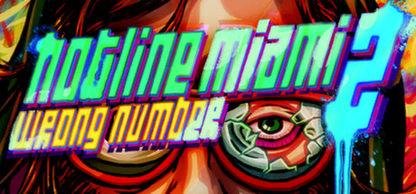
Hotline Miami 2: Wrong Number scores 88/100 — better than 86% of Great Soundtrack capsules (n=126).

Very Positive (758 reviews) · $2.24 · Released Mar 10, 2015 · By Dennaton Games

Quick text summary

Hotline Miami 2: Wrong Number scored 88/100 on Steam Analyzer — Excellent for a Great Soundtrack capsule. Top priority fix: [title_readability] Add subtle outline or shadow to 'WRONG NUMBER' text to improve legibility at thumbnail sizes without adding visual noise

Capsule scores by dimension

  • Genre Clarity: 9/10 — Unmistakable violent indie action. The character's distressed facial expression, oversized red glasses with disturbing eye imagery, psychedelic violent color palette (hot reds, oranges, sickly greens), and aggressive hand positioning immediately communicate brutal action. At tiny size, the distinctive character silhouette and chaotic neon-meets-analog aesthetic remain unmistakable as indie action violence.
  • Title Readability: 8/10 — Bright neon title, mostly legible. The cyan and yellow neon 'HOTLINE MIAMI 2' text pops strongly against the dark background and maintains readability even at small size due to high saturation and clear letterforms. The secondary tagline 'WRONG NUMBER' in yellow is readable at full size but loses some clarity at tiny size due to reduced scale and slight text overlap with effects.
  • Contrast & Color: 9/10 — Extreme contrast, vibrant separation. The neon cyan and hot yellow titles create exceptional value separation against the dark Steam background. The character's saturated warm skin tones, red glasses, and violent orange-red flames in the background all read distinctly even in grayscale due to strong tonal variation and no muddy mid-tone blending.
  • Uniqueness & Polish: 9/10 — Distinctive stylized violence aesthetic. The character design, distorted eye imagery in the glasses, hand-drawn expressionistic style, and cohesive neon-over-chaos visual treatment feel premium and intentional rather than generic. The capsule communicates the game's signature surreal brutality and counterculture identity without relying on common action game tropes.
  • Brand Consistency: 9/10 — Strong recognizable identity marks. The oversized red glasses, disturbing eye-in-glass motif, psychedelic violence color scheme, and neon typography are iconic to Hotline Miami 2's visual identity. These elements are consistent across the known store screenshots and create a memorable brand signature that stands apart from other action titles.
  • Composition: 9/10 — Clear focal point, excellent hierarchy. The character's face dominates the center with strong eye-draw to the red glasses and intense stare, while the neon title floats cleanly in the lower-center without competing for attention. The title maintains safe margins and the background chaos supports rather than overwhelms the character; at tiny size, the focal hierarchy remains intact.

What works

  • Iconic character and visual motif. The red glasses with disturbing eye imagery are instantly recognizable and differentiate this capsule from generic action games.
  • Exceptional color contrast and pop. Neon cyan and yellow title text achieve maximum separation against the dark Steam background and maintain readability at all sizes.
  • Coherent art direction and atmosphere. The hand-drawn expressionistic style, psychedelic color palette, and violent mood communicate the game's unique identity in a single glance.
  • Strong composition hierarchy. Character occupies clear focal point with title positioned to support rather than compete, creating balanced visual flow at all viewing scales.

What hurts the capsule

  • Secondary tagline clarity at tiny size. The 'WRONG NUMBER' subtitle becomes harder to parse at very small scales due to reduced vertical space and text proximity to effects.
  • Potential edge cropping risk. The character's hair and background flames extend close to frame edges and may be slightly cropped on some Steam display contexts.

Priority fixes

  1. [title_readability] Add subtle outline or shadow to 'WRONG NUMBER' text to improve legibility at thumbnail sizes without adding visual noise
  2. [composition] Ensure critical character elements and title text maintain at least 10-15px margin from all frame edges to prevent cropping across Steam layouts

Store copy priority fixes

  1. [hook_strength] Rewrite the short description to lead with the core action verb and difficulty: 'Hotline Miami 2: Wrong Number is a brutal top-down action game where precise, violent combat meets narrative consequence. Play as multiple factions in a neon-soaked revenge story where every kill feeds into escalating retribution.'
  2. [feature_communication] Clarify the moment-to-moment gameplay loop after 'Blistering combat' line: add '—clear rooms using melee, firearms, and environmental kills, learning enemy patterns and mastering timing' to ground abstract language.
  3. [uniqueness] Add a sentence in the opening or Features section that explicitly contrasts this sequel: 'Hotline Miami 2 expands the formula with multiple playable perspectives, dynamic weapon variety, and environmental puzzle-combat that force new strategies each mission.'
  4. [audience_targeting] Include a note on difficulty/learning curve, e.g., 'This is a challenging game demanding precision and pattern recognition; prepare for frequent deaths and intense focus sessions' to set player expectations early.

Related guides

Steam app ID: 274170 · Tags: Great Soundtrack, Gore, Pixel Graphics, Violent, Action