Scoring genre clarity...

Knightborn capsule

Knightborn

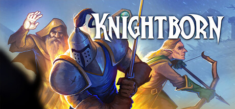
Knightborn is a multiplayer RPG offering bite-sized adventures with classic MMORPG feel. Choose from 4 classes, explore maps solo or with friends, and enjoy straightforward gameplay without grinding and experience dynamic quests in nostalgic 3D graphics.

Early AccessHack and SlashCasual
Lunar ClanTo be announced

Knightborn scores 70/100 — better than 30% of Steam capsules we've analysed (n=22,658).

Released To be announced · By Lunar Clan

Quick text summary

Knightborn scored 70/100 on Steam Analyzer — Good for a Steam capsule. Top priority fix: [uniqueness_polish] Add a distinctive narrative moment or environmental detail (e.g., landmark, special effect, or signature prop) that visually communicates Knightborn's unique hook and breaks from generic RPG templates.

Capsule scores by dimension

  • Genre Clarity: 8/10 — RPG class selection clearly communicated. Three distinct fantasy character archetypes (wizard, knight, archer) are immediately visible at full size, with classic RPG silhouettes and equipment that reads as multiplayer fantasy adventure. At TINY size, the blue-armored central figure and diverse character poses still convey RPG class identity, though specific subclass details fade. The nostalgic 3D art style and character grouping effectively signal the casual RPG and multiplayer intent without confusion.
  • Title Readability: 8/10 — Bold white title stands readable. KNIGHTBORN uses a strong white serif font with dark outline placed on a clean sky background, providing excellent contrast against the Steam dark background. The title remains legible at SMALL size with minor serifs intact. At TINY size the word still reads as a cohesive block, though fine serifs degrade slightly—acceptable for the scale given the strong outline and position above character clutter.
  • Contrast & Color: 7/10 — Warm gold tones separate well overall. The characters are rendered with warm orange and gold accents (torch glow, hair highlights, armor shine) that pop against the cool blue sky and dark Steam background. Silhouettes of the three figures remain distinct even with squinting. The value separation between foreground characters and sky is clear, though the mid-ground figure blends slightly into the blue backdrop and some fine lighting detail on armor edges softens in grayscale conversion.
  • Uniqueness & Polish: 6/10 — Competent 3D render, generic positioning. The 3D character models are well-lit with professional shading and clear material definition, showing solid technical craft. However, the composition—three characters in a row against sky—follows a very familiar RPG capsule template seen in many casual MMORPGs and indie fantasy titles. The scene communicates competence but lacks a distinctive visual hook or memorable narrative moment that would elevate it beyond functional industry standard.
  • Brand Consistency: 6/10 — Consistent art style, no iconic anchor. The rendering style is internally cohesive with matching lighting, color temperature, and 3D asset quality across all three characters. The palette of blue armor, gold accents, and sky backdrop is harmonious. However, there are no signature visual motifs, character archetypes, or memorable color combinations unique to Knightborn—the aesthetic could apply to dozens of similar fantasy RPGs, limiting recognition and brand memorability across future marketing touchpoints.
  • Composition: 7/10 — Clear focal point, balanced layout. The blue-armored knight in center-left dominates the hierarchy, with the wizard and archer flanking to create symmetrical balance and guide the eye left-to-right. Title placement above characters is clean and uncluttered. At SMALL and TINY sizes the three-figure grouping remains readable as a unit with the wizard's staff and archer's bow providing silhouette distinctness. Safe margins are generally respected, though the far-right archer sits close to edge and may crop tightly on some Steam displays.

What works

  • Strong title contrast and legibility. White serif font with dark outline on sky background maintains readability from FULL down to TINY size, ensuring the game name is never lost in quick scrolling.
  • Clear RPG class visual identity. Three distinct character archetypes (armored warrior, mage, archer) instantly communicate multiplayer RPG gameplay and party composition without text.
  • Professional 3D rendering craft. Models, lighting, and material shaders show solid technical quality with warm glows and defined silhouettes that separate well from the sky backdrop.

What hurts the capsule

  • Generic template composition. Three characters lined up against a sky is an overused capsule pattern in indie RPGs, offering no distinctive visual hook or unique selling point that breaks from category norms.
  • No iconic brand anchor. The art style and palette lack a signature motif or memorable character that could serve as a recognizable brand symbol across marketing materials and sequels.
  • Edge-hugging archer figure. The far-right archer sits dangerously close to the capsule edge and risks cropping on some Steam layout displays or thumbnail views.

Priority fixes

  1. [uniqueness_polish] Add a distinctive narrative moment or environmental detail (e.g., landmark, special effect, or signature prop) that visually communicates Knightborn's unique hook and breaks from generic RPG templates.
  2. [brand_consistency] Introduce or emphasize one signature visual motif, color accent, or character silhouette that becomes iconic to Knightborn and remains consistent across all marketing assets.
  3. [composition] Reposition the right-side archer further from the edge margin to eliminate cropping risk and improve Safe Zone compliance across all Steam viewport sizes.

Store copy priority fixes

  1. [hook_strength] Rewrite the short description to open with a concrete gameplay verb (e.g., 'Defend towers and battle in PvP arenas') before pivoting to the time-friendly value prop, rather than leading with 'Knightborn is.'
  2. [feature_communication] Complete the 'Rewarding missions...' sentence and add 1–2 specific examples of how dialogue choices affect NPC reactions and story outcomes, replacing vague 'dynamic' language.
  3. [tone_match] Replace 'shaped within an easily understandable framework' and similar corporate phrases with conversational language consistent with the 'love letter' opening (e.g., 'We kept the stats simple so you can focus on fun, not spreadsheets').
  4. [uniqueness] Add a sentence articulating what mechanic or design choice is genuinely novel—e.g., if procedural quest generation, scaling difficulty, or faction systems are present, highlight one as a concrete selling point.

Related guides

Steam app ID: 2748030