Inn Tycoon scores 77/100 — better than 66% of Management capsules (n=1,996).

Quick text summary

Inn Tycoon scored 77/100 on Steam Analyzer — Good for a Management capsule. Top priority fix: [uniqueness_polish] Add a distinctive visual hook or signature element (unique character design trait, branded furniture detail, or iconic motif) that signals Inn Tycoon specifically rather than generic hospitality management.

Capsule scores by dimension

  • Genre Clarity: 8/10 — Clear management sim signals. The capsule immediately communicates a hospitality/management game through the cozy inn interior setting, NPC character in service attire, and warm ambient lighting that suggests a business simulation. At tiny size, the indoor setting and character silhouette still read as management-focused rather than action or narrative-driven, though the specific 'inn' subgenre requires the title to fully clarify.
  • Title Readability: 9/10 — Excellent legibility at all sizes. The bold, gold serif 'INN TYCOON' title uses strong contrast against the warm interior background and maintains excellent clarity from full header down to tiny thumbnail sizes. The letterforms are large, well-spaced, and the outline/shadow effect prevents any collapse or blur even under squint testing, making it one of the strongest title treatments in the casual sim genre.
  • Contrast & Color: 8/10 — Warm palette pops effectively. The golden-yellow title and warm orange-brown interior tones create strong value separation against both the Steam dark background and the cooler tones of the inn's architectural details. The character's bright reddish-orange hair provides an additional focal point, and grayscale testing shows adequate silhouette separation, though some mid-tone interior elements could be slightly more defined.
  • Uniqueness & Polish: 7/10 — Polished but familiar template. The capsule demonstrates solid craft with clean lighting, well-rendered character model, and coherent art style that matches modern casual sims like House Flipper 2 and Go-Go Town. However, the composition follows a conventional 'character in setting' template without a distinctive hook or unique visual storytelling element that would elevate it to premium distinction—it feels competent rather than memorable.
  • Brand Consistency: 6/10 — Adequate but generic branding. The warm, welcoming interior aesthetic and character-driven approach are consistent with the game's hospitality theme, but there are no distinctive visual motifs, signature color palette elements, or iconic symbols that would create brand recognition across other marketing materials. The capsule relies on the setting and title rather than a memorable identity cue.
  • Composition: 8/10 — Strong hierarchy with clear focal point. The layout uses clear depth layering with the inn interior as background, the character positioned in the right-center midground, and the title dominating the left upper area without competing for attention. The composition reads well at small and tiny sizes with the character and title providing two complementary focal anchors, though some mid-ground architectural elements create minor visual noise in the center.

What works

  • Title legibility across all sizes. Bold serif 'INN TYCOON' maintains perfect readability from full header to tiny thumbnail without any collapse or blurring, with excellent contrast against the warm background.
  • Genre communication through setting. The cozy inn interior, ambient lighting, and NPC character in service attire immediately signal a management/hospitality simulation without ambiguity.
  • Warm color palette cohesion. Golden title, orange-brown interior, and character's bright hair create a harmonious warm palette that evokes hospitality and comfort while popping against the Steam dark background.
  • Clear visual hierarchy. Title and character anchor the composition effectively without competing, with the character positioned to guide eye movement and support rather than distract from the title.

What hurts the capsule

  • Generic template execution. The 'character in setting' composition follows a familiar casual sim template seen in House Flipper 2, Go-Go Town, and similar titles, lacking a distinctive hook or unique visual storytelling element.
  • Weak brand identity signals. No iconic character, motif, symbol, or signature visual element that would create memorable brand recognition or differentiation from other hospitality management games.
  • Mid-ground visual clutter. Architectural details in the interior create some competing visual interest in the center-background area that slightly dilutes focus at small sizes, though not severe.

Priority fixes

  1. [uniqueness_polish] Add a distinctive visual hook or signature element (unique character design trait, branded furniture detail, or iconic motif) that signals Inn Tycoon specifically rather than generic hospitality management.
  2. [brand_consistency] Establish a recognizable visual identity through a consistent color accent or iconic symbol that could appear across marketing materials and store screenshots for brand recall.
  3. [composition] Consider simplifying or softening the mid-ground architecture details to further strengthen the character and title as the primary focal points and reduce visual competition at small sizes.

Store copy priority fixes

  1. [uniqueness] Add a sentence explaining what makes Inn Tycoon distinct—e.g., 'Dynamic weather affects guest mood and demand,' or 'Festival events unlock new revenue streams and staff rewards,' giving a concrete reason to choose this over other management sims.
  2. [feature_communication] Expand the economic loop: explain how profits are earned, how staff wages scale with reputation, and how furniture/room upgrades directly boost guest satisfaction and tips.
  3. [hook_strength] Replace '
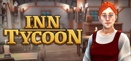
Welcome to Inn Tycoon! Build, design, and manage your dream inn' with a more evocative opening that leads with an emotional or curiosity hook, e.g., 'Transform a ramshackle tavern into a legendary medieval inn where every guest's story becomes your legend.'
  4. [audience_targeting] Add a sentence highlighting family-friendly, controller-friendly, and relaxation-focused accessibility—e.g., 'Perfect for cozy gaming sessions with full controller support and no time pressure or combat.'

Related guides

Steam app ID: 2749000 · Tags: Management, Medieval, Simulation, Building, Cozy