Scoring genre clarity...

SCP capsule

SCP

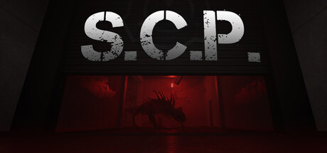
Infiltrate breached SCP facilities in this tactical co-op horror extraction shooter. Survive surreal anomalies, recover forbidden intel, and escape.. or lose everything. The deeper you go, the stranger and deadlier it gets.

Free to Play
Extraction ShooterMultiplayerLooter Shooter
Adrastea GamesComing soon

SCP scores 70/100 — better than 30% of Steam capsules we've analysed (n=22,658).

Free to Play · Released Coming soon · By Adrastea Games

Quick text summary

SCP scored 70/100 on Steam Analyzer — Good for a Steam capsule. Top priority fix: [uniqueness_polish] Add a distinctive visual storytelling element such as a second figure (player character) in silhouette or visible equipment to communicate the co-op extraction mechanic and separate this from generic horror.

Capsule scores by dimension

  • Genre Clarity: 7/10 — Horror containment game implied clearly. The large 'S.C.P.' title immediately signals the well-known SCP Foundation lore to anyone familiar with it, and the dark facility corridor with a glowing red containment cell and a monstrous creature silhouette strongly implies horror and containment gameplay. At tiny size the red glow and creature silhouette still read as horror, though the specific extraction-shooter or co-op nature is not communicated. Genre lands clearly as horror/survival but tactical co-op extraction is not implied visually.
  • Title Readability: 8/10 — Bold title reads at all sizes. The 'S.C.P.' lettering is very large, bold, high-contrast white with visible distress texture against the dark upper portion of the capsule, making it legible even at tiny thumbnail size. At small and tiny sizes the letters remain readable because of the strong value contrast between the white text and the near-black background. Minor grunge texture on the letters does not compromise readability at any practical viewing size.
  • Contrast & Color: 7/10 — Strong red accent lifts dark scene. The deep charcoal and black tones of the facility corridor sit comfortably against Steam's dark #1b2838 background, though the upper portion of the image risks blending into the page chrome at edges. The saturated red glow from the containment cell creates a strong focal accent that punches through at small sizes and survives a grayscale test as a bright mid-tone island. The creature silhouette has decent separation against the red backlight but loses some edge definition at tiny size.
  • Uniqueness & Polish: 6/10 — Competent but genre-template feel. The composition relies on a familiar dark-corridor-with-monster trope common across horror game capsules, and compared to top-tier benchmarks like Resident Evil 4 or Lethal Company it does not introduce a visually distinctive hook or unique artistic signature. Craft is competent — the lighting, creature silhouette, and distressed typography are cohesive — but nothing about the execution feels premium or surprising. It functions as a solid genre representative without standing out in a crowded horror shelf.
  • Brand Consistency: 7/10 — Coherent SCP aesthetic identity. The desaturated institutional palette, distressed sans-serif title treatment, and containment-cell red glow are internally consistent and align well with the SCP Foundation aesthetic that the target audience will recognize immediately. The monochromatic dark base with a single warm accent is a recognizable palette choice that could carry across store assets. No competing styles or mismatched rendering modes undermine cohesion, though the overall identity leans heavily on borrowed SCP iconography rather than a distinctive original brand mark.
  • Composition: 7/10 — Clear hierarchy with good focal layering. The composition establishes a clear three-layer read: large title in the upper zone, dark corridor in the midground, and the red-lit containment cell with creature as the primary focal point in the lower center. The red cell draws the eye naturally after reading the title, creating a logical top-to-bottom hierarchy. At small size the red cell remains the visual anchor, though the creature detail becomes very small and the corridor walls compress into near-uniform darkness, slightly flattening the depth layering.

What works

  • Title legibility at all sizes. The oversized bold 'S.C.P.' letterforms maintain clear readability even at 120x45 thumbnail due to strong white-on-dark contrast.
  • Effective red focal accent. The saturated red containment glow creates an immediate eye anchor and survives compression, giving the capsule a memorable color signature against Steam's dark UI.
  • Strong SCP brand recognition. For the target audience, the title treatment and institutional aesthetic instantly communicate SCP Foundation lore without requiring any supporting text.
  • Clean three-zone hierarchy. Title, corridor, and containment cell occupy distinct vertical zones that guide the eye predictably from top to bottom.

What hurts the capsule

  • Genre specificity lost at small size. The extraction-shooter and co-op tactical aspects of the game are completely invisible in the visual, leaving the genre reading as generic horror survival.
  • Creature detail collapses at tiny size. The creature silhouette in the containment cell becomes an indistinct dark blob at 120x45, removing the horror creature payoff that gives the image its drama.
  • Upper edge blends into Steam chrome. The very dark top corners of the capsule have minimal separation from Steam's #1b2838 background, causing the title to feel like it floats on an undefined surface.
  • Generic dark-corridor composition. Compared to top-performing capsules in the horror and action genres, the layout follows a well-worn template with no compositional surprise or unique visual storytelling hook.

Priority fixes

  1. [uniqueness_polish] Add a distinctive visual storytelling element such as a second figure (player character) in silhouette or visible equipment to communicate the co-op extraction mechanic and separate this from generic horror.
  2. [contrast_color] Brighten or add a subtle rim-light edge to the creature silhouette so it retains a readable outline against the red glow at tiny thumbnail size.
  3. [genre_clarity] Introduce a subtle UI or tactical cue — such as a hazmat suit silhouette or extraction gear — to hint at the shooter-extraction genre without disrupting the horror atmosphere.
  4. [contrast_color] Add a slight vignette or dark gradient to the top edge to create a clean separation zone behind the title text and prevent it from merging with the Steam page background.

Store copy priority fixes

  1. [feature_communication] Replace or contextualize the SCP list with 2-3 sentences explaining how anomalies create dynamic threats and require adaptation (e.g., 'SCP-173 stalks you when unseen, SCP-096 hunts anyone who views its face').
  2. [feature_communication] Add 1-2 sentences detailing the progression loop: what does base expansion unlock, how do artifact research and gear tier progression work, and what is the meta-goal across missions?
  3. [uniqueness] Add a 1-2 sentence statement of differentiation in the extraction shooter space, such as focus on adaptation/observation mechanics or how anomaly behavior changes the tactical layer versus other extraction games.
  4. [tone_match] Move Discord links to after the detailed description or to a separate info box to preserve the immersive atmospheric tone of the opening.

Related guides

Steam app ID: 2768300