Scoring genre clarity...

Asgard's Fall — Viking Survivors capsule

Asgard's Fall — Viking Survivors

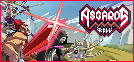
Embark on an epic saga in Asgard's Fall, a norse Survivors-like Roguelite. Fight your way through hordes of creatures and let the gods feel your relentless wrath. How will your saga unfold?

$4.68Very Positive(1,172)
Early AccessAction RoguelikeBullet Hell
SoulpotionApr 9, 2025

Asgard's Fall — Viking Survivors scores 63/100 — better than 6% of Steam capsules we've analysed (n=22,658).

Very Positive (1,172 reviews) · $4.68 · Released Apr 9, 2025 · By Soulpotion

Quick text summary

Asgard's Fall — Viking Survivors scored 63/100 on Steam Analyzer — Solid for a Steam capsule. Top priority fix: [genre_clarity] Add a subtle horde of enemy silhouettes in the background to immediately signal the survivors-like wave combat mechanic at all sizes.

Capsule scores by dimension

  • Genre Clarity: 6/10 — Action RPG Norse theme implied. The three distinct character archetypes (archer, brawler, robed figure) alongside a creature companion suggest a fantasy action RPG or party-based game. The Norse branding in the title reinforces a Viking theme, but the survivors/roguelite subgenre is not visually implied at tiny size. At tiny size the characters read as action or brawler genre, which is adjacent but not precise enough for the survivors-like subgenre.
  • Title Readability: 7/10 — Logo readable at small, tight at tiny. The bold geometric logo for 'ASGARD'S FALL' uses thick outlined letterforms with a distinctive chevron motif that reads reasonably well at small size. The subtitle or secondary text below the main logo becomes unreadable at tiny size and adds clutter. At full size the logo is clean and well-crafted with good contrast against the lighter sky background region where it sits.
  • Contrast & Color: 6/10 — Decent contrast, muddy midground. The large red diagonal sword creates a strong saturated accent against the teal-green background, providing some visual pop against Steam's dark #1b2838 background. However, the characters on the left side blend somewhat into the darker lower portion, reducing their silhouette clarity at small size. In a mental grayscale test the red sword remains the strongest separator but the character group loses definition.
  • Uniqueness & Polish: 6/10 — Competent cartoon style, genre generic. The flat cartoon art style with cel-shading is competently executed and gives a cohesive comic-book feel, but it reads as a fairly standard indie action game capsule. Compared to top-performing genre benchmarks like Hades II or Balatro which have strong signature visual hooks, this capsule lacks a distinctive selling point or unique composition idea. The diagonal sword adds some dynamism but the overall arrangement feels like a common multi-character lineup pose.
  • Brand Consistency: 7/10 — Cohesive style, recognizable logo motif. The chevron-based logo design and consistent flat cartoon rendering style across characters create internal visual cohesion. The limited warm-cool palette with the red sword accent and teal sky feels deliberately chosen and would be recognizable across a store page. The geometric logo mark with its distinctive zigzag border is a memorable identity element that could build brand recognition over time.
  • Composition: 6/10 — Diagonal energy, crowded character group. The large diagonal red sword provides directional energy and a clear visual axis across the header, which helps at small size. The logo is placed top-right in a relatively clean sky area, which is a good placement decision. However, the three characters clustered bottom-left create a crowded group with competing focal points, and at tiny size they collapse into an unreadable mass, leaving the sword and logo as the only legible elements.

What works

  • Strong diagonal sword anchor. The oversized red sword creates a clear diagonal visual axis that adds energy and draws the eye across the full header width.
  • Logo placed on clean background region. Positioning the 'ASGARD'S FALL' logo in the top-right sky area maximizes contrast and readability without competing with character art.
  • Consistent flat cartoon art direction. The cel-shaded style across all characters and the creature companion creates internal visual cohesion that feels intentional.
  • Distinctive geometric logo mark. The chevron zigzag border on the logo is a memorable and recognizable brand element that stands out from typical fantasy game typography.

What hurts the capsule

  • Character group collapses at tiny size. The three characters on the bottom-left merge into an unreadable cluster at 120x45, removing all character-driven genre cues at the smallest viewing size.
  • Survivors subgenre not visually communicated. Nothing in the capsule hints at the horde-survival roguelite mechanic, which is the game's core selling point and distinguishes it from generic action RPGs.
  • Subtitle text unreadable at small size. Any secondary text beneath the main logo is too small to parse at 231x87, adding visual noise without contributing readability.
  • Lower character region lacks contrast separation. In a grayscale test the characters on the left blend into the mid-tone background, weakening silhouette clarity in quick-scroll conditions.

Priority fixes

  1. [genre_clarity] Add a subtle horde of enemy silhouettes in the background to immediately signal the survivors-like wave combat mechanic at all sizes.
  2. [composition] Reduce the character cluster to one or two dominant foreground characters with cleaner silhouettes that remain legible at tiny size.
  3. [contrast_color] Darken the lower background behind the character group or add a subtle glow rim-light to improve character silhouette separation in grayscale.
  4. [title_readability] Remove or integrate the subtitle text into the logo treatment so it does not create unreadable clutter at small and tiny sizes.

Store copy priority fixes

  1. [hook_strength] Replace 'Embark on an epic saga' with an action verb: 'Fight your way through the Nine Realms in Asgard's Fall, a Norse roguelite where you battle hordes and defy the gods themselves.' This leads with combat and urgency rather than generic framing.
  2. [feature_communication] Restructure the detailed description into clear sections: Core Gameplay (Survivors-like loop), Heroes & Abilities, Meta-Progression (Web of Wyrd + Warpaint), and Twitch Integration, using subheadings or bullet points to improve scannability.
  3. [audience_targeting] Add one sentence clarifying intended difficulty level and playstyle: e.g., 'Perfect for roguelite veterans seeking fast-paced action with deep customization' or 'Casual-friendly difficulty options with emergent challenge for hardcore players.'
  4. [uniqueness] Articulate a specific mechanical or design innovation in the opening: e.g., 'Spatial inventory puzzles in the Warpaint system create strategic deckbuilding depth unseen in most Survivors-likes,' to justify why players should pick this over competitors.

Related guides

Steam app ID: 2780710