Scoring genre clarity...

Risk of Rain 2: Alloyed Collective capsule

Risk of Rain 2: Alloyed Collective

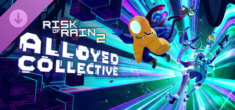
Lured, enslaved, and left to rust. The Alloyed Collective now stirs from the scrap of their fallen allies, driven by a singular purpose: returning home. Master two new Survivors and descend deep into Petrichor V to take on the Alloyed Collective’s ultimate creation.

$9.74Very Positive(38)
Third-Person ShooterAction RoguelikeMultiplayer
Gearbox SoftwareNov 18, 2025

Risk of Rain 2: Alloyed Collective scores 72/100 — better than 44% of Steam capsules we've analysed (n=22,658).

Very Positive (38 reviews) · $9.74 · Released Nov 18, 2025 · By Gearbox Software

Quick text summary

Risk of Rain 2: Alloyed Collective scored 72/100 on Steam Analyzer — Good for a Steam capsule. Top priority fix: [title_readability] Increase the size of the 'Risk of Rain 2' parent logo or reposition it to ensure it remains legible at tiny thumbnail sizes, possibly integrating it more prominently into the main title block.

Capsule scores by dimension

  • Genre Clarity: 7/10 — Action roguelite DLC vibes clear. The dynamic action poses, energy beam effects, and colorful sci-fi characters clearly suggest fast-paced action gameplay. The cartoon-styled alien characters mid-combat with glowing teal energy effects reinforce the action/indie tone familiar to Risk of Rain fans. At tiny size the combat energy reads well enough to imply action genre, though the DLC context is lost without the title being readable.
  • Title Readability: 7/10 — Main title reads, sub-title struggles small. The 'Risk of Rain 2' logo in the top-left uses a recognizable styled font with good weight, and 'Alloyed Collective' uses a bold blocky white font with good letter spacing that reads at medium size. At tiny size (120x45), 'Risk of Rain 2' becomes very small and hard to parse in the top-left corner, while 'Alloyed Collective' retains some readability due to its larger size and thick letterforms. The white text on the gradient purple-blue background provides adequate contrast at full size but competes with background energy effects at small sizes.
  • Contrast & Color: 7/10 — Vibrant palette separates well from Steam dark. The warm orange-yellow central character pops strongly against the cool teal and purple background, creating excellent color temperature contrast and a clear focal silhouette. The glowing teal energy beams and purple gradient background contrast well against Steam's #1b2838 dark background. In grayscale, the orange character and bright energy effects still provide decent value separation, though the darker purple-blue background characters on the right side blend somewhat at tiny size.
  • Uniqueness & Polish: 7/10 — Stylish DLC art with distinctive character design. The artwork has a polished, professionally illustrated feel with clean linework, vibrant colors, and a distinctive cartoon sci-fi aesthetic consistent with the Risk of Rain visual identity. The orange blob-like central character is visually distinctive and memorable. However, as a DLC capsule it follows a fairly standard 'characters in action against energy effects' template, and compared to top-tier benchmarks like Hades II or Balatro it lacks a truly unique compositional hook or visual storytelling element.
  • Brand Consistency: 8/10 — Strong Risk of Rain visual identity maintained. The capsule strongly echoes the Risk of Rain 2 visual identity with its distinctive chunky cartoon character designs, vibrant neon color palette, and energetic sci-fi aesthetic. The 'Risk of Rain 2' logo placement in the top-left clearly signals the parent IP, and the art style is cohesive with the known game aesthetic. The teal grid/energy beam effects and the stylized character silhouettes create a recognizable brand signature that fans of the series would immediately recognize.
  • Composition: 7/10 — Clear focal character with dynamic energy. The large orange central character serves as a clear primary focal point, with supporting characters on the right and energy effects creating diagonal movement guiding the eye from left to right. The 'Alloyed Collective' title text is placed centrally at a readable size with the 'Risk of Rain 2' parent branding nested above it in the upper-left. At small size the composition holds reasonably well with the orange character remaining the dominant element, though the title text and the DLC download icon in the top-left corner create some clutter in the upper region that competes for attention.

What works

  • Strong color contrast focal point. The warm orange central character against cool teal and purple creates an immediate visual anchor that reads clearly even at small sizes.
  • Clear brand IP signaling. The Risk of Rain 2 logo and distinctive character art style immediately communicate the parent franchise to existing fans.
  • Dynamic energy and movement. The diagonal composition with glowing teal energy beams creates a sense of action and excitement appropriate for the game's fast-paced genre.
  • Bold legible DLC title. 'Alloyed Collective' uses thick blocky letterforms that maintain readability at medium-small sizes better than many decorative DLC titles.

What hurts the capsule

  • Parent logo too small at tiny size. The 'Risk of Rain 2' text in the upper-left becomes essentially unreadable at 120x45 thumbnail size, weakening brand recognition at that scale.
  • DLC badge icon adds clutter. The download arrow badge in the top-left corner competes with the logo area and adds visual noise without contributing to genre or brand communication.
  • Right-side characters lose detail small. The darker purple-hued secondary characters on the right side blend into the background at small sizes, reducing the sense of a populated scene.
  • Generic action DLC template feel. Despite good execution, the characters-in-action-against-energy-effects layout is common in the genre and lacks a truly distinctive compositional idea compared to top benchmarks.

Priority fixes

  1. [title_readability] Increase the size of the 'Risk of Rain 2' parent logo or reposition it to ensure it remains legible at tiny thumbnail sizes, possibly integrating it more prominently into the main title block.
  2. [uniqueness_polish] Add a more distinctive compositional hook or visual storytelling element that communicates the 'Alloyed Collective' concept beyond generic action poses, such as a unique environmental or thematic detail.
  3. [contrast_color] Increase value separation on the right-side characters by lightening their silhouettes or adding a subtle glow outline so they read as distinct figures at small sizes.
  4. [composition] Remove or reduce the size of the DLC download badge icon to reduce upper-left clutter and give the title logo more breathing room.

Store copy priority fixes

  1. [audience_targeting] Add a brief primer sentence in the detailed description: 'If you're new to Risk of Rain 2, this expansion adds two powerful new Survivors to master, alongside 18 items and 7 stages of escalating challenge.' This signals whether the DLC requires the base game and sets context.
  2. [uniqueness] After the Drifter description, add an explicit comparison: 'Operator and Drifter each bring a new playstyle to Risk of Rain 2—commanding drone swarms and physics-based projectile control—distinct from the base Survivors.' This reinforces differentiation.
  3. [hook_strength] Rewrite the closing phrase from 'take on the Alloyed Collective's ultimate creation' to 'face the Alloyed Collective's deadliest weapon' or name the final threat, replacing vague language with concrete stakes.
  4. [feature_communication] Move the co-op unlock rules higher in the copy and simplify: 'Note: Only one player needs to own Alloyed Collective for the new Survivors, Items, and Stages to appear in multiplayer lobbies—but the new Survivors and permanent unlocks are exclusive to owners.' This clarifies the value proposition early.

Related guides

Steam app ID: 2781620