Scoring genre clarity...

Sin Slayers: Reign of The 8th capsule

Sin Slayers: Reign of The 8th

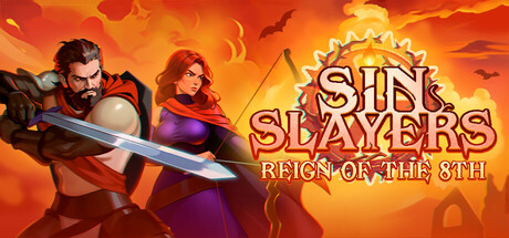
Seven Deadly Sins. Have you heard about the 8th? Delve into madness in Sin Slayers, a challenging RPG Roguelite where you decide how much sin to bear as you transform the world. Assemble a party of wicked adventurers, kill, and pillage to drive off a gluttonous nightmare in turn-based battles

$1.99Mixed(56)
Turn-Based StrategyRoguelikeDark
Goonswarm GamesNov 25, 2024

Sin Slayers: Reign of The 8th scores 65/100 — better than 11% of Steam capsules we've analysed (n=22,658).

Mixed (56 reviews) · $1.99 · Released Nov 25, 2024 · By Goonswarm Games

Quick text summary

Sin Slayers: Reign of The 8th scored 65/100 on Steam Analyzer — Solid for a Steam capsule. Top priority fix: [contrast_color] Add a cooler or darker value zone behind the characters, such as a subtle dark vignette or shadow layer, to separate their silhouettes from the warm fire background in grayscale and at small size.

Capsule scores by dimension

  • Genre Clarity: 7/10 — Dark fantasy RPG clear enough. Two armored adventurers with sword and staff pose against a fiery orange sky with bats and a sun-like emblem, strongly implying a dark fantasy RPG. The roguelite or turn-based nature is not communicated visually, but the genre archetype of party-based fantasy adventure reads clearly. At tiny size the characters and fire backdrop still suggest fantasy combat RPG reliably.
  • Title Readability: 7/10 — Title legible, subtitle struggles small. The 'SIN SLAYERS' logo uses bold, high-contrast lettering with a warm outline against the bright sun emblem backdrop and reads clearly at full and small sizes. The subtitle 'REIGN OF THE 8TH' is noticeably smaller and uses a decorative serif font that begins to collapse at small size and is essentially unreadable at tiny size. The two-word stacked logo treatment for the main title helps it hold up reasonably well in quick scroll conditions.
  • Contrast & Color: 6/10 — Warm palette blends into itself. The dominant orange-red fire palette creates energy but also causes the characters, background, and logo to compete within a similar warm value range, reducing silhouette separation. In grayscale the male character on the left separates reasonably from the background due to darker tones, but the female character on the right merges more with the fiery sky behind her. Against Steam's dark #1b2838 background the overall image does pop, but internal contrast within the capsule is limited.
  • Uniqueness & Polish: 6/10 — Competent but genre-generic execution. The illustrated style is clean and the fire-and-brimstone atmosphere fits the sin-themed premise, but the two-hero pose and fiery backdrop is a common composition seen across many dark fantasy indie RPGs. The sun gear emblem is a distinctive motif that hints at the game's identity but does not stand out strongly enough at small size to differentiate. Craft is solid but the overall impression feels like a competent genre capsule rather than a memorable standout.
  • Brand Consistency: 7/10 — Cohesive dark fantasy identity internally. The warm orange palette, illustrated character style, and sun-wheel emblem work together to create a coherent internal identity. The typography treatment of 'SIN SLAYERS' with its bold weight and warm outline is consistent with the fiery theme. The sun gear motif could serve as a recognizable brand symbol across assets, though at small size it risks reading as generic fantasy iconography rather than a unique brand marker.
  • Composition: 6/10 — Centered pair works, logo placement crowded. The two characters are well anchored in the lower two-thirds with the logo occupying the upper right and the sun emblem as a background focal anchor, creating a readable hierarchy at full size. However the logo and subtitle cluster in the upper right creates slight visual crowding, and at small size the subtitle competes with the character details for attention. The left character's sword extends toward the lower left edge effectively but at tiny size the overall composition reads as a busy warm blob with limited clear focal hierarchy.

What works

  • Bold main title legibility. The 'SIN SLAYERS' lettering is large, bold, and high-contrast enough to remain readable at small capsule size during quick scroll.
  • Thematic atmosphere. The fiery orange sky, bats, and dark fantasy character design immediately establish a dark RPG tone consistent with the game's sin-themed premise.
  • Sun gear emblem as brand anchor. The sun wheel motif behind the logo provides a distinctive visual signature that ties the composition together and hints at unique game identity.
  • Character illustration quality. Both characters are cleanly illustrated with readable silhouettes and distinct poses that communicate action-oriented fantasy adventuring.

What hurts the capsule

  • Subtitle unreadable at tiny size. The 'REIGN OF THE 8TH' subtitle uses a decorative small font that collapses completely at tiny thumbnail size, losing the product differentiator.
  • Low internal contrast in warm palette. The all-orange-red color scheme reduces separation between characters, background, and logo, causing the image to merge into a warm mass at small size.
  • Generic hero duo composition. The side-by-side warrior and mage pose is extremely common in dark fantasy indie RPGs and does not visually communicate the roguelite or sin-mechanic uniqueness of this game.
  • Female character merges with background. The right character's warm-toned outfit and red cape blend into the fiery sky behind her, weakening her silhouette separation especially in grayscale.

Priority fixes

  1. [contrast_color] Add a cooler or darker value zone behind the characters, such as a subtle dark vignette or shadow layer, to separate their silhouettes from the warm fire background in grayscale and at small size.
  2. [title_readability] Increase the subtitle 'REIGN OF THE 8TH' font size and weight significantly, or integrate it visually into the main logo block so it survives at small capsule dimensions.
  3. [uniqueness_polish] Introduce a visual cue unique to the sin or roguelite mechanic, such as a corrupted overlay, sin counter motif, or glowing 8th symbol, to differentiate from generic dark fantasy compositions.
  4. [composition] Reduce logo crowding in the upper right by giving the title more breathing room or repositioning subtitle below the main wordmark with clearer hierarchy.

Store copy priority fixes

  1. [feature_communication] Replace 'learn more about them and exploit their weaknesses' with a concrete tactical example: e.g., 'discover elemental resistances, status vulnerabilities, and tactical positioning opportunities' to make combat strategy tangible.
  2. [uniqueness] Add a sentence after the feature list explaining what Reign of the 8th specifically changes or improves from the original: e.g., 'No longer forced to replay regions—experience a streamlined campaign that respects your time while maintaining strategic depth.'
  3. [hook_strength] Reduce abstract philosophical questions and replace one with a concrete gameplay challenge: e.g., 'Will you sacrifice morality for power, or cling to virtue as enemies grow stronger with your every sin?'
  4. [audience_targeting] Add a sentence identifying the intended player: e.g., 'Perfect for tactical RPG fans who crave meaningful choices with immediate consequences' to help the right players self-identify.

Related guides

Steam app ID: 2790000