Scoring genre clarity...

The WereCleaner capsule

The WereCleaner

Kyle is a Janitor. He's also a Werewolf. And now he's got the night shift. Try not to kill anyone while working to get your paycheck - in a stealth-comedy game with surprises around every corner.

Free to PlayOverwhelmingly Positive(190)
StealthCasualCartoony
Howlin' HugsMay 7, 2024

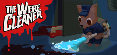
The WereCleaner scores 82/100 — better than 94% of Stealth capsules (n=725).

Overwhelmingly Positive (190 reviews) · Free to Play · Released May 7, 2024 · By Howlin' Hugs

Quick text summary

The WereCleaner scored 82/100 on Steam Analyzer — Good for a Stealth capsule. Top priority fix: [contrast_color] Increase the saturation or brightness of the background dark zone or add a subtle gradient to push the character silhouette further forward and reduce visual weight on the lower-right void.

Capsule scores by dimension

  • Genre Clarity: 8/10 — Clear comedy action with werewolf hook. The capsule immediately communicates a humorous action game through the anthropomorphic werewolf character actively using a cleaning tool as a weapon, establishing the stealth-comedy premise. The bright blue cleaning spray contrasts with the character's predatory appearance, reinforcing the core contradiction of a janitor werewolf. At tiny size, the character silhouette and action pose remain readable, though the genre blend (action-comedy-stealth) is slightly softer than pure action franchises in the benchmark list.
  • Title Readability: 9/10 — Excellent bold serif typography. The title 'THE WERE CLEANER' uses high-contrast white serif lettering with strong black outlines on the red splash background, maintaining excellent readability at all sizes including tiny. The letterforms are thick and distinctive, the spacing is even, and the text sits on a clean color block rather than competing texture. Even at 120x45 pixels, the title remains instantly legible due to the strategic color contrast and robust letterform design.
  • Contrast & Color: 9/10 — Strong value separation and silhouette clarity. The saturated red splash and white title text create dramatic contrast against the dark background, while the brown-tan werewolf character and blue cleaning spray pop distinctly from the dark midground and foreground. The color palette uses warm (red, brown, tan) against cool (blue, dark teal) with no muddy mid-tones, and the character maintains clear edge definition even when squinted. Against Steam's #1b2838 background, the entire composition reads as a cohesive silhouette with no value blending.
  • Uniqueness & Polish: 8/10 — Polished concept with clear visual hook. The werewolf janitor premise is inherently distinctive and communicated cleanly through character design and action pose, avoiding generic template aesthetics. The character model shows good craft with expressive proportions, detailed armor/uniform elements, and intentional animation framing. The concept is memorable and stands apart from action-heavy benchmarks by leaning into character-driven comedy, though the rendering style is solid indie rather than AAA-premium.
  • Brand Consistency: 7/10 — Consistent art direction with recognizable character. The werewolf character design shows consistent proportions, color palette (brown fur, blue uniform, tan accents), and a distinctive expressive face that could serve as a brand icon across marketing materials. The red splash background echoes a blood/action visual language coherent with the werewolf theme. Internal cohesion is strong between character, prop, and background palette, though without reference to the six store screenshots, broader brand identity signals cannot be fully validated.
  • Composition: 8/10 — Clear focal point with balanced layering. The werewolf character anchors the right-center composition as the clear primary subject, with the title occupying the upper left as a secondary focus, creating a natural reading flow without clutter. The blue cleaning spray creates a secondary action line that guides the eye toward the character's action. At small and tiny sizes, the two-element hierarchy (title splash + character) remains instantly readable with safe margins from edges, and the character does not hug dangerous crop boundaries.

What works

  • High-contrast readable title. White serif text with black outline on red background maintains excellent legibility across all sizes including tiny thumbnails.
  • Distinctive character-driven premise. The werewolf janitor concept is immediately recognizable and memorable, differentiating it from action-genre benchmarks that rely on martial or military themes.
  • Strong color separation and silhouette. The warm red and brown tones contrast cleanly against cool dark backgrounds with no muddy blending, ensuring visual pop in quick scroll conditions.
  • Clear focal point composition. Title and character are well-balanced without clutter, with the character's action pose creating natural eye movement and avoiding dead space.

What hurts the capsule

  • Genre blend may soften immediate recognition. While the stealth-comedy hook is clear, casual/strategy game browsers might hesitate between action and casual expectations, slightly weakening discoverability against pure-action benchmarks.
  • Dark background reduces title pop further. The red splash is strong, but the lower-right dark section (dark teal/gray background) consumes prime visual real estate without contributing to the primary message.
  • Indie polish ceiling. Character model and environment rendering, while clean, lack the AAA surface sheen and cinematic lighting that top-performing action benchmarks use to signal production value.

Priority fixes

  1. [contrast_color] Increase the saturation or brightness of the background dark zone or add a subtle gradient to push the character silhouette further forward and reduce visual weight on the lower-right void.
  2. [uniqueness_polish] Consider adding a subtle glow or rim light to the character to increase perceived polish and match the cinematic quality cues of top-performing action benchmarks.
  3. [genre_clarity] Reinforce stealth-comedy identity with a secondary visual cue (e.g., a subtle sneaking pose detail or comic-style effect line) to strengthen genre recognition among strategy/casual browser segments.

Store copy priority fixes

  1. [feature_communication] Expand the tool descriptions with a sentence or two explaining how each of the 3 tools enables different cleaning or stealth strategies (e.g., 'Tool A silences noise, Tool B hides evidence, Tool C distracts NPCs').
  2. [feature_communication] Add a brief sentence after the Feature section explaining the core gameplay loop: 'Navigate levels, clean messes (and bodies) before sunrise, outwit or avoid NPC routines, and escape with your paycheck intact.'
  3. [feature_communication] Clarify what 'dynamic NPC system' means in practice—do characters follow daily routines, react to your actions, or have unique weaknesses? Even one concrete example would help.

Related guides

Steam app ID: 2795000 · Tags: Stealth, Casual, Cartoony, Dark Humor, Cute