Scoring genre clarity...

Eldritch Tactics capsule

Eldritch Tactics

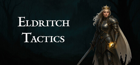
Eldritch Tactics: Lichtmond is a turn-based strategy game based on German folklore. After her untimely demise, the Burgund queen Kriemhild and her allied troops find themselves trapped in the Anderswelt where they face an onslaught of undead creatures as well as their own steadily declining sanity.

Turn-Based TacticsTactical RPGStrategy
Secret Item GamesTo be announced

Eldritch Tactics scores 65/100 — better than 11% of Steam capsules we've analysed (n=22,658).

Released To be announced · By Secret Item Games

Quick text summary

Eldritch Tactics scored 65/100 on Steam Analyzer — Solid for a Steam capsule. Top priority fix: [contrast_color] Add a subtle rim light or brighter background separation behind the character silhouette to increase value contrast against both the background and Steam's dark UI.

Capsule scores by dimension

  • Genre Clarity: 7/10 — Dark fantasy tactics implied clearly. The armored queen figure with a sword and glowing hand against a dark, foreboding forest background strongly signals dark fantasy RPG or strategy. The word 'Tactics' in the title reinforces the turn-based strategy subgenre. At tiny size the armored character silhouette still reads as fantasy combat, though the specific tactics/strategy angle relies heavily on the title being legible.
  • Title Readability: 7/10 — Readable at full, marginal at tiny. The serif-style title 'Eldritch Tactics' is placed on the left side over a relatively controlled dark background, giving decent contrast. At full size the letterforms are clear and the spaced caps treatment reads well. At tiny thumbnail size (120x45) the two-line stacking and thinner letterforms begin to collapse, making it difficult but not impossible to parse the title text.
  • Contrast & Color: 6/10 — Adequate but muted separation. The character is rendered in mid-tone armor grays against a dark gray-green forest background, which limits value separation especially against Steam's #1b2838 dark background. The warm glowing orb in her hand provides a focal contrast point but is small. In a mental grayscale test the character and background blend somewhat, reducing silhouette clarity at small sizes.
  • Uniqueness & Polish: 6/10 — Competent but genre-generic feel. The AI-generated or photorealistic queen character is well-rendered and attractive, but the composition of 'armored fantasy character on dark background with title text' is extremely common in the indie RPG-strategy space. The German folklore and eldritch horror angle is not visually communicated beyond the dark tone. No distinctive visual hook or unique selling point is evident beyond competent execution.
  • Brand Consistency: 6/10 — Dark gothic palette, no distinct motif. The dark green-gray forest palette and armored medieval aesthetic create a coherent mood internally. However there is no distinctive symbol, logo mark, or signature color treatment that would make this capsule immediately recognizable as 'Eldritch Tactics' versus any other dark fantasy title. The queen character could serve as a recurring identity anchor if used consistently across store assets.
  • Composition: 7/10 — Clear focal point, safe layout. The right-side character and left-side title create a conventional but functional two-zone split that reads well at full and small sizes. The character's centered vertical placement and slight rightward positioning leaves clean space for the title text. At small capsule size the layout holds reasonably well, though the title risks competing with the character for attention due to similar tonal weight.

What works

  • Clear character focal point. The armored queen is well-lit relative to the background and anchors the right side of the composition with a strong vertical silhouette.
  • Title placement on dark zone. Placing 'Eldritch Tactics' over the darker left background region provides enough contrast for legibility at full and small sizes.
  • Genre keyword in title. The word 'Tactics' directly communicates the gameplay subgenre, compensating for any ambiguity in the visual-only genre read.
  • Coherent dark fantasy mood. The muted dark green forest, fog, and gothic armor create a consistent atmospheric tone appropriate for the described game setting.

What hurts the capsule

  • Low value contrast against Steam background. The dark gray armor against a dark gray-green background produces limited silhouette separation, especially when the capsule sits on Steam's #1b2838 dark UI.
  • Generic dark fantasy composition. The armored character plus dark forest layout is one of the most common formulas in indie RPG and strategy capsules, offering no distinctive visual hook.
  • Folklore and horror angle not visualized. The German folklore setting and eldritch horror mechanics described in the game have no visual representation in the capsule, missing an opportunity for differentiation.
  • Title collapses at tiny size. The two-line spaced serif title loses definition at 120x45 thumbnail size, reducing discoverability in very small browse contexts.

Priority fixes

  1. [contrast_color] Add a subtle rim light or brighter background separation behind the character silhouette to increase value contrast against both the background and Steam's dark UI.
  2. [uniqueness_polish] Introduce a distinctive eldritch or folkloric visual element such as a rune, creature silhouette in the background fog, or a stylized motif that differentiates this from generic dark fantasy capsules.
  3. [title_readability] Increase the font weight or add a subtle dark shadow/outline behind the title letterforms so they remain legible when the capsule is scaled to tiny thumbnail size.
  4. [genre_clarity] Consider adding a subtle environmental cue such as a hex grid overlay, ghost troops, or undead shapes in the background fog to visually reinforce the turn-based tactics gameplay.

Store copy priority fixes

  1. [feature_communication] Add a 1-2 sentence explanation of how the Veil mechanic works mechanically: does it trigger automatically, can players influence it, and what happens to unit stats/abilities when it activates?
  2. [audience_targeting] Insert a sentence clarifying campaign length (e.g., '15+ turn-based battles across 5 chapters') and whether permadeath applies to named heroes or all units, to set expectation for commitment and emotional investment.
  3. [hook_strength] Strengthen the short description's opening verb: replace 'is a turn-based strategy game' with an action-forward hook like 'Command a cursed queen's army through a purgatorial nightmare where every choice corrupts or saves your soldiers' to create immediate emotional pull.
  4. [feature_communication] Add a single sentence explaining how character upgrades and ability progression work ('Unlock unique active and passive abilities by committing units to light or dark paths'), as the current bullet point is vague.

Related guides

Steam app ID: 2805110