Scoring genre clarity...
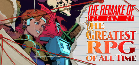
A deduction puzzle game set in the last hour of a lost 90s JRPG complete with original manual, director's commentary, and clips of an unreleased amateur documentary, all used to uncover the secret at the heart of it all: "What is the Greatest RPG of All Time?"
$15.29Very Positive(16)
JRPGPuzzleInvestigation
Coin Drop Games, Lucas Immanuel, jucobee, Kyle ChuangMay 28, 2026