ESC (Electronics Security Company) scores 60/100 — better than 0% of Hacking capsules (n=132).

Quick text summary

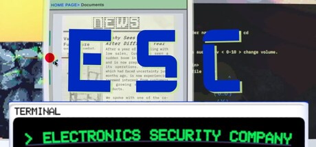
ESC (Electronics Security Company) scored 60/100 on Steam Analyzer — Solid for a Hacking capsule. Top priority fix: [composition] Remove overlapping background windows and reduce visual layers to a single clear focal point—keep only the dominant element (either blue ESC letters or terminal interface, not both) and simplify the background to a solid or subtle gradient.

Capsule scores by dimension

  • Genre Clarity: 7/10 — Hacking sim messaging readable. The green terminal text '> ELECTRONICS SECURITY COMPANY' and CRT monitor aesthetic clearly signal a hacking or cybersecurity simulation game. At TINY size, the retro computer UI and command-line interface remain recognizable as hacking-adjacent gameplay. However, the overlapping window screenshots at full size create some visual noise that slightly obscures the core genre hook.
  • Title Readability: 6/10 — Acronym legible, context unclear. The 'ESC' acronym in blue block letters reads clearly at full and SMALL sizes due to high contrast against the dark background. At TINY size it remains legible but loses context—the full meaning 'Electronics Security Company' below it becomes difficult to parse, and viewers may only see the three-letter acronym. The green terminal text provides genre context but doesn't reinforce the actual game title.
  • Contrast & Color: 7/10 — Strong value separation overall. The bright blue 'ESC' lettering and neon green terminal text both pop distinctly against the dark background and create clear silhouettes. The light yellow and pale window elements on the left side add visual variety. However, the overlapping translucent window elements and multiple background layers create some mid-tone muddiness that slightly reduces the crisp separation expected at TINY sizes.
  • Uniqueness & Polish: 6/10 — Retro aesthetic competent generic. The CRT monitor and terminal aesthetic is thematically appropriate and conveys a hacking simulation feel effectively. The blue block letters and green command-line text follow established cyberpunk conventions, but the overall execution feels like a well-executed template rather than a distinctive visual identity—similar retro-tech aesthetics appear frequently in simulator and strategy game capsules. At SMALL size, the generic layered window composition becomes more apparent.
  • Brand Consistency: 5/10 — Mixed visual elements lack cohesion. The capsule combines retro CRT aesthetics, blue geometric letters, neon green terminal text, and overlapping UI windows, but these elements feel assembled rather than unified into a recognizable brand identity. There are no distinctive character, motif, or signature visual hooks that would make an ESC capsule instantly recognizable across multiple store screenshots. The palette and rendering style lack the internal consistency needed for strong brand recall.
  • Composition: 5/10 — Cluttered layering scattered focus. The composition stacks multiple overlapping window elements (left sidebar, center blue box, right code window, top banner) creating visual clutter and competing focal points rather than a clear hierarchy. The 'ESC' lettering sits in the center but is not the dominant element—the eye jumps between the blue box, green text, and background screenshots equally. At TINY size, the layering collapses into an indecipherable mess of overlapping rectangles with no clear primary subject.

What works

  • Strong color contrast against dark Steam background. Bright blue 'ESC' letters and neon green terminal text create immediate visual pop and maintain legibility even when scrolling quickly past the capsule.
  • Thematically appropriate retro-tech aesthetic. The CRT monitor, terminal interface, and command-line green text instantly communicate a hacking or cybersecurity simulation without ambiguity.
  • Acronym readability at multiple sizes. The three-letter 'ESC' in bold blue block letters remains legible from full header down to small thumbnail due to simple letterforms and high contrast.

What hurts the capsule

  • Cluttered multi-window layering collapses at small sizes. Overlapping translucent windows and background screenshots create visual noise that becomes an illegible mesh at TINY and SMALL sizes, obscuring the core message.
  • No clear focal point or visual hierarchy. Multiple competing elements (blue box, green text, sidebar, code window) demand equal attention, making it difficult to identify what the player should focus on first.
  • Generic retro-tech treatment lacks distinctive brand identity. The CRT and terminal aesthetic, while thematically sound, uses common visual tropes that don't differentiate ESC from other hacking-themed games or simulators.
  • Full title obscured at small viewing sizes. The complete 'Electronics Security Company' text becomes unreadable at SMALL and TINY sizes, leaving only the cryptic 'ESC' acronym without context.

Priority fixes

  1. [composition] Remove overlapping background windows and reduce visual layers to a single clear focal point—keep only the dominant element (either blue ESC letters or terminal interface, not both) and simplify the background to a solid or subtle gradient.
  2. [title_readability] Enlarge and reposition the full game title 'Electronics Security Company' to be readable at SMALL size, or replace the acronym with the full name in a cleaner typographic treatment with better outline/shadow separation.
  3. [uniqueness_polish] Develop a distinctive visual motif or signature element (custom terminal design, unique character, or iconic UI component) that would be instantly recognizable across all store materials and screenshots.
  4. [brand_consistency] Establish a unified palette and rendering approach across the entire capsule—commit fully to either flat geometric design or realistic CRT rendering, but not a mixed approach that dilutes visual identity.

Store copy priority fixes

  1. [hook_strength] Rewrite the short description to lead with a specific scenario or emotional outcome: 'Infiltrate corporate networks as a rogue security expert to expose corruption—but leave no digital footprint behind.' This creates urgency and stakes.
  2. [feature_communication] Add a bulleted breakdown of core mechanics in the detailed description, such as: 'Navigate firewalls • Decode encrypted files • Avoid detection systems • Uncover a conspiracy'—concrete nouns that clarify gameplay.
  3. [uniqueness] Clarify what makes ESC distinct: Is it the typing-command interface? The moral ambiguity? A narrative twist? Add one sentence that positions this game against other hacking sims.
  4. [audience_targeting] Resolve the tone conflict by choosing a lane: Either emphasize the 'relaxing puzzle solver' angle (lighten language, show cozy aesthetics) or the 'serious infiltrator thriller' angle (deepen the stakes narrative). Currently both signals exist and compete.

Related guides

Steam app ID: 2811590 · Tags: Hacking, Programming, Job Simulator, Simulation, Investigation